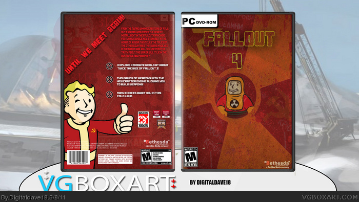
A Russian theme is interesting, and the red works well, as does the simple front. The back's not bad either, but man does that tagline have some issues. The text is too small and spread out to be slanted at that angle, leaving a huge and awkward empty space in the corner. I'd give the tag two lines and reduce the size of the angle.
 Fallout 4 Box Cover Comments
Alright guys this is my attempt at creating a new fallout i went with a Russian themes because i thought it seemed appropriate.
[ Reply ]
A Russian theme is interesting, and the red works well, as does the simple front. The back's not bad either, but man does that tagline have some issues. The text is too small and spread out to be slanted at that angle, leaving a huge and awkward empty space in the corner. I'd give the tag two lines and reduce the size of the angle.
[ Reply ]
#2, will fix that soon thanks.
[ Reply ]