You took the official design and really made it your own. Much more balanced and pleasing to the eye than what'll actually be on store shelves.
You've outdone yourself with the back as well. Creative and fitting of the game in question. It's creative and well laid out while maintaining aspects from your previous designs. It's a huge improvement.
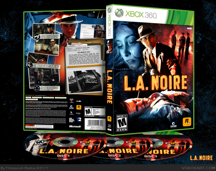
The front is my own take on the official, if you look closely at the link above, you will be able to see that my front and the official don't match exactly. The man laying down at the crime scene with the cops was taken out, I found a larger version of that man laying down and rendered him out, so it looks like Cole is actually examining his body instead of the lady's with the smudged makeup. The white shirt he's grabbing matches the color of the laying man, so it worked. If you've seen some of the artwork you could know that the image of Cole on the front is actually from an image of him looking at a lady at the crime scene.
So I had to color him black and white, and then re-color him to match the white/blue/red tones of everything else, the ladies face was also put there by myself, I didn't touch the official however want I really wanted to do obviously was change it.
The back has a lot of elements from the official website, and I used a few pamphlets and folders for the description text, upon second inspection the text is kind of small which is something I plan on fixing when I release the printable for sure. The color tones match well and I really like the cover and I think it is well balanced.
I had some discs already made and upload at console-covers a few months back so I used those.
Created on May 4th, completed on May 21st, because I had to wait for a scan to come out for the legal information and barcode. The scan I found was indeed BBFC which worked out for me perfectly, since the barcode was fresh, I was able to convert it over to NTSC. The printable is now available, the description text has also been made bigger and has been shortened.
 L.A. Noire Box Cover Comments
Looks too official, I can hardly tell the difference. Nice work.
[ Reply ]
Excellent work, my friend.
[ Reply ]
Ooooooh, I love it.
[ Reply ]
It looks like you took the official and made it twice as good. Excellent. This might be my favorite from you.
[ Reply ]
Nice work!
[ Reply ]
Awesome retake on the official, and a hell of a lot better too. Good stuff, like always. And I cannot wait for this game to come out.
[ Reply ]
I love the back, but the front just doesn't work for me. Good work on the back though.
[ Reply ]
You took the official design and really made it your own. Much more balanced and pleasing to the eye than what'll actually be on store shelves.
You've outdone yourself with the back as well. Creative and fitting of the game in question. It's creative and well laid out while maintaining aspects from your previous designs. It's a huge improvement.
[ Reply ]
That back is a killer and fits the game very well.
Front is also nice, even if it is too official-looking.
[ Reply ]
link
The front is my own take on the official, if you look closely at the link above, you will be able to see that my front and the official don't match exactly. The man laying down at the crime scene with the cops was taken out, I found a larger version of that man laying down and rendered him out, so it looks like Cole is actually examining his body instead of the lady's with the smudged makeup. The white shirt he's grabbing matches the color of the laying man, so it worked. If you've seen some of the artwork you could know that the image of Cole on the front is actually from an image of him looking at a lady at the crime scene.
So I had to color him black and white, and then re-color him to match the white/blue/red tones of everything else, the ladies face was also put there by myself, I didn't touch the official however want I really wanted to do obviously was change it.
The back has a lot of elements from the official website, and I used a few pamphlets and folders for the description text, upon second inspection the text is kind of small which is something I plan on fixing when I release the printable for sure. The color tones match well and I really like the cover and I think it is well balanced.
I had some discs already made and upload at console-covers a few months back so I used those.
[ Reply ]
The cover looks amazing and i can't wait to play the game. How can i get the printable version of your cover ?
[ Reply ]
#11, The printable will be available the day the game comes out.
[ Reply ]
It's a nice take on the original. Yet again, anther one of your cases I could see being used for real.
[ Reply ]
Turns out this version has 3 discs, go to console-covers to see them, although they are blatantly plain.
[ Reply ]
Created on May 4th, completed on May 21st, because I had to wait for a scan to come out for the legal information and barcode. The scan I found was indeed BBFC which worked out for me perfectly, since the barcode was fresh, I was able to convert it over to NTSC. The printable is now available, the description text has also been made bigger and has been shortened.
Edited at 1 decade ago
[ Reply ]
This is fantastic, but the Cola King billboard on the back is noticeably flipped.
[ Reply ]
#16, Arguably a bad design choice, thanks for viewing
[ Reply ]
looks very official, especially love the back!
but, The Team Bondi logo on the front is way to small,
(compared with the Rockstar logo) make it bigger.
put a little fade mask on Cole at the top of the spine,
to make it more merge with the rest.
and why 3 discs? is this a special edition?
p.s. I would like to see this for PS3....;)
Edited at 1 decade ago
[ Reply ]
#18, The XBOX 360 version comes on 3 discs.
[ Reply ]
#19, Didn't knew that? I only have a PS3.
[ Reply ]
#20, link
[ Reply ]
this is really nice man!
[ Reply ]