I'm really excited about this because it's my first box posted without being posted in the WiP forum first.
Please view in full as it looks best that way.
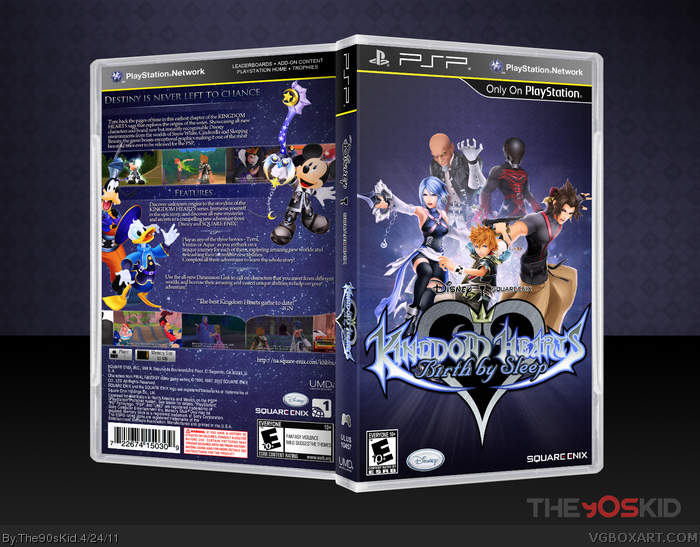
Credit to jevangod for the case and temp and to the KH wiki for a few of the renders.
This kind of design for this series make me bored, character renders with star background. This box is really good, but I'm not a fan of this design anymore. =.=
The lighting, specifically on the front, is lovely. I feel the logo could be sized down a tad, it's pretty large in comparison to the characters. The back is flawlessly executed, I've no issues with it.
The whole cover is somewhat jagged in full-view, do you have a 2D printable version on hand?
#9, I wanted to differentiate the front from the back somehow and a star field was all I could think of. Thanks anyway.
#10, Thanks, sd, I'll put up a printable.
 Kingdom Hearts: Birth by Sleep Box Cover Comments
I'm really excited about this because it's my first box posted without being posted in the WiP forum first.
Please view in full as it looks best that way.
Credit to jevangod for the case and temp and to the KH wiki for a few of the renders.
[ Reply ]
Wow, incredible job on this dude. You really have improved so much!
[ Reply ]
The back is very well done, some of the renders have white outlines around them.
A very good concept and design with appealing colors, the front is a bit empty by the top.
The legal info looks kind of disorganized, try to use blocks.
[ Reply ]
There is also no spine, try to use this as a reference.
link
[ Reply ]
#2, Thanks!
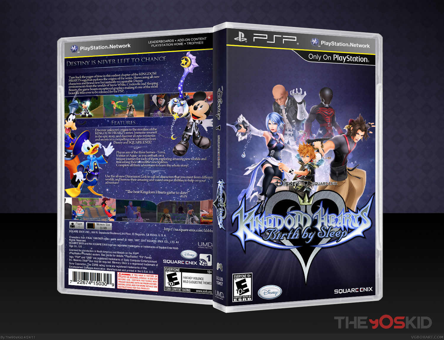
#3, 4, I can't believe I forgot the spine temp! I'll update.
[ Reply ]
How the logo is filled with black, bothers me a bit. but other than that, fantastic job.
[ Reply ]
Another fantastic offering, with each box you keep on growing. Excellent! I might make one now you've inspired me.
[ Reply ]
Updated, fixed the spine and legal info.
#6, That's how the logo was when I found it but thanks.
#7, Thanks. Please do, I'd love to see it.
[ Reply ]
This kind of design for this series make me bored, character renders with star background. This box is really good, but I'm not a fan of this design anymore. =.=
[ Reply ]
The lighting, specifically on the front, is lovely. I feel the logo could be sized down a tad, it's pretty large in comparison to the characters. The back is flawlessly executed, I've no issues with it.
The whole cover is somewhat jagged in full-view, do you have a 2D printable version on hand?
[ Reply ]
#9, I wanted to differentiate the front from the back somehow and a star field was all I could think of. Thanks anyway.
#10, Thanks, sd, I'll put up a printable.
[ Reply ]
One thing I would do is move the people up a bit on the front.
[ Reply ]