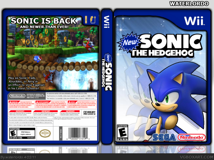
This is the Hardest I've ever worked on a Box, trying to make this one MasterWorks worthy but Its not going to be because of my custom-made template :( It is just still a little pieces of white in places. But I think I did a Fairly Awesome job lol so tell me what you think!
#7, thx for crushing my spirit lmao u could have just stated what I did wrong, because I think I did really good besides the template, which was fairly good.
I'm not even HoF "level" yet, but that's not really the point of this site. This site is all about showing your at to others and sharing your creativity.
Sonic has a black choppy outline around him. That really bothers me. The back is what really brings the box down. The layout is pretty bad in my opinion. The tagline isn't so much as a problem. I think box would look better with screenshots. But The ONE back picture you put on there is kinda low-res.I don't like the black outline of the template either.
It take GREAT effort to get into the Hall of Fame, let alone the Master Works. Not to say you didn't put effort into it. You just didn't Put enough. Not to be arrogant, or sound like my stuff is Master Work material, but I haven't even gotten into the Hall of Fame, and my stuff is better than this... No Offense, but you new, and gotta understand it isn't easy getting into the Master Works (For a select few, it maybe), and you're definitely not getting into the Hall of Fame with this box. Try again. And Make sure you Use GIMP, Paint.NET, or Photoshop.
 New Sonic The Hedgehog Box Cover Comments
This is the Hardest I've ever worked on a Box, trying to make this one MasterWorks worthy but Its not going to be because of my custom-made template :( It is just still a little pieces of white in places. But I think I did a Fairly Awesome job lol so tell me what you think!
[ Reply ]
Someones full of themselves.
lol.
[ Reply ]
lmao
[ Reply ]
Anyone? Tell me what you think! lol
[ Reply ]
Its Great! Like How You Used Sonic Generations At The Back.
[ Reply ]
Thanks!
[ Reply ]
You need to do a lot more than that to even get Hall of Fame. Better lower your aims for now methinks.
[ Reply ]
#7, thx for crushing my spirit lmao u could have just stated what I did wrong, because I think I did really good besides the template, which was fairly good.
[ Reply ]
#8, It's just not very appealing :/
I'm not even HoF "level" yet, but that's not really the point of this site. This site is all about showing your at to others and sharing your creativity.
[ Reply ]
#9, Everybody's work is Creative, and is being shared. If it's all the same to you lol
[ Reply ]
Sonic has a black choppy outline around him. That really bothers me. The back is what really brings the box down. The layout is pretty bad in my opinion. The tagline isn't so much as a problem. I think box would look better with screenshots. But The ONE back picture you put on there is kinda low-res.I don't like the black outline of the template either.
It take GREAT effort to get into the Hall of Fame, let alone the Master Works. Not to say you didn't put effort into it. You just didn't Put enough. Not to be arrogant, or sound like my stuff is Master Work material, but I haven't even gotten into the Hall of Fame, and my stuff is better than this... No Offense, but you new, and gotta understand it isn't easy getting into the Master Works (For a select few, it maybe), and you're definitely not getting into the Hall of Fame with this box. Try again. And Make sure you Use GIMP, Paint.NET, or Photoshop.
[ Reply ]
nice box
[ Reply ]
#11, Thanks for saying that stuff without saying it sucked lol but what is GIMP?
[ Reply ]
#13, Nvm about the GIMP thingy lol and #11 I put the black line around him to make it seem cooler but obviously it didn't work lmao
[ Reply ]
Great! very nice design!
[ Reply ]
the wii mote icon on the back is gold and choppy.
[ Reply ]