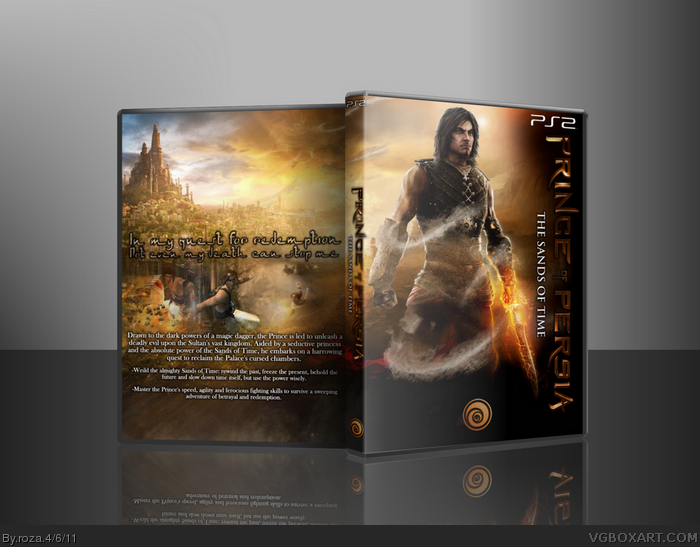
OK so I got PoP Sands of Time recently but it was the Platinum edition and I hate Platinum cases so I thre whis together. wanted to try something different. So I made a new template desigh and opted against age ratings and legall info. But I kept the dev logo because it was inkeeping with the design. Took a few hours to do but I'm happy with the outcome.
Credit:
Scorpion_Soldier- Logo
Devidas- 3D presentation
May add a printable and the temp sometime this week
Outside of the weird black stroking around the tagline, I like the back. The front's a different story though, specifically due to the varying Prince of Persia material. The movie logo doesn't seem fitting for the game series, and is a bit difficult to read in the center. And the Prince is, of course, from Forgotten Sands and really doesn't look anything at all like the Sands of Time Prince.
#6 Yeah, I originally made this just as a replacement for my own game, and seeing as most of the SoT art was quite poorly graphiced, and I wanted something quite gritty. And the movie logo was all I could get ahold of.
#6, Oddly enough, Sands of Time was rereleased at the same time as The Forgotten Sands, and Ubi opted to use the same art and logo as The Forgotten Sands. I think they wanted to fool people who didn't know any better into thinking they were getting the new game.
Pretty much what #6 said, I agree with.
I actually don't mind the use of the movie logo, but it is difficult to see on the front. I think the back looks empty. I would like it better if there were a render you could place on the upper right of the prince and possibly Farrah. Overall, this looks pretty sweet, but there are just a few things stopping it from being great.
#9 the text font or the tagline font? and I cant seem to get a decent logo pre rendered, but im still looking for a better one. Itll be at least the 26th when an update arrives though :(
 Prince of Persia: Sands of Time Box Cover Comments
OK so I got PoP Sands of Time recently but it was the Platinum edition and I hate Platinum cases so I thre whis together. wanted to try something different. So I made a new template desigh and opted against age ratings and legall info. But I kept the dev logo because it was inkeeping with the design. Took a few hours to do but I'm happy with the outcome.
Credit:
Scorpion_Soldier- Logo
Devidas- 3D presentation
May add a printable and the temp sometime this week
[ Reply ]
Oh damn you posted this already? I was hoping you could give me a better resolution IMG to put into the 3D but oh well :)
[ Reply ]
it looks awesome it came out pefect ;D
10/5
+fav
[ Reply ]
#2 yeh ill try and get the better res IMG for ya, busy at the moment but ill try and pm you a png.
[ Reply ]
Sweet!!!
[ Reply ]
Outside of the weird black stroking around the tagline, I like the back. The front's a different story though, specifically due to the varying Prince of Persia material. The movie logo doesn't seem fitting for the game series, and is a bit difficult to read in the center. And the Prince is, of course, from Forgotten Sands and really doesn't look anything at all like the Sands of Time Prince.
Not my favorite of yours, I'm afraid.
[ Reply ]
#6 Yeah, I originally made this just as a replacement for my own game, and seeing as most of the SoT art was quite poorly graphiced, and I wanted something quite gritty. And the movie logo was all I could get ahold of.
[ Reply ]
#6, Oddly enough, Sands of Time was rereleased at the same time as The Forgotten Sands, and Ubi opted to use the same art and logo as The Forgotten Sands. I think they wanted to fool people who didn't know any better into thinking they were getting the new game.
Pretty much what #6 said, I agree with.
I actually don't mind the use of the movie logo, but it is difficult to see on the front. I think the back looks empty. I would like it better if there were a render you could place on the upper right of the prince and possibly Farrah. Overall, this looks pretty sweet, but there are just a few things stopping it from being great.
[ Reply ]
It's nice and all but change the font on the back and use a different logo.
[ Reply ]
#9 the text font or the tagline font? and I cant seem to get a decent logo pre rendered, but im still looking for a better one. Itll be at least the 26th when an update arrives though :(
[ Reply ]
tagline.
[ Reply ]
#12 Ah ok. Any suggestions what I can change it to?
[ Reply ]
Great box, I really like it!
[ Reply ]