I like it, but the logo seems too plain. try and do something to jazz it up
and add a mist/sand storm on the back to cover the soldiers legs so theyre not just floating
#4 I'll update it tommorow, i've already half-done it, but my computer died out and my recharger stopped working (again)and the box is on there :$
#5 - Is that a good or bad thing :/
 Conflict: Desert Storm Box Cover Comments
Good job man!
[ Reply ]
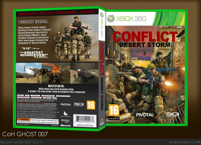
I like it, but the logo seems too plain. try and do something to jazz it up
and add a mist/sand storm on the back to cover the soldiers legs so theyre not just floating
[ Reply ]
#1 thanks dude :')
#2 I'll try to change the logo a bit, about the other thing; do you mean the one of the four on the back (top right corner? :D
[ Reply ]
#3 yeah, the back ground seems to subtle. if you add a sand storm type thing it will add a bit more action to the box
[ Reply ]
I thought this was a humor box at first.
[ Reply ]
#4 I'll update it tommorow, i've already half-done it, but my computer died out and my recharger stopped working (again)and the box is on there :$
#5 - Is that a good or bad thing :/
[ Reply ]
oh why must you induce nostalgia on me like this?? I LOVED Conflict:DS on PS2, FAV worthy indeed, but I agree with #2 about the title though
[ Reply ]
You should change the logo color, I think white better than red. Front is really cool, but the back need more works, it looks a bit boring too me.
[ Reply ]