Well here is my latest box. The amount of time that went into this was is crazy. But I think it came out really good. I had to edit the images a lot to make them all look the same style but finally I achieved it. Thanks to some of my classmates for finding some of the images. Pretty sweet of them to help me out with that. Went with a completely different color scheme then the usual. I like the way the orange came out. I also wanted to do a very dark scheme and I took away the screens because they did not look good with that setup so I kept it simple. Anyways, enjoy! Comments and favs are always appreciated.
This has an interesting concept but there are a few points that you could improve on. Like Eggboy'13 said above me, the logo is a bit bad. It could do without the black outline and the glow could be a bit better. ;)
But as it is, there's so much you could do to make it better... There's small things like the typeface you used for the back text, or the flatness to the text for the tagline. The front is amazing and the back concept is raw. However t he back itself is just not up to par with the front. As you mature as an artist you'll see what I mean, just those small things that really get to perfectionists like myself, and things that stand out to the tad bit more experienced artists.
You have some incredible composition talent, and a good eye for placement, but there's a whole lot left to learn for all of us, and I think this is a great example of a naturally good artist that will evolve into something spectacular. Great work man, just needs some fine tuning here and there with typeface selection, text placement, and blending. If you have the time on your hands, experiment with blending man... You'll love it...
#11, Thanks I really appreciate that! And yea I will def be working more with blending and little stuff as I continue to make boxes. I think from my first one I really improved drastically. And as long as I keep getting better and better ill be happy :)
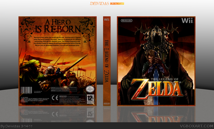
 The Legend of Zelda Box Cover Comments
Well here is my latest box. The amount of time that went into this was is crazy. But I think it came out really good. I had to edit the images a lot to make them all look the same style but finally I achieved it. Thanks to some of my classmates for finding some of the images. Pretty sweet of them to help me out with that. Went with a completely different color scheme then the usual. I like the way the orange came out. I also wanted to do a very dark scheme and I took away the screens because they did not look good with that setup so I kept it simple. Anyways, enjoy! Comments and favs are always appreciated.
[ Reply ]
Logo's awful, like really bad..
[ Reply ]
This has an interesting concept but there are a few points that you could improve on. Like Eggboy'13 said above me, the logo is a bit bad. It could do without the black outline and the glow could be a bit better. ;)
[ Reply ]
I love my logo. It fits the box.
[ Reply ]
Superb.
[ Reply ]
#4, No, I like it too, it's just that it's badly cut-out.
it's choppy around the edges.. :/
[ Reply ]
#6, Oh I got youu! Yea I see what your talking about. Ill fix :) Thankss
[ Reply ]
#5, Thanksss
[ Reply ]
You misspelled "dungeons" on the back.
[ Reply ]
#9, Son of a bitch!!! I double checked the spelling too. Damnit.
[ Reply ]
It's really good.
But as it is, there's so much you could do to make it better... There's small things like the typeface you used for the back text, or the flatness to the text for the tagline. The front is amazing and the back concept is raw. However t he back itself is just not up to par with the front. As you mature as an artist you'll see what I mean, just those small things that really get to perfectionists like myself, and things that stand out to the tad bit more experienced artists.
You have some incredible composition talent, and a good eye for placement, but there's a whole lot left to learn for all of us, and I think this is a great example of a naturally good artist that will evolve into something spectacular. Great work man, just needs some fine tuning here and there with typeface selection, text placement, and blending. If you have the time on your hands, experiment with blending man... You'll love it...
[ Reply ]
#11, Thanks I really appreciate that! And yea I will def be working more with blending and little stuff as I continue to make boxes. I think from my first one I really improved drastically. And as long as I keep getting better and better ill be happy :)
[ Reply ]
really awesome ! worths a fav !
[ Reply ]