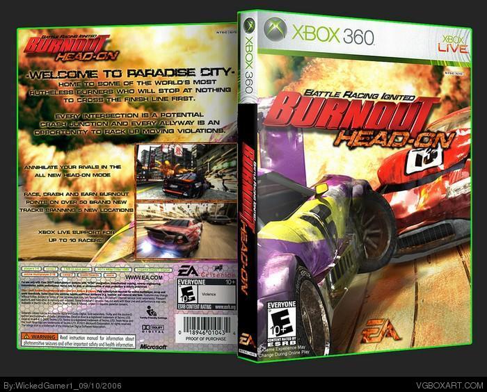
Tell me how you like it :)
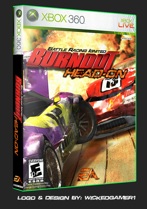
im working on a back cover for it, but it may not be done for a while. i have like, 2-3 other projects im working on at the moment :P
well, could you possibly do me a favor then? go talk to criterion for me, and have them send some exclusive art from Burnout 5. Thanks man.
seriously, why is it so important that i use art from only burnout?
i mean, its not like i put a picture of Gordan Freeman on it. At least i stayed in the genre, and the picture even looks like it could be burnout!
This is a demagogy, dude...
This is wrong. If you doesn't understand it, I can't say nothing more...
P.S. I allready sad before, if game doesn't have the art (or you don't), don't make the box for it. If this was the box for Destruction Derby Arens - there will be no problems... But who needs some stupid Destruction Derby Arenas box, right? :P
demagogy huh? i take offense to that.
and you know what? i can make a box art without official art if i want to. i dont need "mr_perfection" telling what and what not to do.
and i think the reason i "doesn't understand it" is cause your English sucks. I'm sorry, but i can rarely understand the stuff you say.
No comments...
You can do everything you want. I can gave you 4/5... Are you happy now?
P.S. I am here not to talk with you here or in my private mail. I am here to add some boxes to the website... If you want to talk - talk with your psychiatrist...
no comment huh... then whats with the PS and the you giving him a 4/5. plus saying no comment is leaving a comment.
PS: if your wondering why im saying this its because i like to correct other peoples mistakes using something called logic. ;)
#24 - Then use your brain and keep the PM's between the two of you. While you're at it, stop flooding the comment section with your inane drivel. Thanks. 8)
As for this boxart... I really like the overall color scheme of the box plus the grittiness of the font you chose for the back is great. Nice job on this one.
If WG1 (or someone else) talks rude to me in THIS topic - I will answer him in THIS topic...
The same thing about the pm...
I think that placing the Destruction Derby Arenas wallpaper on the Burnout's box is wrong. If other people doesn't thinks the same, they can rate this box with 5... link
I rate this box: 4/5, and, by the way, not only me...
#28, i hate to say this but i stillt hink ti shoudl be a five and all but using another game is ok sometimes like in this case it looks terrific so i dont know what the arguement is about i mean using mario wallpaper for a zelda box is wrong but not this. o yea nice work wg1. hoo-rah
#20 the fight betwin WG1 and made spike is starting to get a littil anooyng so please leave the fights in the pm okay ... i like the box but the idea of the Destruction Derby Arenas wallpaper is not good man butat the end you made a nice box give it 4/5
i don;t care what the walllpapers from, i give this a 5 still.
(look at my Hostile boxes, those used Socom wallpapers, but i changed them around and stuff to make them look different)
#29
I can tell why it is wrong. This is unprofessioanal... Maybe, even, lame... That is why this box deserve 4/5... This is my IMO.
The art from another Burnout series game - no problem
The art from another game - very bad. And boxes with the same "problem" won't get the highest rating from me.
Just my point of view...
 Burnout: Head-On Box Cover Comments
Tell me how you like it :)
im working on a back cover for it, but it may not be done for a while. i have like, 2-3 other projects im working on at the moment :P
[ Reply ]
cool i like what you did with the EA logo. 5/5
[ Reply ]
Nice.
[ Reply ]
Looks great so far my friend. I'm looking forward to the back and will rate it then. 8)
[ Reply ]
Nice- like how you made the "Head-on" piece, it fits well.
[ Reply ]
You've done it again WickedGamer! 5/5
[ Reply ]
Further proof that i have no life.
enjoy!
[ Reply ]
#7, awome box 5/5 again
[ Reply ]
oh...my...god... 5,555,555.1/5
[ Reply ]
Amazingly incredible. 5/5.
[ Reply ]
The Writing is black yet I can read and itÂ’s not normally easy to make black writing standout.
Spectacular box art Sir.
[ Reply ]
that is...AWSOME!!
[ Reply ]
The art is not from the Burnout series game!
It is from the Destruction derby Track....
[ Reply ]
#13, *GASP* like we care mad spike this box is awsome.
[ Reply ]
yeah, nice mad_spike, thats not a big deal! you fail.
thanks treesquirrel :)
[ Reply ]
This is important for me... So still 4/5
I am sure that I am right.
P.S. WG1, chill out, dude...
[ Reply ]
well, could you possibly do me a favor then? go talk to criterion for me, and have them send some exclusive art from Burnout 5. Thanks man.
seriously, why is it so important that i use art from only burnout?
i mean, its not like i put a picture of Gordan Freeman on it. At least i stayed in the genre, and the picture even looks like it could be burnout!
[ Reply ]
This is a demagogy, dude...
This is wrong. If you doesn't understand it, I can't say nothing more...
P.S. I allready sad before, if game doesn't have the art (or you don't), don't make the box for it. If this was the box for Destruction Derby Arens - there will be no problems... But who needs some stupid Destruction Derby Arenas box, right? :P
[ Reply ]
demagogy huh? i take offense to that.
and you know what? i can make a box art without official art if i want to. i dont need "mr_perfection" telling what and what not to do.
and i think the reason i "doesn't understand it" is cause your English sucks. I'm sorry, but i can rarely understand the stuff you say.
[ Reply ]
No comments...
You can do everything you want. I can gave you 4/5... Are you happy now?
P.S. I am here not to talk with you here or in my private mail. I am here to add some boxes to the website... If you want to talk - talk with your psychiatrist...
[ Reply ]
#20, That was lame...
[ Reply ]
no comment huh... then whats with the PS and the you giving him a 4/5. plus saying no comment is leaving a comment.
PS: if your wondering why im saying this its because i like to correct other peoples mistakes using something called logic. ;)
[ Reply ]
#20, ....having a bad day i see :/
[ Reply ]
WG1 knows what I am talking about...
He write me a giant letter in Private Mail with a lot of dirty words...
But this is between WG1 and me...
[ Reply ]
#24, ok then.....
i don't know what you guys are going through, and frankly i don't care
just keep it in the pms, ok guys
[ Reply ]
The private conversation is about this box, that is why you read some negative words from us here...
[ Reply ]
#24 - Then use your brain and keep the PM's between the two of you. While you're at it, stop flooding the comment section with your inane drivel. Thanks. 8)
As for this boxart... I really like the overall color scheme of the box plus the grittiness of the font you chose for the back is great. Nice job on this one.
[ Reply ]
If WG1 (or someone else) talks rude to me in THIS topic - I will answer him in THIS topic...
The same thing about the pm...
I think that placing the Destruction Derby Arenas wallpaper on the Burnout's box is wrong. If other people doesn't thinks the same, they can rate this box with 5...
link
I rate this box: 4/5, and, by the way, not only me...
[ Reply ]
#28, i hate to say this but i stillt hink ti shoudl be a five and all but using another game is ok sometimes like in this case it looks terrific so i dont know what the arguement is about i mean using mario wallpaper for a zelda box is wrong but not this. o yea nice work wg1. hoo-rah
[ Reply ]
#20 the fight betwin WG1 and made spike is starting to get a littil anooyng so please leave the fights in the pm okay ... i like the box but the idea of the Destruction Derby Arenas wallpaper is not good man butat the end you made a nice box give it 4/5
[ Reply ]
Funny, I assumed it was Burnout art. It works perfectly well, so I don't see the problem.
[ Reply ]
I think it's time you take the "oath" Mad Spike... ::slap::
[ Reply ]
i don;t care what the walllpapers from, i give this a 5 still.
(look at my Hostile boxes, those used Socom wallpapers, but i changed them around and stuff to make them look different)
[ Reply ]
#29
I can tell why it is wrong. This is unprofessioanal... Maybe, even, lame... That is why this box deserve 4/5... This is my IMO.
The art from another Burnout series game - no problem
The art from another game - very bad. And boxes with the same "problem" won't get the highest rating from me.
Just my point of view...
[ Reply ]
Oh, and sorry again and again for my bad english :D
I am sure there is no necessarily to remind it to me in such a rude form...
[ Reply ]