Ok, no comments are acceptable for maybe 3-4.5s, but could you explain why this gets a 1.5??? If it's because it's a bunch of different screens in seperate boxes, you are a 24 nub and did not know that that's a common theme in 24 and that it's supposed to be like that. 1.5= A little better that horrible. So why is this horrible?! >:|
If you are going to post, don't use these justifications for your ratings:
1)"It's a bunch of screenshots thrown together."
24 is supposed to be like that. That's what the real box and the whole TV show is like.
2)"It should be 24, not Twenty Four."
I tried 24 first. It does not look very good.
3)"It doesn't have 'The Game' attached."
That definetly makes it a 1.5. :P
oh god just shut up! quit spamming your own boxes. you look really bad doing that. i just dont like the design of the box, regardless if "the show is like that". and if you can point out your own mistakes like that, i think theres some correcting that needs to be done here :P
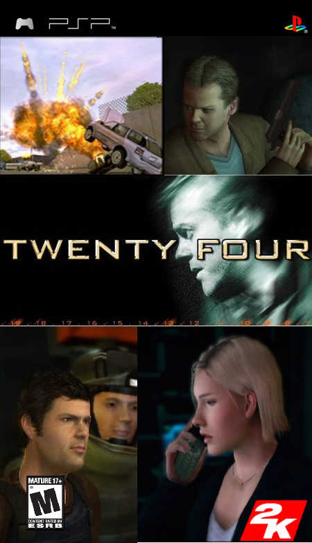
1.5, because the top two screenshots are way out of proportion compared with the bottom two. you didn't bother to get rid of the orange writing below the title 'box'. the m logo is too small and the 2k logo is to close to the the bottom of the box. to round it off, there is the occaisonal white line here and there, and the screenshot you used are dull and un-interisting. try merging the pixtures more using motion blur, a light brush, or gausian.
there are your crits. update and it'll probably bounce up to a 3, but until then a:

 24: The Game Box Cover Comments
I think it's pretty cool. Please leave crits, comments, and ratings(justified ones, that is).
[ Reply ]
Ok, no comments are acceptable for maybe 3-4.5s, but could you explain why this gets a 1.5??? If it's because it's a bunch of different screens in seperate boxes, you are a 24 nub and did not know that that's a common theme in 24 and that it's supposed to be like that. 1.5= A little better that horrible. So why is this horrible?! >:|
[ Reply ]
Now a two? Please leave comments!
[ Reply ]
Also, no spoilers please, I just started watching season 3 on DVD today. I'm hoping to finish all the seasons in time for season 6.:)
[ Reply ]
why is it spelt out?
[ Reply ]
Design choices.......does it really make it deserve a 1.5?
[ Reply ]
Yay, more unjustified votes!!!
[ Reply ]
If you are going to post, don't use these justifications for your ratings:
1)"It's a bunch of screenshots thrown together."
24 is supposed to be like that. That's what the real box and the whole TV show is like.
2)"It should be 24, not Twenty Four."
I tried 24 first. It does not look very good.
3)"It doesn't have 'The Game' attached."
That definetly makes it a 1.5. :P
[ Reply ]
oh god just shut up! quit spamming your own boxes. you look really bad doing that. i just dont like the design of the box, regardless if "the show is like that". and if you can point out your own mistakes like that, i think theres some correcting that needs to be done here :P
[ Reply ]
Ok, I voted it 5 so that it would bounce it up to 2/5 (I don't think the box deserves a 5 but I don't think it deserves a 1.5 either)
[ Reply ]
STOP TALKING WERDNEY!
[ Reply ]
I like it.
[ Reply ]
1.5, because the top two screenshots are way out of proportion compared with the bottom two. you didn't bother to get rid of the orange writing below the title 'box'. the m logo is too small and the 2k logo is to close to the the bottom of the box. to round it off, there is the occaisonal white line here and there, and the screenshot you used are dull and un-interisting. try merging the pixtures more using motion blur, a light brush, or gausian.
there are your crits. update and it'll probably bounce up to a 3, but until then a:
1.5/5
[ Reply ]
All I wanted were explanations. I'll take all your crits Lodo, except the orange writing. I left that on purpose.
[ Reply ]
Do you use gimp? How do I do motion blur?
[ Reply ]
#15, i use ps......i don't how to do it in gimp. sorry
[ Reply ]
Ok. Thanks anyway.
[ Reply ]
V2, I got better pics.
[ Reply ]
I did what everyone said, and got no better ratings...v_v
[ Reply ]
not bad
[ Reply ]
its ok
Edited at 1 decade ago
[ Reply ]
why
the hell
are you talking
like this
especially
when
its on
a year
and a half
old box
[ Reply ]