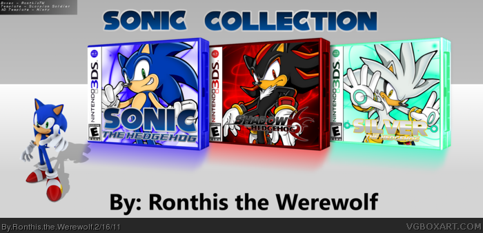
The Sonic and Shadow ones are kinda cool, even though you actually just found cool images from Google images and put renders on top. ;) But I don't like the Silver one .. at all. You can barely see the logo and it like ... just doesn't look good.
Also, I wish the shadows on the presentation were all the same color lol.
It looks like a quick copy / paste design. If you wanted this to be a set collection, some consistency in elements like the logos would have helped. The backgrounds seem kind of random, and essentially irrelevant to the Sonic series. This isn't as much a problem, considering you may have been trying to approach this in a more simplistic way. In a sense, the backgrounds do work with the one-character layout and don't overcrowd things. Although, I still have a problem with the one-character layout itself, as I feel it shows laziness and a preference to quantity over quality.
They look pretty cool. Just out of curiosity, how did this take 6 hours to do? They are simple renders on a random image...Presentation is pretty nice but for how simple it is, dont know how it took you 6 hours lol Pretty cool though, I like the Silver one for some reason. But I think the logo for it blends in too much with the box, make it stand out a little more.
 Sonic Collection (3DS) Box Cover Comments
HeeHee, I tagged it "sonicsonicsonic". I'm so witty. =D
Anyway, I made this one in about... 6 hours or so... yeah, sue me...
Credit is on the box, it that little black square... Yeah, it's pretty small...
Oh, and the credit that isn't really that important is here:
Sonic logo - Google
Shadow logo - Google
Silver logo - Me
Renders - Google/Sonic Art Archive/Sonic Retro
RTW out (b")b
[ Reply ]
The Sonic and Shadow ones are kinda cool, even though you actually just found cool images from Google images and put renders on top. ;) But I don't like the Silver one .. at all. You can barely see the logo and it like ... just doesn't look good.
Also, I wish the shadows on the presentation were all the same color lol.
Not badd
[ Reply ]
It looks like a quick copy / paste design. If you wanted this to be a set collection, some consistency in elements like the logos would have helped. The backgrounds seem kind of random, and essentially irrelevant to the Sonic series. This isn't as much a problem, considering you may have been trying to approach this in a more simplistic way. In a sense, the backgrounds do work with the one-character layout and don't overcrowd things. Although, I still have a problem with the one-character layout itself, as I feel it shows laziness and a preference to quantity over quality.
[ Reply ]
i really like the color schemes ;)
[ Reply ]
They look pretty cool. Just out of curiosity, how did this take 6 hours to do? They are simple renders on a random image...Presentation is pretty nice but for how simple it is, dont know how it took you 6 hours lol Pretty cool though, I like the Silver one for some reason. But I think the logo for it blends in too much with the box, make it stand out a little more.
[ Reply ]
Well, I guess I wanted to make this a simplicity...
Oh, and to Yoshi... xD I have a brush in gimp that makes those effects, so I didn't use Google Images for those. :P
[ Reply ]
Like It!? I Love It!!!
[ Reply ]
+millionfavs.
You should make more sonic. U good at it B]
[ Reply ]