For best results please view in printable version.
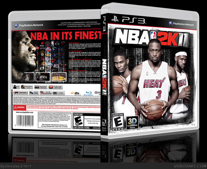
This is a simple box for NBA 2K11. Prob one of the best sports games of all time. Even if someone doesnt like basketball, they should def try this game. Hope you guys like.
I like that you've taken a different direction with an NBA title. The white background + splatters can look nice, but is becoming stale.
Other than the legal text referring to God of War III, all I can recommend is a better tagline font. The rounded edges give off a cartoonish look and is pretty unfitting of the dark, grungy style you've come up with.
 NBA 2K11 Box Cover Comments
For best results please view in printable version.
This is a simple box for NBA 2K11. Prob one of the best sports games of all time. Even if someone doesnt like basketball, they should def try this game. Hope you guys like.
[ Reply ]
back is great, front only good:D
[ Reply ]
Nice job, you should correct the legal information.
[ Reply ]
#2, #3, Thanks guys. Yea I spent a lot of time on the actual designs and overlooked the legal. Ill fix it when I have time. thankss
[ Reply ]
sexy
[ Reply ]
I didn't notice in the WIP that the front's left white border is way thinner than the right one, you should correct that.
Everything else, great job.
[ Reply ]
Thankss! Will def fix the white border.
[ Reply ]
I totally love this!
[ Reply ]
#8, Thanks :D
[ Reply ]
Very nice! You're missing the dev logo on the front though.
[ Reply ]
#10, Thanks :) Just added the Dev Logo in the Printable version of it. Also aligned the outside border more evenly with the left side.
[ Reply ]
Glad to see different artists on this site making some fine work.
[ Reply ]
#12, Thank you :) I appreciate the support
[ Reply ]
I like that you've taken a different direction with an NBA title. The white background + splatters can look nice, but is becoming stale.
Other than the legal text referring to God of War III, all I can recommend is a better tagline font. The rounded edges give off a cartoonish look and is pretty unfitting of the dark, grungy style you've come up with.
[ Reply ]
#14, Yea I too think the normal NBA covers are starting to look boring. Thanks for the tips :)
[ Reply ]
The front doesn't look so good close up.
[ Reply ]
#16, okay...
[ Reply ]
#17: He has a point. Finding a new, higher-res logo would be a good idea.
[ Reply ]
#18, K, will do.
[ Reply ]
This is hot! I like it :]
[ Reply ]
#20, Thanksss :D
[ Reply ]