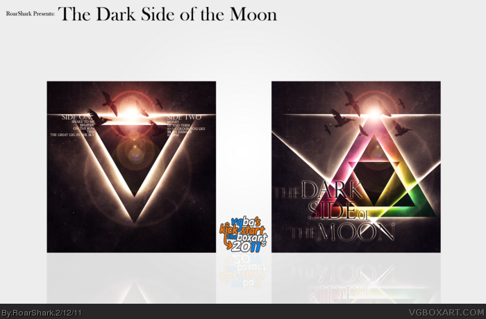
So this is my entry for the KickStart event this year. I originally planned on submitting my Toon Attack box for this, but it was taking far to long to finish. So I sat around trying to think of something to do and this came to mind. So thanks for viewing, and please leave your thoughts and feelings about this in the comments. If you see anything I can improve on please do tell. Later!
The textures look great on it, and I love the colors and lighting. I think the birds look great on both the front and the back, and the placement of the song titles is perfect. Very nice job on this!
Time to make my second comment. Perhaps it is just me, but I would have liked to have seen an alternate front cover without the text (just the triangular rainbows), as it would have made it more like the original, but that could just be me.
 The Dark Side of the Moon (Pink Floyd) Cover Comments
Out-standing, another great master-piece from you, 9.5/10+fav
[ Reply ]
So this is my entry for the KickStart event this year. I originally planned on submitting my Toon Attack box for this, but it was taking far to long to finish. So I sat around trying to think of something to do and this came to mind. So thanks for viewing, and please leave your thoughts and feelings about this in the comments. If you see anything I can improve on please do tell. Later!
[ Reply ]
lol.. Triforce..
But seriously, you took a classic design, somthing everyone knows, and pumped it full of some epic juice, this is really really cool.
[ Reply ]
Koolio
[ Reply ]
About time you posted this ;)
The textures look great on it, and I love the colors and lighting. I think the birds look great on both the front and the back, and the placement of the song titles is perfect. Very nice job on this!
[ Reply ]
My gosh... there are no words...
[ Reply ]
Yes! You posted it! Really is the cream of the crop here, I love the triangles and what you did with the back with the upside down triangle. Genius.
[ Reply ]
WOW. I don't usually comment on boxes, but this is an exception. WOW
[ Reply ]
This really is amazing..
[ Reply ]
Not crazy about the huge blank presentation, but that's really stylish. Reminds me of ElCrazy's work.
[ Reply ]
#10, I'm not a fan of the presentation either, it was rushed. But you have to admit, the presentation is a bit better than most of my other ones.
[ Reply ]
Also Thanks for all the comments guys!
[ Reply ]
#11, I think it would look better with something darker, maybe a leathery background, maybe a dark royal purple? Idk, never listened to the album.
[ Reply ]
#13, Oddly enough, neither have I. The original album cover though is one of the most iconic music covers out there. I'll try something dark.
[ Reply ]
I must be suffering from Brain Damage.
[ Reply ]
Really good!! Not a fan of the outer glow on the black text though. Would look better if it was just white text. But still GREAT JOB MAN
[ Reply ]
Wait, this isn't Hall yet?
[ Reply ]
I don't like Pink Floyd but I absolutely love this box.
[ Reply ]
Pink Floyd is one of my favourite bands, and I feel you captured the essence of this album perfectly.
[ Reply ]
DAWN I'M LOVE WITH THIS!
My printer is out of ink, a printable would be pleased ='(
[ Reply ]
Cool beans. It doesn't have the same sleek simplicity of the original, but it's a nice busy contrast to the official cover. It's very nice.
[ Reply ]
Congrats on the hall!
[ Reply ]
Thanks for the hall guys!
[ Reply ]
Simply awesome. Well deserving.
[ Reply ]
Hot damn! That front is so...breathtaking!
P.S. congrats on Hall! ;)
[ Reply ]
Should have been sooner.
[ Reply ]
Sexa
[ Reply ]
Time to make my second comment. Perhaps it is just me, but I would have liked to have seen an alternate front cover without the text (just the triangular rainbows), as it would have made it more like the original, but that could just be me.
[ Reply ]
Looks good, some of the text on the front could use a bit more outerglow.
[ Reply ]
despite not being a pink floyd fan, i think you've done an awesome album art serious justice.
bravo.
[ Reply ]
Thanks
[ Reply ]
If Pink Floyd saw this they'd probably love it
[ Reply ]