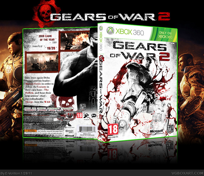
Well, I wanted to change my GeoW 2 box art which were to classic (very dark) so I made this new one, quite different with a lot a white and brightness. Comments and criticisms are appreciated.
Credits : Scorpion Soldier (Template)
Cerium (Epic and Microsoft Logo)
Very nice man. I say the front is pretty original and very creative.
I think to help the design you might want borders that aren't so bold and blocky. They look like it says "69"
You never want your text to go to the end of the paper, give yourself a margin to stop at with text, borders, logos and movable things like that. Usually you can see the margin size based on how far the text is off the end on a original boxart.
I would bring the back text in off the images a little. Whatever margin you pick on the sides I would pick between the images and text. The text on the back also says "and and". Your back is very detailed almost like a novels description. Try to go with more basic description and more eye catching things like quotes "Game you can't set down!!! -Magazine name" Hope that helps.
Firt of all, thank's for you comment and the fact you said my front is "creative".
Also thank you for you advices about my back, I'm quite awkward on backs so this is going to help me.
I'm working on a V2, modifying the back and text/image arrangement. And if you think you have more appropriated border I'm interested, but I'll try with these one firt (by the way credit to LEGOslayer for the Bloody Border).
I like the overall concept, but the box and presentation need a lot of work.
1. You misspelled Marcus Fenix in your text body on the back.
2. As #4 said, bring in the text body so that it fits nice and tight in between images.
3. All text, to include specifications, requirements and warnings should be legible.
4. The primary imagery looks very jagged and oversharpened. Edges need to be smoother.
5. The background image in the presentation is low resolution. It looks as though it was possibly enlarged. I have a clean version of that image and logo. Send me a PM if you are interested.
Thanks for your comment.
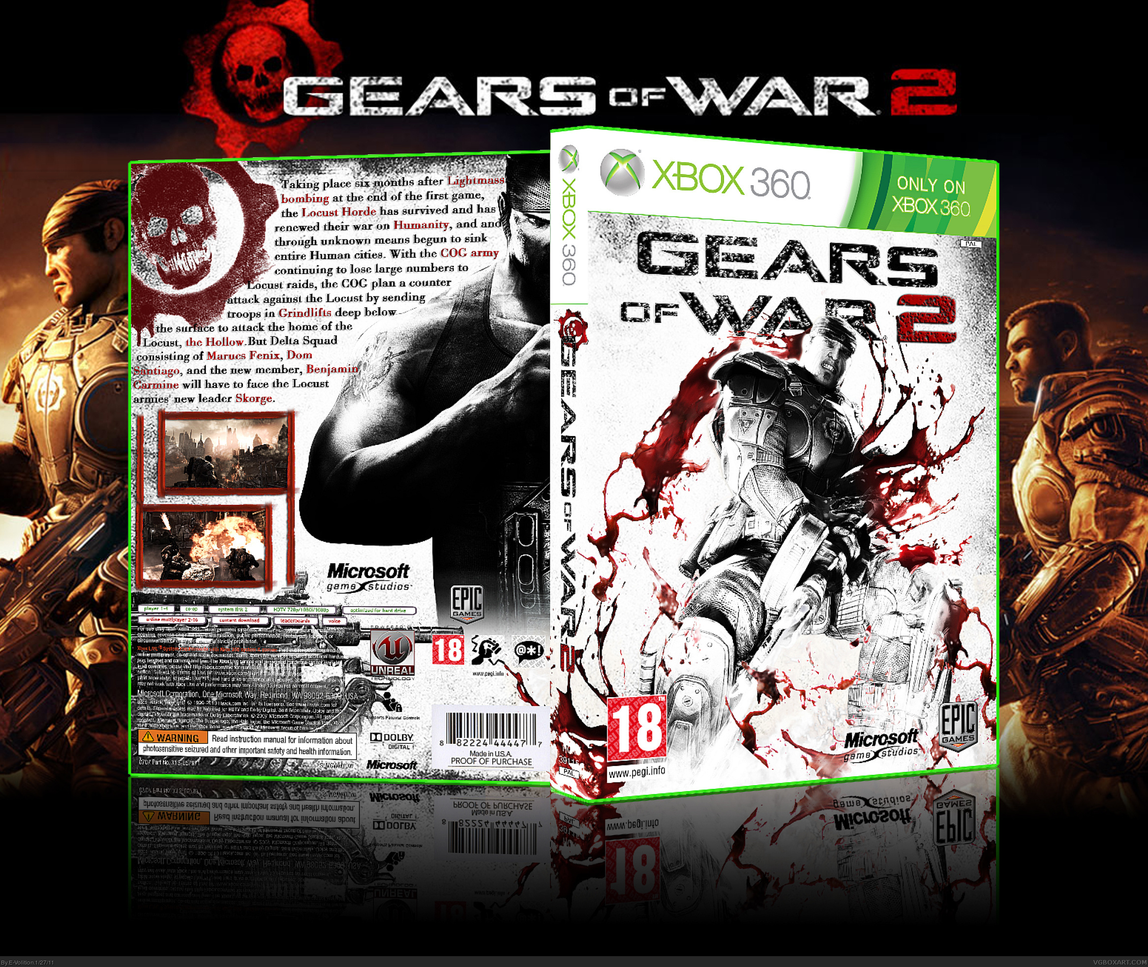
Box uptaded !
I tried to fix problemes you noticed :
- I modified the text/image arrangement
- I smoothed edges of the primary image
Otherwise, about specifications, requirements ... they are legible on printable version, but not on the "normal one" 3D effect I guess ...
And about the background image, I didn't enlarged it, in fact I shrunked it ...
I hope you'll like the new version.
 Gears of War 2 Box Cover Comments
Well, I wanted to change my GeoW 2 box art which were to classic (very dark) so I made this new one, quite different with a lot a white and brightness. Comments and criticisms are appreciated.
Credits : Scorpion Soldier (Template)
Cerium (Epic and Microsoft Logo)
[ Reply ]
great m8. I need printable ver. of this to replace the original cover with it.
[ Reply ]
Printable version added. I'm proud you decided to take my box to use it, thank's.
[ Reply ]
Very nice man. I say the front is pretty original and very creative.
I think to help the design you might want borders that aren't so bold and blocky. They look like it says "69"
You never want your text to go to the end of the paper, give yourself a margin to stop at with text, borders, logos and movable things like that. Usually you can see the margin size based on how far the text is off the end on a original boxart.
I would bring the back text in off the images a little. Whatever margin you pick on the sides I would pick between the images and text. The text on the back also says "and and". Your back is very detailed almost like a novels description. Try to go with more basic description and more eye catching things like quotes "Game you can't set down!!! -Magazine name" Hope that helps.
[ Reply ]
Firt of all, thank's for you comment and the fact you said my front is "creative".
Also thank you for you advices about my back, I'm quite awkward on backs so this is going to help me.
I'm working on a V2, modifying the back and text/image arrangement. And if you think you have more appropriated border I'm interested, but I'll try with these one firt (by the way credit to LEGOslayer for the Bloody Border).
[ Reply ]
I like the overall concept, but the box and presentation need a lot of work.
1. You misspelled Marcus Fenix in your text body on the back.
2. As #4 said, bring in the text body so that it fits nice and tight in between images.
3. All text, to include specifications, requirements and warnings should be legible.
4. The primary imagery looks very jagged and oversharpened. Edges need to be smoother.
5. The background image in the presentation is low resolution. It looks as though it was possibly enlarged. I have a clean version of that image and logo. Send me a PM if you are interested.
[ Reply ]
Thanks for your comment.
Box uptaded !
I tried to fix problemes you noticed :
- I modified the text/image arrangement
- I smoothed edges of the primary image
Otherwise, about specifications, requirements ... they are legible on printable version, but not on the "normal one" 3D effect I guess ...
And about the background image, I didn't enlarged it, in fact I shrunked it ...
I hope you'll like the new version.
[ Reply ]
How has been ignored so much? more attention NOW!!!!!
[ Reply ]
I'm Really Like This Cover Evo,Front Unbeatable . . .
[ Reply ]
Thanks, it's been awhile since I made this cover but it's still one of my best front
[ Reply ]
@E-Volition I Personally Like Your Works And This One Is One Of The Bests I've Ever Seen In This Site , It Must Have More Attention . . .
[ Reply ]