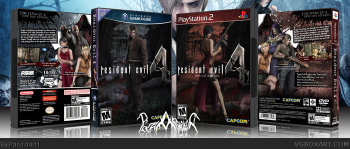
A pair of Resident Evil box I made simultaneously. I really wanted to make a regular/special version of the same box, and this is the end results, figured I might as well do one cover for each console. I also as really in the mood to do a new Resident Evil 4 box, since I don't really like my old one. Printables of both are available, I'll upload them soon.
There's a typo or two. It should be "president's" daughter instead of "presidents" daughter. On the special edition, the line ending with "side story" shouldn't have a period since the feature continues on the next line. Other than that, it looks great and the whole presentation is slick.
I like that you made a layout specific to each console rather than a simple recoloring. Practically everything looks great, but I think the white splatters throw off the rest of the design. They're a bit distracting.
They sheme kinda big. They are good. And the main chars on the boxes do look bad-ass like they owned them. But I remember the box without it. And I think I might like it better. But both versions are awesome
I feel that having a double feature lowers the quality of the covers themselves.
The original cover with Leon, has a feeling of "despair", killing zombies while trying to protect someone else. The rain, the crows, and the dead zombies on the ground insinuate this. The further down the hill you go, the darker the zombies should be. Since their laying around Leon's feet where there is less light, they should be darkened a little.
The whole concept is nicely done, but I don't care too much for the special edition, even though there isn't anything wrong with that cover.
#12, The Ada one is the original one, the Leon one is the second one I made. I see what you're saying with the dead guys, but I actually did edit each one as I went along, they got too dark so I brightened them up a bit else I couldn't see them when printed.
#13 Thanks, when I made my last Re4 box I altered the logo too.
#15, I just took a rain texture like such link and put it at 50% opacity and 50% fill, and added water drops/splash such as link at the characters feet. Change the slash to a layer type that works, in this case it was Color Dodge, and use brushes to isolate the splash effect.
 Resident Evil 4 Box Cover Comments
A pair of Resident Evil box I made simultaneously. I really wanted to make a regular/special version of the same box, and this is the end results, figured I might as well do one cover for each console. I also as really in the mood to do a new Resident Evil 4 box, since I don't really like my old one. Printables of both are available, I'll upload them soon.
Comments are greatly appriciated.
[ Reply ]
Very nice. They both match the feel of the game well, and I love what you did with the templates.
[ Reply ]
great work, please add printable versions
[ Reply ]
There's a typo or two. It should be "president's" daughter instead of "presidents" daughter. On the special edition, the line ending with "side story" shouldn't have a period since the feature continues on the next line. Other than that, it looks great and the whole presentation is slick.
[ Reply ]
I like that you made a layout specific to each console rather than a simple recoloring. Practically everything looks great, but I think the white splatters throw off the rest of the design. They're a bit distracting.
[ Reply ]
I would have liked them both on the same template. It looks weird to have them on two different systems.
[ Reply ]
#4, Thank you, I will correct them on the printables.
#5, I quite like the white splatter, I did take it away at one point but it made the back look simple/empty.
#6, The game was released for 2 different consoles(well, 4) So I wanted to make one for each of them.
[ Reply ]
Perfect stuff , love what you did with both temps.
I duno bout the dead bodies tho.
but other then that. awesome awesome.
[ Reply ]
#8, You don't like the corpses? That was my favorite part.
[ Reply ]
They sheme kinda big. They are good. And the main chars on the boxes do look bad-ass like they owned them. But I remember the box without it. And I think I might like it better. But both versions are awesome
[ Reply ]
The printable versions are up(and corrected) click on "version 2" for the Gamecube version, click on "view printable" for the PS2 version.
Also here are the printed versions just because:
link
[ Reply ]
I feel that having a double feature lowers the quality of the covers themselves.
The original cover with Leon, has a feeling of "despair", killing zombies while trying to protect someone else. The rain, the crows, and the dead zombies on the ground insinuate this. The further down the hill you go, the darker the zombies should be. Since their laying around Leon's feet where there is less light, they should be darkened a little.
The whole concept is nicely done, but I don't care too much for the special edition, even though there isn't anything wrong with that cover.
[ Reply ]
finally someone actually made a "resident evil 4" box instead "4 resident evil" XD but anyways great boxes i can see why your rank 11
[ Reply ]
#12, The Ada one is the original one, the Leon one is the second one I made. I see what you're saying with the dead guys, but I actually did edit each one as I went along, they got too dark so I brightened them up a bit else I couldn't see them when printed.
#13 Thanks, when I made my last Re4 box I altered the logo too.
[ Reply ]
very awesome! i love that rain effect too! howd you do it? ive been trying for ages to get a good one!
[ Reply ]
#15, I just took a rain texture like such link and put it at 50% opacity and 50% fill, and added water drops/splash such as link at the characters feet. Change the slash to a layer type that works, in this case it was Color Dodge, and use brushes to isolate the splash effect.
[ Reply ]
Mind blown. This is AWESOME!!!!!
[ Reply ]
!!!!!
[ Reply ]