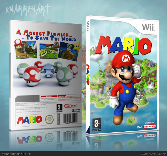
just a vision of a pure mario game. its mario vs. bowser...no luigi, no peach...just one on one ;D
its entitled "MARIO" cause a title like "mario vs. bowser" or something else sounds ridiculous in my opinion...
if it's mario vs bowser 1on1 you should mention that on the package - unless you want people to go "Mario... WHAT?"
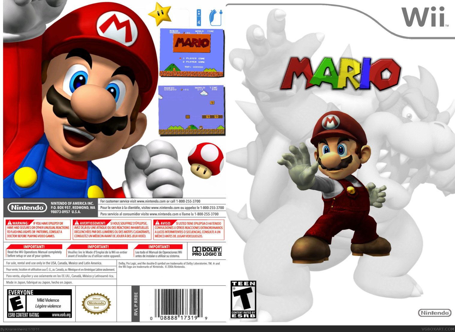
You did not work very well with the template btw, because you place image outside the preset area for this (the back) and the ratings don't fit. The front could be more striking too. Logo bigger would help a bit.
Try to make some quality over quantity next time. You can do way better, so take your time rather than uploading a lot of "patched together" works.
A few quick notes that I think would improve this box.
On the front:
1. Use the same Mario render, but normal colored instead of the white/red one you have.
2. Flip the Bowser render horizontally to add some balance to the right side of the composition. You would probably have to scale him down a bit so the wii box art wouldn't cover him up in the upper right corner.
3. Make the logo a little bigger, and completely remove the transparency effect.
4. Use a red nintendo logo to bring in some more color, and have the age rating have a white background to cover up Bower's leg.
On the back:
1. Don't let your renders overlap the template.
2. Busy it up some with more stars, mushrooms, and fireflower renders behind Mario.
3. Make the 'Mario' Logo on the screen shot look more 8-bit-ish to fit in better.
Having a better presentation would help alot too. Look into getting a 3d wii temp and putting your artwork in it, and placing that on a background that looks good.
Much better indeed, but the back lacks some stuff and - yeah - my mario wold reinterpretation still got more creativity as this, because it's just the basic mario stuff. Even though you attest me a lack of creativity.
Anyways, it's still not very clear what the game is supposed to be. You said it's the plain fight about plumber vs "turtle" (or dragon), so you should make that visible. This way it#s still just a "Mario..? Mario WHAT?".
I also have to agree with #11 on the flying issue. It's okay, but it sure seems a bit off.
This is a good concept. I would like a game like this. The box looks great too. The back is nice but some text to describe what the game is like would make it a little better. 9/10
 M A R I O Box Cover Comments
just a vision of a pure mario game. its mario vs. bowser...no luigi, no peach...just one on one ;D
its entitled "MARIO" cause a title like "mario vs. bowser" or something else sounds ridiculous in my opinion...
[ Reply ]
no back text ? Damn !!! but its good ! 4/5
[ Reply ]
if it's mario vs bowser 1on1 you should mention that on the package - unless you want people to go "Mario... WHAT?"
You did not work very well with the template btw, because you place image outside the preset area for this (the back) and the ratings don't fit. The front could be more striking too. Logo bigger would help a bit.
Try to make some quality over quantity next time. You can do way better, so take your time rather than uploading a lot of "patched together" works.
[ Reply ]
A few quick notes that I think would improve this box.
On the front:
1. Use the same Mario render, but normal colored instead of the white/red one you have.
2. Flip the Bowser render horizontally to add some balance to the right side of the composition. You would probably have to scale him down a bit so the wii box art wouldn't cover him up in the upper right corner.
3. Make the logo a little bigger, and completely remove the transparency effect.
4. Use a red nintendo logo to bring in some more color, and have the age rating have a white background to cover up Bower's leg.
On the back:
1. Don't let your renders overlap the template.
2. Busy it up some with more stars, mushrooms, and fireflower renders behind Mario.
3. Make the 'Mario' Logo on the screen shot look more 8-bit-ish to fit in better.
Having a better presentation would help alot too. Look into getting a 3d wii temp and putting your artwork in it, and placing that on a background that looks good.
[ Reply ]
=========
UPDATE!!!
=========
[ Reply ]
Terrific update! I love it! (Lol at update being at 11:11 1/11/11...)
[ Reply ]
now thats better !! XD 5/5
[ Reply ]
MUCH better, but still no back text ;)
[ Reply ]
MUCH better, but still no back text ;)
edit: and the title, you gotta add something ;) even if it seems dull
[ Reply ]
box after box...you never stop posting a box for a single day do you asshole!!!
go a day without posting a fucking box!!!
it's not even good for a first dude...
it's pissing me off now
[ Reply ]
also why is mario floating on the front???
[ Reply ]
#10, Someone here said "Rise of the Dwarves"?
[ Reply ]
Wow, really nice update. It looks leaps and bounds better than the original. Keep up the good work.
[ Reply ]
This is good.
[ Reply ]
#11, Really? this is actually really good for beginner.
[ Reply ]
Much better indeed, but the back lacks some stuff and - yeah - my mario wold reinterpretation still got more creativity as this, because it's just the basic mario stuff. Even though you attest me a lack of creativity.
Anyways, it's still not very clear what the game is supposed to be. You said it's the plain fight about plumber vs "turtle" (or dragon), so you should make that visible. This way it#s still just a "Mario..? Mario WHAT?".
I also have to agree with #11 on the flying issue. It's okay, but it sure seems a bit off.
[ Reply ]
The back needs a bit more text, but it looks really good. :D
[ Reply ]
This is a good concept. I would like a game like this. The box looks great too. The back is nice but some text to describe what the game is like would make it a little better. 9/10
[ Reply ]