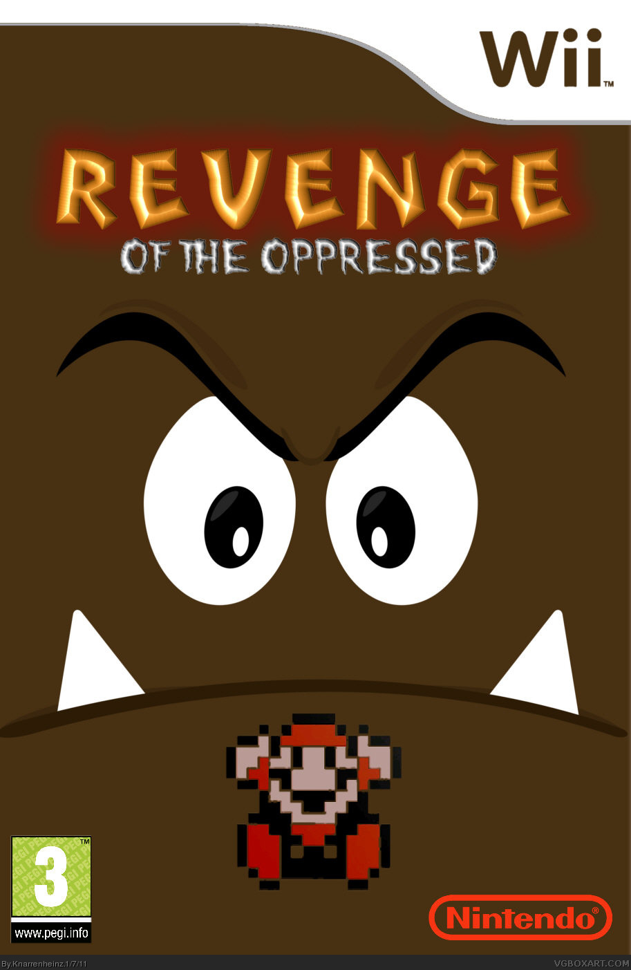
that's more concept as the peach one - kudos on that. now you only have to use the right nintendo-logo (it's no longer red - FOR YEARS) and get the size of both logos (Nintendo, Pegi) into the right dimensions.
the white bar between the pegi-logo and its url shouldn't be there. the wii-logo of the template should not be brown and the logo of the game... welll... CONGRATULATIONS on finding filters. It looks not very good, but get's the job done, however it's a bit too far on the top.
#5, es ist "Brückentag" da muss man nicht zwingend arbeiten (manche schon) und man sollte auf der Seite nicht komlpett inDdeutsch schreiben. Übrigens bist du heute nicht zwingend weniger online! Glashaus, Steine...
_______________
it's "Brückentag" (that's a normal working day between weekends and bank holiday), so nobody is forced to work on it (okay, some people have to ;)) and it's not suitable to write in a foreign language only.
By the way: you are not less online as me today. Glass houses, stones...
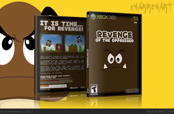
yes I know ... now is the XBOX 360! However, was intended!
At issue here is "xbox vs. wii" ... Revenge should not appear on the same console like Mario :D
... before "certain" people complain again!
Yes ... the whole box looks simple. This is pure intention! What is even simpler than a Goomba? This is the explanation. Logically ... for "certain" people, it is again an excuse! But it's NOT!
there is simple and there is simple... and your front is still far away from being real minimalistic and simple design. you sure have to work on the text makeup, because you have big gaps between the words on your grouped style. you can breakup some words, you can work with the text tracking, etc. there are ways to avoid this. it's also not very good to use caps on grouped style of this size. intention... yeah. but a NO GO for real designers.
you used nintendo on the fron and microsoft on the back... use both on front and back or choose only one of it.
screenshots are "empty". It's not wrong to use just one or two screenshots, but they have to be more significant.
again: you show some skills, but you are just not willing to improve. you say everything is intention and wanted that way, well, it may be true and is okay, but that's not how a real design and boxart is working. that's a mere excuse for not paying attention to some basic rules of designing print-medias, and a boxart sure is a print-media, even if you make it just for viewing online. so get used to people giving you some advise about the real stuff and stop your trolling.
@ locic-stuff: console war is kindergarten a rather stupid argument. it's a fake boy, I know, but even a fake boy should mind some logical thinking. Coypright (of goomba) anyone?
#11, why are you writing me almost always a bunch of stuff? Pity about the letters ...
And NO, you do not rattling down again so a text ... I will say a few things:
I myself realize that it has nothing to do with real design. But that was not my intention from the beginning, ok? For me it is a kind of hobby, ok? And more, it should not do so, ok? You just do not seem to understand ... why would I want to exercise real graphics Desingn when I got a completely different job? (noted only in passing: 12 hour shifts, health and care of people is not necessarily mentally Disneyland!)
NOTE: Please do not comment on the sentence in parentheses, ok?
So let it be Just the way it is. Would I be soooooo wrong on this page, then why favs from people who know as much or more of graphic design as you have? (yoshi star tmrd, setroavium, Leegion etc.)
Think about it!
AND ... if again the glass house phrase is in reference to "as much text", then I bite into the carpet. You're not the alpha and omega of the page, ok? Your boxes are really good (would be sad if they are not with respect to your profession)
But of the best boxes here on the side, they are DAMN far away!
you are hopeless. the page is about boxarts so just get used to people reviewing your stuff as BOXART. Once more: You don't have to troll, to flame, and if you are that touchy about critism you better go to a site like DA, where you can switch off comments.
yeah, my boxes are far away... that's your point of view anyways, not to mention I don't care about having any rank or being somewhere on the top. so you can scoop your accusation up your ass - ONCE MORE. and please stop crying about how hard your job is too. like being a designer is sitting around and doing pictures for 8 hours *lol* if your job is too hard, get another one and don't complain!
again and again: you sure show some skill (sometimes more, sometimes less) but you should listen to some of the comments you are getting, because the site is about posting your work and getting critism. That said: at least try to fix your problems with the text. grouped style is working fine, but in your case it's not. If you cannot handle that one just switch to left-aligned or centered.
price question in return: where does goomba belong to? YEah, Nintendo - and you think nintendo will gibe its copyrights to a business rival?
"please stop crying about how hard your job is too"
- The thing with the sentence in parentheses? I had written in ancient hebrew? only to understand: I enjoy my job! There was only one explanation for why I have no time "professional " graphic design practice.
GAP
and ONCE MORE: I'm actually very happy to critique one - but not of YOU! This should already have noticed in my TDU2 box. Or are the gaps in the text now disappeared?
GAP
"where does goomba belong to? YEah, Nintendo - and you think nintendo will gibe its copyrights to a business rival?"
- for this reason we find the box under "humor"
GAP
YET! You want to be one of the best (or you think that it's you!)... people are like that would never admit it. That is a fact.
you just cannot eat as much as you wanna puke when seeing either avatar, name, comment or box of this guy.
how many glasshouses do you wanna build up? anyways, I was one of the best here - removed my stuff before the blue ranks came up, etc. yeah, believe it or not. problem about the ranks is: I am uploading here to share, not to get any better rank. that� some illness from everyone who joined the site the last months - including you. for the record: YOU don't admit being here for ranks on your own ;)
However, problem about your "you are not he best here" is: You just don't like my stuff. That's not constructive and it doesn't mean I violate the rules of design as you do (the gaps...)
Yes, and you sure are working hard... remember your assumtion at #28 on this one link ?
And another record: The box is listed as unofficial!
 Revenge of the Oppressed Box Cover Comments
==================================
much more primitive. to get even more critics :-)
==================================
[ Reply ]
that's more concept as the peach one - kudos on that. now you only have to use the right nintendo-logo (it's no longer red - FOR YEARS) and get the size of both logos (Nintendo, Pegi) into the right dimensions.
the white bar between the pegi-logo and its url shouldn't be there. the wii-logo of the template should not be brown and the logo of the game... welll... CONGRATULATIONS on finding filters. It looks not very good, but get's the job done, however it's a bit too far on the top.
[ Reply ]
ahm...
fuck you! ;D
[ Reply ]
#3, congrats on being reported
[ Reply ]
Oooohhhh...
jetzt hat's mir der Bubi aber gegeben. Ich bin getroffen...
Aaaahhhh
... wieder so ein "ich bin immer online Freak weil ich kein reales Leben mehr habe" ... du tust mir leid
[ Reply ]
#5, es ist "Brückentag" da muss man nicht zwingend arbeiten (manche schon) und man sollte auf der Seite nicht komlpett inDdeutsch schreiben. Übrigens bist du heute nicht zwingend weniger online! Glashaus, Steine...
_______________
it's "Brückentag" (that's a normal working day between weekends and bank holiday), so nobody is forced to work on it (okay, some people have to ;)) and it's not suitable to write in a foreign language only.
By the way: you are not less online as me today. Glass houses, stones...
[ Reply ]
The design on the front is awesome (I like simplistic) and I'd like to see a back. But, listen on wasa-bi. He knows what he's talking about.
[ Reply ]
=======
UPDATE!
=======
yes I know ... now is the XBOX 360! However, was intended!
At issue here is "xbox vs. wii" ... Revenge should not appear on the same console like Mario :D
[ Reply ]
... before "certain" people complain again!
Yes ... the whole box looks simple. This is pure intention! What is even simpler than a Goomba? This is the explanation. Logically ... for "certain" people, it is again an excuse! But it's NOT!
[ Reply ]
Edited at 1 decade ago
[ Reply ]
there is simple and there is simple... and your front is still far away from being real minimalistic and simple design. you sure have to work on the text makeup, because you have big gaps between the words on your grouped style. you can breakup some words, you can work with the text tracking, etc. there are ways to avoid this. it's also not very good to use caps on grouped style of this size. intention... yeah. but a NO GO for real designers.
you used nintendo on the fron and microsoft on the back... use both on front and back or choose only one of it.
screenshots are "empty". It's not wrong to use just one or two screenshots, but they have to be more significant.
again: you show some skills, but you are just not willing to improve. you say everything is intention and wanted that way, well, it may be true and is okay, but that's not how a real design and boxart is working. that's a mere excuse for not paying attention to some basic rules of designing print-medias, and a boxart sure is a print-media, even if you make it just for viewing online. so get used to people giving you some advise about the real stuff and stop your trolling.
@ locic-stuff: console war is kindergarten a rather stupid argument. it's a fake boy, I know, but even a fake boy should mind some logical thinking. Coypright (of goomba) anyone?
[ Reply ]
*fake box >__< ack. for the record: don't go online when you're still a sleepy head. but it's a good base for trolling :D
[ Reply ]
#11, why are you writing me almost always a bunch of stuff? Pity about the letters ...
And NO, you do not rattling down again so a text ... I will say a few things:
I myself realize that it has nothing to do with real design. But that was not my intention from the beginning, ok? For me it is a kind of hobby, ok? And more, it should not do so, ok? You just do not seem to understand ... why would I want to exercise real graphics Desingn when I got a completely different job? (noted only in passing: 12 hour shifts, health and care of people is not necessarily mentally Disneyland!)
NOTE: Please do not comment on the sentence in parentheses, ok?
So let it be Just the way it is. Would I be soooooo wrong on this page, then why favs from people who know as much or more of graphic design as you have? (yoshi star tmrd, setroavium, Leegion etc.)
Think about it!
AND ... if again the glass house phrase is in reference to "as much text", then I bite into the carpet. You're not the alpha and omega of the page, ok? Your boxes are really good (would be sad if they are not with respect to your profession)
But of the best boxes here on the side, they are DAMN far away!
[ Reply ]
#11, CONTRAINDICATIONS: The Microsoft logo is on EACH 360 box. PRICE QUESTION: Who has made the 360?
Or is the box from a UBISOFT game (for example) then automatically UBI? sometimes really funny, your statements! :-/
[ Reply ]
you are hopeless. the page is about boxarts so just get used to people reviewing your stuff as BOXART. Once more: You don't have to troll, to flame, and if you are that touchy about critism you better go to a site like DA, where you can switch off comments.
yeah, my boxes are far away... that's your point of view anyways, not to mention I don't care about having any rank or being somewhere on the top. so you can scoop your accusation up your ass - ONCE MORE. and please stop crying about how hard your job is too. like being a designer is sitting around and doing pictures for 8 hours *lol* if your job is too hard, get another one and don't complain!
again and again: you sure show some skill (sometimes more, sometimes less) but you should listen to some of the comments you are getting, because the site is about posting your work and getting critism. That said: at least try to fix your problems with the text. grouped style is working fine, but in your case it's not. If you cannot handle that one just switch to left-aligned or centered.
price question in return: where does goomba belong to? YEah, Nintendo - and you think nintendo will gibe its copyrights to a business rival?
[ Reply ]
#15,
"please stop crying about how hard your job is too"
- The thing with the sentence in parentheses? I had written in ancient hebrew? only to understand: I enjoy my job! There was only one explanation for why I have no time "professional " graphic design practice.
GAP
and ONCE MORE: I'm actually very happy to critique one - but not of YOU! This should already have noticed in my TDU2 box. Or are the gaps in the text now disappeared?
GAP
"where does goomba belong to? YEah, Nintendo - and you think nintendo will gibe its copyrights to a business rival?"
- for this reason we find the box under "humor"
GAP
YET! You want to be one of the best (or you think that it's you!)... people are like that would never admit it. That is a fact.
[ Reply ]
Edited at 1 decade ago
[ Reply ]
you just cannot eat as much as you wanna puke when seeing either avatar, name, comment or box of this guy.
how many glasshouses do you wanna build up? anyways, I was one of the best here - removed my stuff before the blue ranks came up, etc. yeah, believe it or not. problem about the ranks is: I am uploading here to share, not to get any better rank. that� some illness from everyone who joined the site the last months - including you. for the record: YOU don't admit being here for ranks on your own ;)
However, problem about your "you are not he best here" is: You just don't like my stuff. That's not constructive and it doesn't mean I violate the rules of design as you do (the gaps...)
Yes, and you sure are working hard... remember your assumtion at #28 on this one link ?
And another record: The box is listed as unofficial!
[ Reply ]