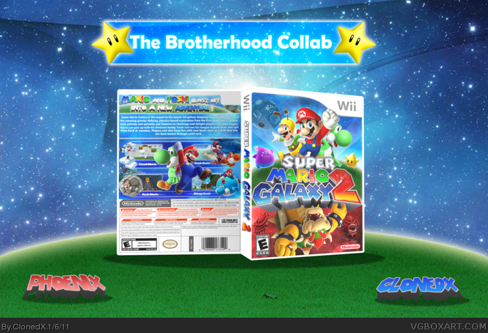
Heeeeeeey guys, It's been a long time since I don't post a box around here hehe. Well I wasn't really going to make one, but I saw Yoshistar's box and I was amazed.
Now the whole box was inspired by him but this is absolutely no match for his box, but still it was fun to make a box again ^^
I did the front and spine, and my brother did the back and presentation.
Now, I know that the box is a little blurry, but we had troubles with uploading the box since it was 12MB. We had to reduce the quality quite some times until it uploaded.
From Phoenix: Well it was quite fun to make a box with my brother/mentor. I learned some new stuff with the text in the box.
Credits:
TwilightMystics for the template
Nerdysimmer for the logo (you promised a subzero demo you bastard D:)
Thanks for Sentry, del, sd, spiderpig and the rest for the help in the forums
This is a pretty good box but the upside down renders are really a turn off. It would have been better just to have Bowser right side up on the bottom if you really wanted to go that route.
I think the upside-down part is what sets this box apart from others. I think it's fitting here since Super Mario Galaxy has some interesting gravity-based gameplay where things can easily go from rightside-up to upside-down.
I agree with the others about the upside-down renders, and I also don't really like the addition of Luigi on the front. It just seems strange. As for the back, the tagline could use some work to make it look more like the official logo text, and the descriptive text would be more effective as bullet points, rather than a large paragraph. Also, the presentation is enormous. Large presentations take away too much from the box, imo, and make them too hard to see.
Looks great. I disagree with people complaining about the upside down renders. It might not make sense as a picture, but if this were a physical cover it'd be really cool to flip the box and see the alternate side. Great idea in my opinion, and your back is nice as well. Keep up the good work!
 Super Mario Galaxy 2 Box Cover Comments
Heeeeeeey guys, It's been a long time since I don't post a box around here hehe. Well I wasn't really going to make one, but I saw Yoshistar's box and I was amazed.
Now the whole box was inspired by him but this is absolutely no match for his box, but still it was fun to make a box again ^^
I did the front and spine, and my brother did the back and presentation.
Now, I know that the box is a little blurry, but we had troubles with uploading the box since it was 12MB. We had to reduce the quality quite some times until it uploaded.
From Phoenix: Well it was quite fun to make a box with my brother/mentor. I learned some new stuff with the text in the box.
Credits:
TwilightMystics for the template
Nerdysimmer for the logo (you promised a subzero demo you bastard D:)
Thanks for Sentry, del, sd, spiderpig and the rest for the help in the forums
[ Reply ]
:) let me be the first to say I like it! :) not exactly a fan of upside down renders, but you managed to make it work!
[ Reply ]
This is a pretty good box but the upside down renders are really a turn off. It would have been better just to have Bowser right side up on the bottom if you really wanted to go that route.
[ Reply ]
I think the upside-down part is what sets this box apart from others. I think it's fitting here since Super Mario Galaxy has some interesting gravity-based gameplay where things can easily go from rightside-up to upside-down.
[ Reply ]
Thanks everyone
#3 You know, I actually thought of that, but I really didnt liked the idea. I wanted to make Bowser as is he was going to pop out of the logo
[ Reply ]
This turned out really good, your styles work hand in hand to make an awesome box
[ Reply ]
Thanks everyone for the comments and faves. This was fun to make, now ClonedX logging out, see you around someday ^^
[ Reply ]
Love this. The layout is great and the front and back go together very well. Nice job from both of you.
[ Reply ]
Exelent work, but I think the bowser section really kills it...
[ Reply ]
#3, I agree.
[ Reply ]
I agree with the others about the upside-down renders, and I also don't really like the addition of Luigi on the front. It just seems strange. As for the back, the tagline could use some work to make it look more like the official logo text, and the descriptive text would be more effective as bullet points, rather than a large paragraph. Also, the presentation is enormous. Large presentations take away too much from the box, imo, and make them too hard to see.
[ Reply ]
Looks great. I disagree with people complaining about the upside down renders. It might not make sense as a picture, but if this were a physical cover it'd be really cool to flip the box and see the alternate side. Great idea in my opinion, and your back is nice as well. Keep up the good work!
[ Reply ]
Thanks everyone. Also for the upside-down Bowser, I'm sorry. I like it that way. If i flip Bowser, it just looks plain bad.
[ Reply ]
Wow man! this is great!
[ Reply ]