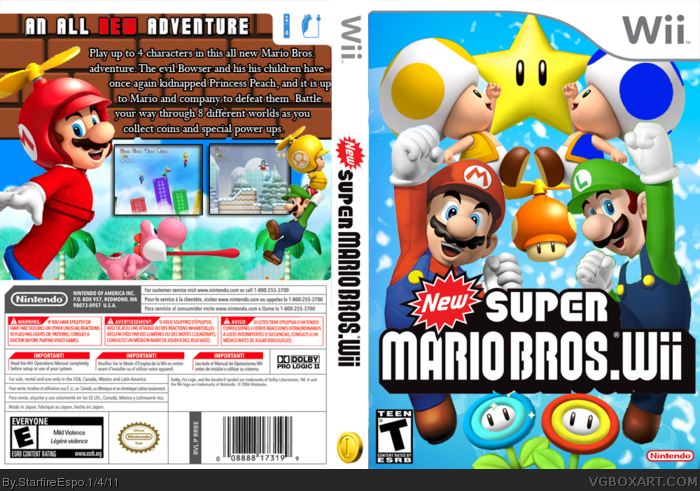
There's a lot of good here, you just need to learn a few techniques for how to polish up your design. Just looking at the box as a whole, it would look so much more professional and polished if you had a different template, one that shows the plastic for the case. Check the Resources section, I know there are a few available. Even something as simple as making it look like an actual case, rather than the cover, can help.
As for the back, look at your tagline. You've given the word "New" a red color, but that makes it blend into the background rather than stand out. Besides that, the brick background is so complex that it makes it difficult to read the text you have above it. You've chosen to focus on the main powerup from the game, which is a good idea, but the art is so large it takes away from your remaining design space, meaning you have less space for screenshots. Have you seen the box for NSMB, for DS? link See how it made the back into an actual level, almost? And look at the text. All Mario games have the same plot, so it's sometimes better to focus on bullet points rather than full text.
As for the front, I've done something similar: link Your front looks like you were trying to create some sort of mirrored art, which is great, but it needs MORE. If you weren't going for a mirrored look, you need some sort of ground under them, so that they're jumping in an actual world, not just in air.
I like the front. There is a lot going on, but it doesn't feel too crowded. Everything is a good size and in good scale to one another. The back could use some work. Those bricks are really stealing a lot of space that could be used for more design. I'm guessing you used them so it would be easier to read the text over top of them, but going back to what Koopa said, every Mario game has the same story, you don't really need to tell it again. I'm also not in love with what you used for screen boarders. Just a thin soild colored stroke would work better in my opinion.
 Super Mario Bros Wii Box Cover Comments
This is one of my first boxes for the Wii, so I hope it looks somewhat good.
[ Reply ]
There's a lot of good here, you just need to learn a few techniques for how to polish up your design. Just looking at the box as a whole, it would look so much more professional and polished if you had a different template, one that shows the plastic for the case. Check the Resources section, I know there are a few available. Even something as simple as making it look like an actual case, rather than the cover, can help.
As for the back, look at your tagline. You've given the word "New" a red color, but that makes it blend into the background rather than stand out. Besides that, the brick background is so complex that it makes it difficult to read the text you have above it. You've chosen to focus on the main powerup from the game, which is a good idea, but the art is so large it takes away from your remaining design space, meaning you have less space for screenshots. Have you seen the box for NSMB, for DS? link See how it made the back into an actual level, almost? And look at the text. All Mario games have the same plot, so it's sometimes better to focus on bullet points rather than full text.
As for the front, I've done something similar: link Your front looks like you were trying to create some sort of mirrored art, which is great, but it needs MORE. If you weren't going for a mirrored look, you need some sort of ground under them, so that they're jumping in an actual world, not just in air.
That's all I got.
[ Reply ]
I like the front. There is a lot going on, but it doesn't feel too crowded. Everything is a good size and in good scale to one another. The back could use some work. Those bricks are really stealing a lot of space that could be used for more design. I'm guessing you used them so it would be easier to read the text over top of them, but going back to what Koopa said, every Mario game has the same story, you don't really need to tell it again. I'm also not in love with what you used for screen boarders. Just a thin soild colored stroke would work better in my opinion.
[ Reply ]
Wow.Just WOW.+Fav!!
[ Reply ]