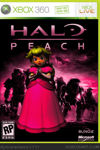
here we go my friends. its peach, thats what she looks like in super mario soccer on gamecube ;D the logos are wrong, i know that... but no matter how...
;D
I think it's fairly clever and funny. I didn't literally laugh out loud when I saw it, but I appreciate the thought behind it.
I definitely agree that the logos should be reversed (top to bottom) to be more standard. I also think there should be a Nintendo logo in there somewhere. Finally, I think the whole project would benefit from being in color.
#14, I got 15+ years experience in making designs FOR REAL - not just as hobby. That said I repeat: The peach pun works way better.
And wanna know why? Because the "peach" blends in with "reach", the original. Mario however doesn't even sound like "halo" and just because it's ending with a simple "o" doesn't make it work that good. You could use "jerko" or "holdrio" as well, so where's the pun about this? That's a lack of concept, no good idea, maybe even a "almost fail".
#16, just because you think it works doesn't mean it got much thought and works for real - and it does NOT. Even the image is wrong - lack of research and just another proof for a rather shallow work. Something for the forums, not the gallery!
#19, Uff...
Man, its just FUN! OK? Understand?
There was never a concept!
A concept never interested me!
And if you like ... it's Peach as a Table Dancer!!!
for god's sake
#20, why do you bother uploading stuff on this site if you can't handle comments about your stuff? the site is about boxarts, so get used to comments regarding this.
#23, I just wanted to bring together two very different things. i am an old school nintendo fan sice i was a kid. but also i like the new generation, for example HALO. craft you a concept of it about the pun AND the box, if you like!
#24, it's your box - and if you just put two images together you have to take comments about the lack of a concept, idea, whatever. that's how the site is working!
#30, Du Depp, du Depp, du Depp, du depperta Depp du, du depperta Depp du, Depp du, schau di doch o!
Du Depp, du Depp, du Depp, du depperta Depp du, du depperta Depp du, Depp du, schau di doch o!
Von hundert Meter ko ma scho erkenna, da kimmt a Depp daher!
Von weitem scho kon a jeder sehng, des is a Depp!
Von hundert Meter ko ma schon erkenna, schau hie, da kimmt a Depp daher!
Von weitem sigt a jeder Depp: oh, des is a Depp!
 MARIO: PEACH Box Cover Comments
Love it.
[ Reply ]
This doesn't make one inch of sense. Also, I believe thats Daisy, not Peach.
[ Reply ]
Yeah, it's Daisy. Still, I like the idea and how it's made. But still the logos should be where they are supposed to.
[ Reply ]
=P
[ Reply ]
#2, Its a Halo Reach pun, because mario and halo both end in O's and peach and reach rhyme. its actually quite a clever pun if you ask me.
[ Reply ]
here we go my friends. its peach, thats what she looks like in super mario soccer on gamecube ;D the logos are wrong, i know that... but no matter how...
;D
[ Reply ]
#5, 100 Points for ya! ;D
[ Reply ]
#6, That is Daisy, this is Peach:
link
[ Reply ]
#8, OK OK!
The mighty bean counter is among us...
;D
[ Reply ]
#5, I'm not an idiot, I understand the pun. Its just not very funny.
[ Reply ]
#5, everyone would laugh and fav, if it was a very clever pun.
[ Reply ]
I think it's fairly clever and funny. I didn't literally laugh out loud when I saw it, but I appreciate the thought behind it.
I definitely agree that the logos should be reversed (top to bottom) to be more standard. I also think there should be a Nintendo logo in there somewhere. Finally, I think the whole project would benefit from being in color.
[ Reply ]
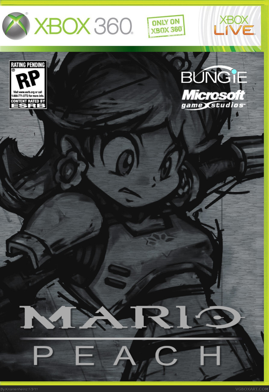
#12, the mario pun doesn't work - the peach one does better. could need more thought!
[ Reply ]
#13, You know, just because you think something isn't funny doesn't mean it doesn't work.
Just though I'd put that out there.
[ Reply ]
#14, I got 15+ years experience in making designs FOR REAL - not just as hobby. That said I repeat: The peach pun works way better.
And wanna know why? Because the "peach" blends in with "reach", the original. Mario however doesn't even sound like "halo" and just because it's ending with a simple "o" doesn't make it work that good. You could use "jerko" or "holdrio" as well, so where's the pun about this? That's a lack of concept, no good idea, maybe even a "almost fail".
[ Reply ]
#15, Again, just because you don't like it doesn't mean it doesn't work. I thought it was rather clever. Not very funny, but clever.
[ Reply ]
#16, just because you think it works doesn't mean it got much thought and works for real - and it does NOT. Even the image is wrong - lack of research and just another proof for a rather shallow work. Something for the forums, not the gallery!
[ Reply ]
everybody satisfied now???
[ Reply ]
it's still more daisy... peach is blonde. I know the lightening, etc. but it doesn't make blonde hair dark O__o
nopew, not satisfied, because there's still a very big lack of concept. you could make more with it, not just put a random "peach"-image into it.
[ Reply ]
#19, Uff...
Man, its just FUN! OK? Understand?
There was never a concept!
A concept never interested me!
And if you like ... it's Peach as a Table Dancer!!!
for god's sake
[ Reply ]
#20, why do you bother uploading stuff on this site if you can't handle comments about your stuff? the site is about boxarts, so get used to comments regarding this.
[ Reply ]
#21, i can handle comments very well!
but you talk about a concept, that never was! thats the point!
[ Reply ]
#22, I talk about the box and pun being stupid because THERE IS NO concept!
[ Reply ]
#23, I just wanted to bring together two very different things. i am an old school nintendo fan sice i was a kid. but also i like the new generation, for example HALO. craft you a concept of it about the pun AND the box, if you like!
[ Reply ]
#24, it's your box - and if you just put two images together you have to take comments about the lack of a concept, idea, whatever. that's how the site is working!
[ Reply ]
#25, Oh, thank you, great Omniscient!
Life is serious enough...
Relax a little bit ok? It is JUST a website...nothing that is vital ok?
[ Reply ]
get mature or go at least back to play some more with your guns, heinz. we don't need another user of your kind.
[ Reply ]
#27, who yells is wrong ;D
lock up! throw away the key!
[ Reply ]
I did not yell, but you did at #20, #22 and even #24 and #26. Or did you cry? Both can be the same at some point.
Well, glad you locked yourself away now.
[ Reply ]
#29,
Schamts eich ihr ruhig für mi,
I scham mi a so für eich
Lasst's mi mcha wos I macha mog.
Jo i red eich doch a net drei.
[ Reply ]
#30, Du Depp, du Depp, du Depp, du depperta Depp du, du depperta Depp du, Depp du, schau di doch o!
Du Depp, du Depp, du Depp, du depperta Depp du, du depperta Depp du, Depp du, schau di doch o!
Von hundert Meter ko ma scho erkenna, da kimmt a Depp daher!
Von weitem scho kon a jeder sehng, des is a Depp!
Von hundert Meter ko ma schon erkenna, schau hie, da kimmt a Depp daher!
Von weitem sigt a jeder Depp: oh, des is a Depp!
[ Reply ]
HAHAHAHAHAHAHAHA
[ Reply ]
HAHAHAHAHAHAHAHA
[ Reply ]
C-c-c-combo breaker!! I like the thought and the pun. +fav
[ Reply ]
I like the pun, not the box.
[ Reply ]