[ Box updated on December 28th, 2010 ] [ original ]
 Prince of Persia: The Forgotten Sands Box Cover Comments
Comment on Tinie Tempah's Prince of Persia: The Forgotten Sands Box Art / Cover.
well the reflection is wrong and
if i was you i would get rid of it
anyway only positive thing about this boxart is the backround
[ Reply ]
hey #1 just shut up
i know you don't like me and i dnt like you you
but just be quiet
and no one is bothered much about the reflection...it's the box which matters
[ Reply ]
i could just say that to your new boxes
[ Reply ]
#2, if you are going to get pissy about feedback on your box, perhaps you should not post them. The reflection is off, way off, and detracts from the overall effort in a bad way.
Also, please refrain from telling another member to shut up. That is very rude and not needed. My suggestion is for you to use the works in progress (WIP) section in our forums prior to posting your "finished" works to the gallery.
[ Reply ]
Hmmmm..... I never realised that my work was that poor. Well I just looked at my boxarts and to me they look alright (my opinion)
No dodgey reflections etc
Tinie tempah if your work was that good you wouldn't be rank 1
Don't worry dude your work will gradually get better if you take more longer and keep your tempah down
[ Reply ]
#2 well looks like I'm right
[ Reply ]
I think it's funny that you are terribly mean to other members when your boxes look like this.
[ Reply ]
Well, for a first the reflection is horrid, fix it. And you didn't care about how much someone worked for those resources, in other words, give credit.
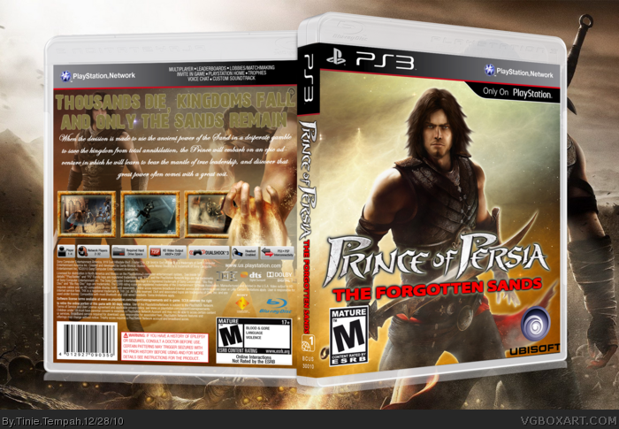
Front:
Just a render, a logo and some dev logos slapped on part of a wallpaper.
PoP: FS is not rated M.
Back:
Text over renders is a big no-no.
Bland, boring text.
2 renders and text slapped on a wallpaper.
Sorry dude, but try to do a little better on your boxes. AND GIVE CREDIT!
[ Reply ]
Out of curiosity is that my renders?
[ Reply ]
whats annoying is that none of you are actually giving me ways to improve but just go on about the out of scale reflection
come on people
and i'm getting angry how you lot always gang up on me
[ Reply ]
and #5 i've only made 4 boxes so how can i be above rank 1 already
i'm not MARKER alright!!!
and your first five boxes weren't good itself as many were stolen
[ Reply ]
the reflections way off
this was my first time seeing this box and i can already
pick out something wrong
[ Reply ]
well i thunk your too new to know that the stolen boxes were not me and im not going to explain in detail what happened cause it will take me forever.
yes i know you have only made 4 boxes but only the first one was good and the rest look like they were made in a minute
so if i was you i would take more longer on your work or post it on the WIP forum.
and dude you really need to calm down ,people arent ganging up on you they are trying to help you:)
[ Reply ]
Well ... Here you have it ladies and gentlemen, another horrendous boxart by mr tempah here. I want to start off by pointing out that if you think it is not appropriate to have a reflection, why include one in your compostion in the first place. It 's placement is wide off the mark. Another thing which has already been pointed out is that this is just a couple of psd's splashed on a page, something that I am sick of seeing being done by you and other members on this site. It's horrific and should by no means be called " art". And I think I speak for everyone when I say accept that you got it wrong, take the critiscm on the chin and improve or get the he'll out of sight. Ametuers. Huh!
[ Reply ]
#14 Yeah i agree.These dreadful boxes that he has made are all 'slapped on psds'which alot of peopele have already mentioned.saying this i think you should get off this site or improve your work because 'psds'will get you no where.
[ Reply ]
#14 who would actually give a dam listening to you
your a waste of my time and you've made such a crap box which no one likes
i'm surprised your not banned yet and your telling me to get the hell out of here...your having a laugh my friend but infact your not my friend and i'll never have a troll as a friend...i don't even think anyone likes you in this site and why your even here gets everyone talking
and another thing, when we you try insulting peoples work we don't laugh with you...we laugh at you because your so pathetic and immature
and why do you freaks make a conversation on my bloody boxes
do another box for a change
[ Reply ]
also #15 calling my boxes bad will make you a parasite to those who fave them
you say my shadow box was the only good one there well i'll say the sonic colors was the only good box you made
it's not even hard to do
and it's not psds...their pngs stupid
[ Reply ]
your not a father of photoshop either or by now you'll be achieving hofs and masterworks...
[ Reply ]
i don't think you've ever gave me a praise rather than severall insults and criticism
just get out of my face
you seem to cause trouble with a lot of people here
all true....remember vaderkid and that agent471 fellow
[ Reply ]
and you actually agree with #14 that thing
the guy that insulted practically all of your boxes
[ Reply ]
woah guys whats going on here
[ Reply ]
wo wo wo.......slow the post down dude and calm down.
you expect me to say good to a box which no-one likes.
you really need to stop talking and do more work on your boxes.
on the positive side,atleast no one gets more comments on there boxes than you:)
[ Reply ]
i've never seen anyone with a worser attitude than you
yeah i'm not really happy why trolls and weirdo's like you starting a biased conversation in all my boxes
i've had it before in my mario strikers box whcih had 78 comments with like 40 being all bickering and uselesss nonsense
[ Reply ]
your starting to annoy me from the minute i made a box!!!
and thats not a good thing by the way
btw why do you fave forbidden masters box and he faves yours too
it's like you started approx at the same time and faving each others ever since
and people awkwardly thinking that i make severall alts
[ Reply ]
I'll tell you how to improve.
Front - It's very bland. Nothing stands out. Try adding a few more characters in the background or something.
Back - It's a very basic layout (tagline, text, screenshots) The font for the tagline doesn't fit the box. Try experimenting with different fonts and see which fits.
And yeah, fix that reflection. See that? I gave you constructive criticism without insulting you. It's not difficult people.
[ Reply ]
Are you saying i have alts?
i think you've lost it.you cant just make accusations about a person who faves my work.maybe because i give him a fav so he decides to give me one.
you really need to sort your self out dude.
just go away for a while and make a work better!
[ Reply ]
why should i go away...maybe you should asshole!!!
and i'm not saying you have alts i'm just saying a possibility that you could've had one
by the looks of it, looks like some poeple do though because they act such alike with anotgher user...who knows
and #25 thank you for the constructive feedback...will update the box soon
[ Reply ]
#27, you really should calm down Your discontent with criticism from others notwithstanding, there is no reason for use of such language or flaring of your temper here. AS I suggested earlier, in order to cut down on the more negative responses to your submitted works, you should try using the WIP forums. Those forums are intended to be of use for the artists to gather feedback on his work, which you are asking for.
Aside from that, others and myself have noted serious issues that stand out like sore thumbs, but your attitude shown here will give none of us any reason to continue offering feedback. Perhaps you should reconsider your position on feedback.
My last suggestion here is this...try actually reading what I have to say here. The admins thought it good enough info to sticky it.
link
[ Reply ]
#27, just to let you know, personal attacks are uncalled for here and will get you banned.
[ Reply ]
Updated: removed reflection.
[ Reply ]