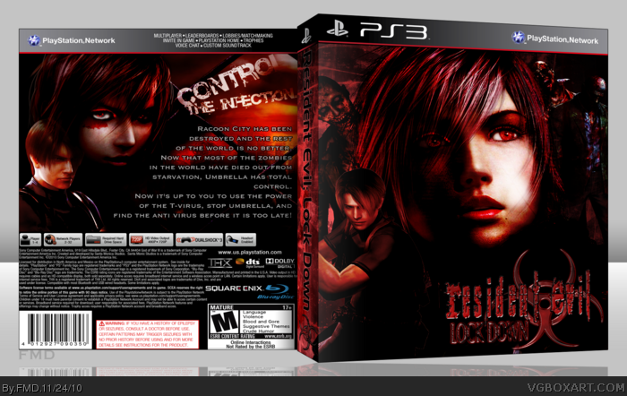
This has taken me 3 days or so. Making that girl on the front and back was the funnest part about making this. Guess who it is! So, thanks for viewing it and don't forget to C&C! :-)
Love it! I would keep "Control" on the same line as "Starvation, Umbrella has total". Looks funny seeing one word be on a line all by it self. Good job!
- The logo on the front doesn't match up well with everything else you have going. Despite the dark, gritty colors and textures of the design around it, the logo has a shiny, almost glossy look to it. That and how it's crammed into the corner makes it distracting, it could be moved up a few notches.
- A few images, specifically Leon and Lightning, are stretched horizontally.
- The ESRB and Square Enix logos are missing, though I'm not sure if this was intentional. It leaves quite a bit of empty space.
- On the back, the synopsis/typography could be flashier. The white w/ black stroke is very standard and plain for the style of game you're designing for, and each line is spaced out far from each other. It takes up more space than it needs to.
- If you were to fix up the synopsis and reduce the space it's taking, you could place in some screenshots. If you went as far as to edit the hell out of Lightning's face, I don't see why you can't go the extra step and add some edited RE4 or even FF13 screens.
- Leon should be in front of Lightining, at least that's what I assume is supposed to be. Instead his head suddenly fade out at the top, and it doesn't look right at all.
Despite these flaws, I like the general concept and grittiness you've gone with. And the zombie Lightning weired me out a little, so... mission accomplished there, I guess.
- Try to find a reflection tutorial on the forums, I learned by someone who did a tutorial of it on the forums.
- Add more stuff on the back, like screenshots
- Follow the sd1833's tips and hints, it should help too.
 Resident Evil: Lock Down Box Cover Comments
This has taken me 3 days or so. Making that girl on the front and back was the funnest part about making this. Guess who it is! So, thanks for viewing it and don't forget to C&C! :-)
[ Reply ]
Really good! I like the dark red and black color scheme a lot. Fav+
[ Reply ]
Is that Lightning from FFXIII?
[ Reply ]
#3, Yep!
[ Reply ]
Love it! I would keep "Control" on the same line as "Starvation, Umbrella has total". Looks funny seeing one word be on a line all by it self. Good job!
[ Reply ]
Interesting concept, but it needs some work.
- The logo on the front doesn't match up well with everything else you have going. Despite the dark, gritty colors and textures of the design around it, the logo has a shiny, almost glossy look to it. That and how it's crammed into the corner makes it distracting, it could be moved up a few notches.
- A few images, specifically Leon and Lightning, are stretched horizontally.
- The ESRB and Square Enix logos are missing, though I'm not sure if this was intentional. It leaves quite a bit of empty space.
- On the back, the synopsis/typography could be flashier. The white w/ black stroke is very standard and plain for the style of game you're designing for, and each line is spaced out far from each other. It takes up more space than it needs to.
- If you were to fix up the synopsis and reduce the space it's taking, you could place in some screenshots. If you went as far as to edit the hell out of Lightning's face, I don't see why you can't go the extra step and add some edited RE4 or even FF13 screens.
- Leon should be in front of Lightining, at least that's what I assume is supposed to be. Instead his head suddenly fade out at the top, and it doesn't look right at all.
Despite these flaws, I like the general concept and grittiness you've gone with. And the zombie Lightning weired me out a little, so... mission accomplished there, I guess.
[ Reply ]
Some tips for your box:
- Try to find a reflection tutorial on the forums, I learned by someone who did a tutorial of it on the forums.
- Add more stuff on the back, like screenshots
- Follow the sd1833's tips and hints, it should help too.
Overall, it's great.
[ Reply ]