I agree with #2 and #4 but i guess its actually quite good for a first, but there are a few improvements nedded as mention above.
This gets my fave though!
Yeah, it is good for a first. You need to try to mimic official boxes kind of. Try to get inspiration from them. Or head over to Masterworks and see boxes that could be official!
so i listened to your kind feedbacks and from that i made this.
yeah mattstar i took your advice in not making a text go over the characters and i know it looks bad like that and sorry.
but still i hope you like the updated version above and plz still fav.
Sorry but this new version is not very good. I like the old version much better.
All the pictures are stretched, this is mostly what makes the newer version not so good.
You've changed the temp, which you shouldn't have done, it looked much better before.
Because you've changed the temp it doesn't mean you shouldn't write anything in the middle.
Change it back, it'll look a whole lot better, or else i'm removing my fav.
Just do what we said in #2 and #4.
The only thing i like about the update is the back font. That's all.
Try keeping that but change the rest.
Also is part of Donkey Kong and the basketball supposed to be in the bottom screenshot? I hope not.
P.S on the front make mario and luigi on the front and daisy and the princess and wario and waluigi in the background.
 Mario Sports Mix Box Cover Comments
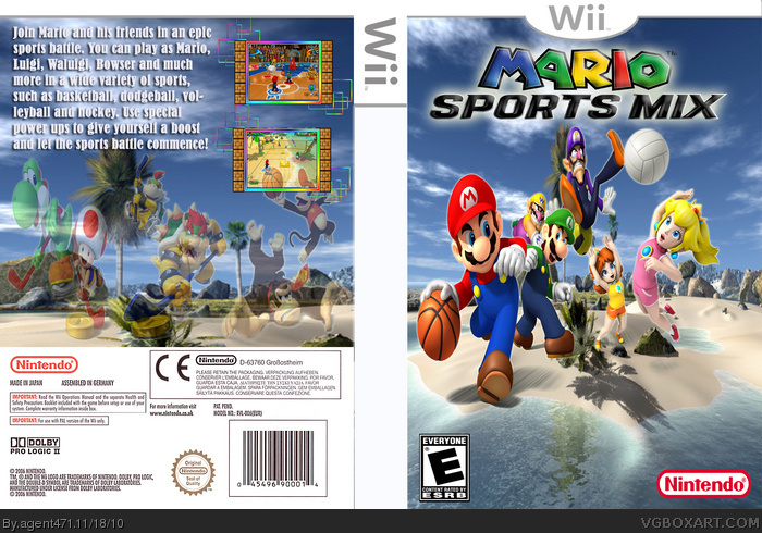
This is my fist box. Spent long on this. Tell me what you think.
Tleeart for borders, spiderpig24 for logo and renders and del337er for template.
Comments, faves and criticism appreciated.
[ Reply ]
The front is pretty good, but the back looks bad. You shouldn't ever put text over a picture, plus the choice of font and color isn't good either.
[ Reply ]
thank you for that and i'll try and change the back and then update this box. Hopefully it'll be better...
[ Reply ]
Anyone else notice how Luigi is 12x bigger than Daisy?
[ Reply ]
#4, Thanks, I'll try putting mario and luigi in the front and peach and the princess in the background like wario and waluigi.
[ Reply ]
I agree with #2 and #4 but i guess its actually quite good for a first, but there are a few improvements nedded as mention above.
This gets my fave though!
[ Reply ]
Try doing what you said in #5, it will make it look a lot better and change the back.
[ Reply ]
Yeah, it is good for a first. You need to try to mimic official boxes kind of. Try to get inspiration from them. Or head over to Masterworks and see boxes that could be official!
[ Reply ]
#6-#8 Thanks
[ Reply ]
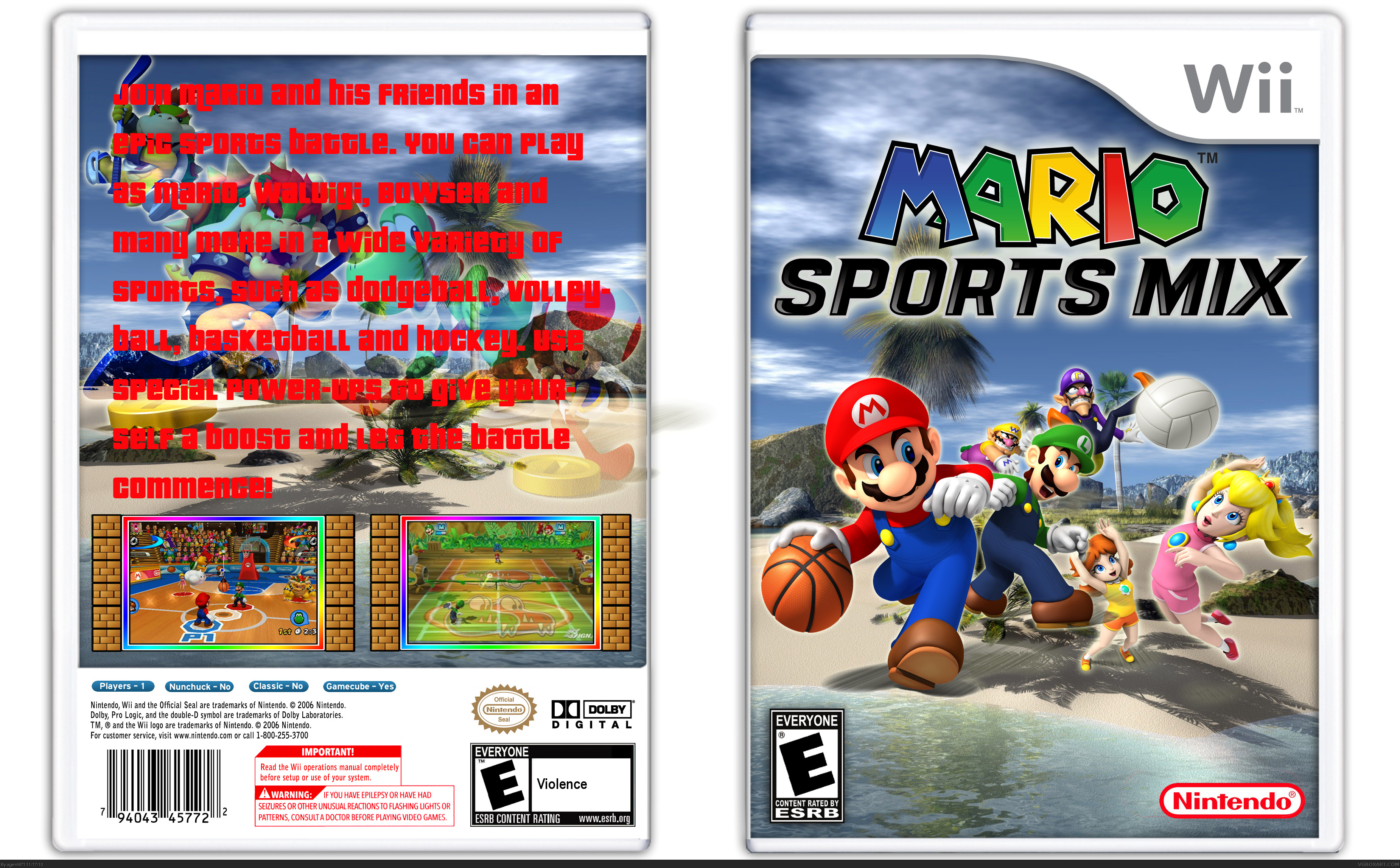
so i listened to your kind feedbacks and from that i made this.
yeah mattstar i took your advice in not making a text go over the characters and i know it looks bad like that and sorry.
but still i hope you like the updated version above and plz still fav.
[ Reply ]
Sorry but this new version is not very good. I like the old version much better.
All the pictures are stretched, this is mostly what makes the newer version not so good.
You've changed the temp, which you shouldn't have done, it looked much better before.
Because you've changed the temp it doesn't mean you shouldn't write anything in the middle.
Change it back, it'll look a whole lot better, or else i'm removing my fav.
[ Reply ]
Just do what we said in #2 and #4.
The only thing i like about the update is the back font. That's all.
Try keeping that but change the rest.
Also is part of Donkey Kong and the basketball supposed to be in the bottom screenshot? I hope not.
P.S on the front make mario and luigi on the front and daisy and the princess and wario and waluigi in the background.
[ Reply ]
#10, don't ask for faves :)
[ Reply ]
#12, Try doing it anytime soon...
[ Reply ]
The screenshots are small too. Removing fav.
[ Reply ]
Quintuple post...
Anyways please hold the shift key when resizing. It does magic.
[ Reply ]