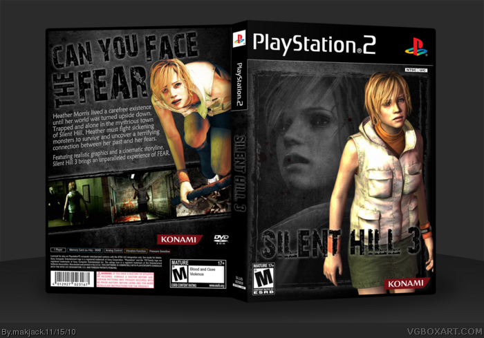
I've been trying to think of what I could say about this cover, but it's been hard. My biggest problem is with the two images of Heather. They stand out just a little too much for my own personal taste, like they should blend in to the rest of the box more. Aside from that little gripe, I think the front is damn wonderful. The font, the border, the darker image of Heather, all great! The back, again, I just have that one small problem. It's still awesome, though!
#6, yeah I tried different things but most of them made the box too boring or too uniform and it didn't look too good. But yeah, i totally understand what you are saying.
 Silent Hill 3 Box Cover Comments
Nothing really much to say here. Did this for the October Fest round 1, but forgot to post.
Credit to Indexenos for the temp.
Comment and fav if you like. THanks for viewing.
[ Reply ]
As you can probably see, the emotion here is FEAR.
[ Reply ]
Good but I reckoned you could have emphasised the logo and tagline in another way than outer glow though.
[ Reply ]
Thanks guys.
[ Reply ]
Just one comment?
[ Reply ]
I've been trying to think of what I could say about this cover, but it's been hard. My biggest problem is with the two images of Heather. They stand out just a little too much for my own personal taste, like they should blend in to the rest of the box more. Aside from that little gripe, I think the front is damn wonderful. The font, the border, the darker image of Heather, all great! The back, again, I just have that one small problem. It's still awesome, though!
[ Reply ]
#6, yeah I tried different things but most of them made the box too boring or too uniform and it didn't look too good. But yeah, i totally understand what you are saying.
[ Reply ]
Front is good but the back is great! I really like what you did with the screenshots
[ Reply ]