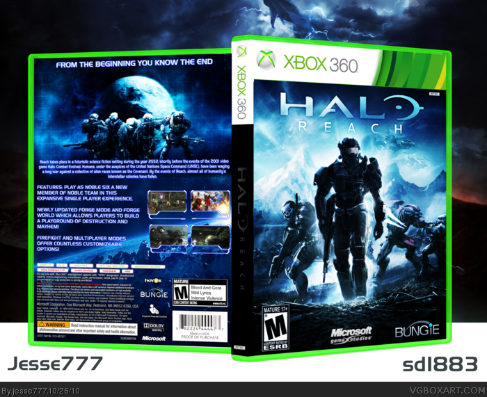
This is me and sd1833's collaboration, it took 4-5 days to sort everything out. sd1833 did the front and spine, I inverted the spine to make the logo easier to see. I made the 3D back of the cover and the presentation. Credit to Scorpion soldier for the inlay template and Indexenos for the casing which I edited to a light green color. A printable is on the way and it is at the appropriate casing dimensions so if anyone want's to print this out feel free and tell me how it looks in the your vgboxart printables thread. Also credit to sd1883 for the screen borders hey gave me for the back, which I think were originally elcrazy's. Enjoy Favorite and Comment! It took a huge ammount of effort from both of us!
#10, It seems he had some last minute editing done to the colors and contrasts before uploading. I could tell, as my half looked a bit different in terms of color and brightness before.
I like the overall design of the box but i fear it is a little monochromatic. It also seems very over saturated, it hurts the eyes to look at in some parts, namely the template on the front.
The bright colours look really nice, but I am EXTREMELY dissapointed that the spine is just plain, and doesn't fit with the front OR back.
Love it otherwise.
#19, I tried continuing the front design onto the spine, but I couldn't get the Reach logo against the busy background to work, and it looked awful. My original version had a white spine that matched up better with the template and brighter colors, it looked "classier" if you will. (link
 Halo Reach Box Cover Comments
Nice job, the back works pretty good with the front, but it could use some more black, as the back is kinda dark.
[ Reply ]
This is me and sd1833's collaboration, it took 4-5 days to sort everything out. sd1833 did the front and spine, I inverted the spine to make the logo easier to see. I made the 3D back of the cover and the presentation. Credit to Scorpion soldier for the inlay template and Indexenos for the casing which I edited to a light green color. A printable is on the way and it is at the appropriate casing dimensions so if anyone want's to print this out feel free and tell me how it looks in the your vgboxart printables thread. Also credit to sd1883 for the screen borders hey gave me for the back, which I think were originally elcrazy's. Enjoy Favorite and Comment! It took a huge ammount of effort from both of us!
[ Reply ]
B-E-A-utiful, but the spine's title is extremely hard to see, especially on my monitor :)
[ Reply ]
Blue colors look really great :)
[ Reply ]
Printable Added it was over 9MB so I had to resize it enjoy!
[ Reply ]
Nice. I like the blue. But i would like the see SD try something more dark instead of always bright colors.
[ Reply ]
#6, Brightly lit colors is my thing. I've tried darker tones before, but they always end up looking awful. I just can't get it right.
Enjoyed the collab, jesse. Your back ended up quote nice.
[ Reply ]
Quite nice I mean. Damn edit function.
[ Reply ]
I like it, my only complain with it is that the spine doesn't fit with the entire box and the 3d looks a bit weird...anyway +fav!
[ Reply ]
It's nice, but I think the contrast/color is a bit too strong. Also, the top section of the back seems a tad lonely.
[ Reply ]
#10, It seems he had some last minute editing done to the colors and contrasts before uploading. I could tell, as my half looked a bit different in terms of color and brightness before.
[ Reply ]
#11 I increased the curves of the brightness I thought it would match but apparently not.
[ Reply ]
#12: Eh, it probably matches up better like this than if you were to leave my side as it was before.
[ Reply ]
I like the overall design of the box but i fear it is a little monochromatic. It also seems very over saturated, it hurts the eyes to look at in some parts, namely the template on the front.
[ Reply ]
#6, I agree I think you should try something darker. Still looks amazing either way.
[ Reply ]
:O
Ahh, look at the ity bity screenshots.
I dont like halo, but this makes it feel exponentially more epic.
I am so impressed right now :D I pat myself on the back for adding you as a favorite author, its paying dividends.
[ Reply ]
That's crazy good! :D
[ Reply ]
on the back in the rated M box, why does it say "mild lyrics"???
[ Reply ]
The bright colours look really nice, but I am EXTREMELY dissapointed that the spine is just plain, and doesn't fit with the front OR back.
Love it otherwise.
[ Reply ]
#19, I tried continuing the front design onto the spine, but I couldn't get the Reach logo against the busy background to work, and it looked awful. My original version had a white spine that matched up better with the template and brighter colors, it looked "classier" if you will. (link
[ Reply ]
sd1883 did good but Jesse777 you need to work on the back i bit more.
[ Reply ]
Uhh I'm here for the free Viagra...?
[ Reply ]
#22 I will give it to you via ebay, the shipping is never free though.
[ Reply ]
There is Only ONE thing I see wrong with this... You Mispelled "Customizable" on the back. You spelled "Customizab:e" D:
[ Reply ]