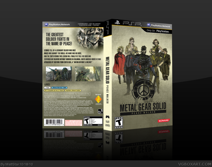
I think the blending/fading on Paz - on the back - could have been better, and the back as a whole is pretty standard design. The front's good though, good arrangement and the colors stand out.
I never figured out how people could be so sure someone's using their render. At any rate, this box is really bland. Nothing is blended together too well to make some contiguous and the front is pretty empty. The blending on the back is even worse because the picture in the upper right just fades. The back is too empty.
 Metal Gear Solid: Peace Walker Box Cover Comments
My first PSP box. Let me know what you think, thanks to the guys in the WIP forums again!
[ Reply ]
3d perspective looks a little off, but I like the design a lot. +fav
[ Reply ]
Clean and simple but still nice. Could you some screenshot borders though.
[ Reply ]
Ha! You use my logo at the front, you found it on the IGN Boards ;)
[ Reply ]
I think the blending/fading on Paz - on the back - could have been better, and the back as a whole is pretty standard design. The front's good though, good arrangement and the colors stand out.
[ Reply ]
#4, No, I Google image searched and rendered them myself. Sorry.
[ Reply ]
I never figured out how people could be so sure someone's using their render. At any rate, this box is really bland. Nothing is blended together too well to make some contiguous and the front is pretty empty. The blending on the back is even worse because the picture in the upper right just fades. The back is too empty.
[ Reply ]