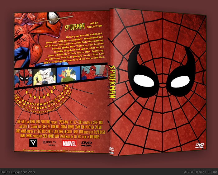
-The spider web on the back stops before it runs off the page, it would look better if it extended all the way.
-There is a huge blank spot to the right of the special features. It would look nice with some Spider-Man villains to balance things out.
-The Spider-Man art on the upper left is way too modern. If you took a shot out of the actual cartoon and retraced it so it's in higher quality, that would work much better.
This has great potential, but these issues are deal breakers for me.
 Spider-Man: The 67' Collection Box Cover Comments
This box makes me <3
Everything on the front is custom, and the back is custom apart from the Spidey render (Legoslayer's) and the screens. Please leave C&C.
Enjoy!
[ Reply ]
fhsh
[ Reply ]
I love everything except the screen borders.
[ Reply ]
You should make the screenshots stuck in spider webs.
[ Reply ]
Yeah, this is awesome.
[ Reply ]
Three things bother me about this one.
-The spider web on the back stops before it runs off the page, it would look better if it extended all the way.
-There is a huge blank spot to the right of the special features. It would look nice with some Spider-Man villains to balance things out.
-The Spider-Man art on the upper left is way too modern. If you took a shot out of the actual cartoon and retraced it so it's in higher quality, that would work much better.
This has great potential, but these issues are deal breakers for me.
[ Reply ]
I agree with 6 & 4. It's a good start, but with some changes here and there, it could be great.
[ Reply ]
Nice, but I agree with #6.
[ Reply ]
this takes me waaay back..brilliant loving the nostalgia
[ Reply ]
There's not much to add other than what tleeart has already stated.
[ Reply ]
I can't believe I missed this. +fave
[ Reply ]
i agree with 6 the spiderman on the back should be older thats ultimate spiderman
[ Reply ]
Congrats on the hall.
[ Reply ]
Finally, hall material gets hall!
[ Reply ]
About friggin' time. Well earned I say.
[ Reply ]
Wow, didn't expect this. Thanks, everyone!
[ Reply ]
Cheers.
[ Reply ]