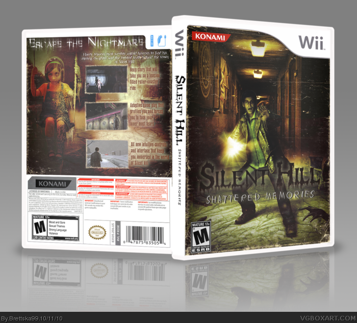
Its been a few months since i've made a cover due to mind block, but the clutter went away for a few hours and i made this. I wanted to avoid the generic blue theme this game has, i took a different approach. Hope you like it, enjoy!
Looks good man. It looks like an old, worn photograph, which is a nice touch and I'm liking the different direction you took with the colors. I think you could have blended the two background images on the front a little better, but other than that a really good effort.
I both love this box and don't at the same time. There are only 2 things I don't like, the first being while the Halo symbol on the wall looks nice, I don't like it being there. The second problem is the back, while really nice looking, seems a bit crammed with the screen shots taking up so much room. Overall though this is still very nice to look at.
 Silent Hill: Shattered Memories Box Cover Comments
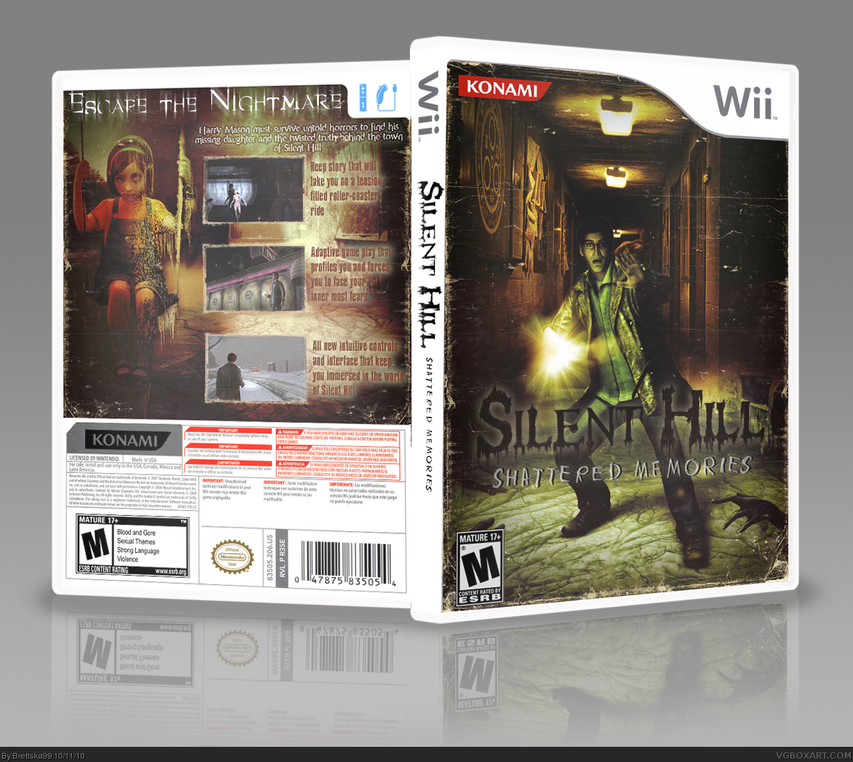
Its been a few months since i've made a cover due to mind block, but the clutter went away for a few hours and i made this. I wanted to avoid the generic blue theme this game has, i took a different approach. Hope you like it, enjoy!
[ Reply ]
I really, like it, but I don't like how the Wii template clashes so much, it's not your fault at all really.
[ Reply ]
There is a bluish metal Wii template that may fit better
[ Reply ]
#2, I almost used a PS2 template, but i liked having more of that upper corner space. But thanks!
#3, that blue template wouldn't flow with color scheme i having going on, nor do i want to recolor the template.
[ Reply ]
Just adjust the brightness or contrast till it fits...
[ Reply ]
Looks good man. It looks like an old, worn photograph, which is a nice touch and I'm liking the different direction you took with the colors. I think you could have blended the two background images on the front a little better, but other than that a really good effort.
[ Reply ]
ooh now that cover(especially the back) is rather spooky....I'm going to get nightmares...
[ Reply ]
This looks really good. It has a good horror feel to it, and the color scheme sets itself apart from the usual blue color scheme for the game.
[ Reply ]
I both love this box and don't at the same time. There are only 2 things I don't like, the first being while the Halo symbol on the wall looks nice, I don't like it being there. The second problem is the back, while really nice looking, seems a bit crammed with the screen shots taking up so much room. Overall though this is still very nice to look at.
[ Reply ]