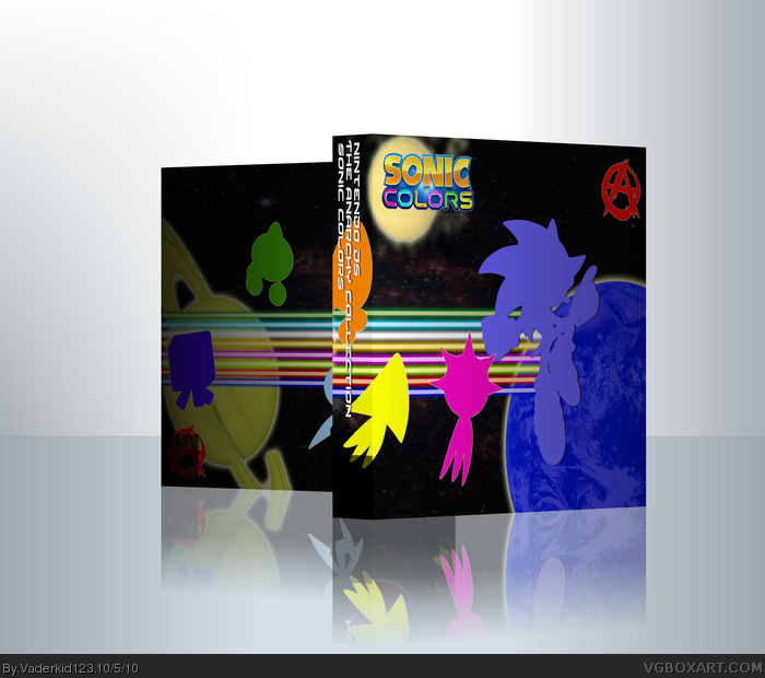
Second entry in the Anarchy Collection.
Based on an article I read in nintendo power. I have not been following the game and have no intention on buying it so there may be some things off.
i like it but you need to add the pegi age rating, nintendo ds logo, game description and pics and the sega logo, to me it looks like a instruction booklet
Er... Sorry, but this is terrible, the execution, the silhouettes, the box lacks, in all the things that's suppose to sell it to me in real life, even artsy fartsy boxes such as these try to catch the eye of the buyer, it also comes to me the name of this "collection" I know you are trying to have your own letter in the alphabet but could not you think of something less pretentious than "Anarchy Collection" it sounds as appealing as "Holocaust: Caramel Sweets" and do you know what anarchy means? I see your point at the Ultimate Alliance since it is based on Civil War(aka Shit hits the fan in the marvel universe) but what does sonic have to do with it?
As for the box on it's own 2/5, judging by previous works from you not that good.
This is honestly not so good. Aside from the fact that the back is both too dark and half covered by the front/spine, it's very badly blended. The background and logo are low res and just plain bad and the random shapes (is any one of those colored blobs supposed to be anything?) are completely unnecessary. The Anarchy "A" is absolutely retarded.
#12, THAT *** of yours SEEMS UNFINISHED! As usual! No unfinished concept, unfinished package,... You are free to make experimants with effects and such, but don't submit the poor result HERE! There's a forum for it and YOU should use it!
I know what they are, but where is the concept? It seems like you think a designers job is just to fool around with photoshop and such tools. And that's what you see when looking at your packages. There sure is some good stuff, but it's minimal...your packages seem unfinished most of the time, just like this one.
 Sonic Colors Box Cover Comments
Second entry in the Anarchy Collection.
Based on an article I read in nintendo power. I have not been following the game and have no intention on buying it so there may be some things off.
[ Reply ]
Nice, keep it up
[ Reply ]
I don't like this.
[ Reply ]
#3, Elaboration is the key word
[ Reply ]
I do like this, but I think there's too much unnecessary space around the box.
[ Reply ]
#5, I think so too.
Still toying around with imandix.
[ Reply ]
i like it but you need to add the pegi age rating, nintendo ds logo, game description and pics and the sega logo, to me it looks like a instruction booklet
[ Reply ]
Er... Sorry, but this is terrible, the execution, the silhouettes, the box lacks, in all the things that's suppose to sell it to me in real life, even artsy fartsy boxes such as these try to catch the eye of the buyer, it also comes to me the name of this "collection" I know you are trying to have your own letter in the alphabet but could not you think of something less pretentious than "Anarchy Collection" it sounds as appealing as "Holocaust: Caramel Sweets" and do you know what anarchy means? I see your point at the Ultimate Alliance since it is based on Civil War(aka Shit hits the fan in the marvel universe) but what does sonic have to do with it?
As for the box on it's own 2/5, judging by previous works from you not that good.
[ Reply ]
Well now that I look at it... I don't like it, but I don't hate it it just needs some more stuff, it's too...blank.
[ Reply ]
#8, Fair enough.
And as far as the "anarchy collection" goes, well I only picked it cause it my favorite word :P
[ Reply ]
seems like you stopped not just while coming up with a concept, but also during working.
[ Reply ]
#11, Listen, I know your primary language isn't english, but could you at least try to make that a proper sentence.
[ Reply ]
Niceit...there is just something missing, I'm not sure what it is
[ Reply ]
This is honestly not so good. Aside from the fact that the back is both too dark and half covered by the front/spine, it's very badly blended. The background and logo are low res and just plain bad and the random shapes (is any one of those colored blobs supposed to be anything?) are completely unnecessary. The Anarchy "A" is absolutely retarded.
[ Reply ]
#14 Sheesh, it has a few problems, look at the up side aswell!
[ Reply ]
I really don't like it. If I say it's phenomenal, how does he improve?
[ Reply ]
#12, THAT *** of yours SEEMS UNFINISHED! As usual! No unfinished concept, unfinished package,... You are free to make experimants with effects and such, but don't submit the poor result HERE! There's a forum for it and YOU should use it!
[ Reply ]
sorry... It must be "no finished concept"
[ Reply ]
#14, The colored blobs are wisps, if thats what your talking about.
[ Reply ]
I know what they are, but where is the concept? It seems like you think a designers job is just to fool around with photoshop and such tools. And that's what you see when looking at your packages. There sure is some good stuff, but it's minimal...your packages seem unfinished most of the time, just like this one.
[ Reply ]
#20, That wasn't directed to you, at all.
[ Reply ]
#21, new food for the troll? anyways, put some more work into your packages!
[ Reply ]
I love this box!
[ Reply ]
#10, "Anarchy" is your favorite word..... what the shit.
[ Reply ]
#24, Why, whats wrong with having a favorite word?
[ Reply ]