![]() »
»
[ Box updated on August 30th, 2010 ] [ original ]
 The Legend Of Zelda: Twilight Princess Box Cover Comments
Comment on jevangod's The Legend Of Zelda: Twilight Princess Box Art / Cover.
No.
[ Reply ]
I disagree.
[ Reply ]
Stop being so damn good at making boxes.
[ Reply ]
This sucks.
[ Reply ]
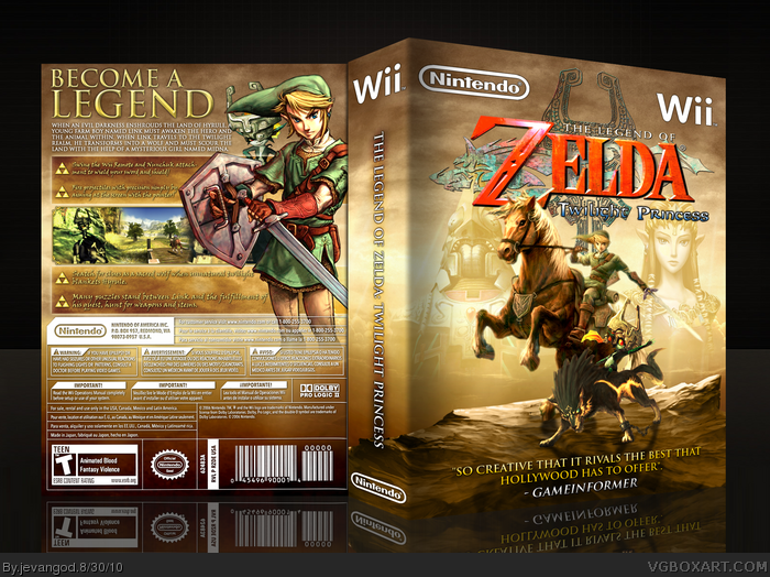
Just finished this up. I was working on another Prince of Persia box and I find some great art that I thought could be great to use in a Twilight Princess box and it all came together quite well.
[ Reply ]
O.o
[ Reply ]
Not bad.
[ Reply ]
Pretty sexy.
[ Reply ]
NOM.
[ Reply ]
I love that front!
+FaV!
[ Reply ]
Thanks everyone.
[ Reply ]
It's pretty good but the front looks a little empty and the spine is WAY too big. I mean it's so big it's actually detracting from the box.
[ Reply ]
#12, His spines are always that size, I thought people would be use to this by now.
[ Reply ]
#12, Thanks. Yea the front is a bit empty. There was actually nothing great I could make to fill up the area. I mean I tried, I really did but nothing good came out of it. The spine is always that big its just usually every time I do a new Wii box and I put it in a 3D dimension I get it from a different angle.
[ Reply ]
Really good, but is completely beaten by your MW Zelda box.
[ Reply ]
#15, Yea. I know I could never top that. I just really had to do this. It just needed to be done.
[ Reply ]
I don't think the front is empty, it doesn't need to be cluttered to look great, it's great the way it is.
[ Reply ]
Amazing. I think the front and back come together perfectly.
[ Reply ]
#13, I'm pretty sure I've mentioned the spine size a few other times.
#14, I suppose you can only do so much to fill it. It's not a bad box though. And I'm not trying to break balls by mentioning the spine I just feel it looks weird.
[ Reply ]
#19, No, I mean that that's just how he does his Wii spines since I could remember, so suggesting he change it doesn't work.
[ Reply ]
vmbgfjdfhkvudfgbbk (sorry, this was the result of my jaw hitting the keyboard
[ Reply ]
Thanks everyone.
#19, I understand what your saying.
#20, Thanks for defending me.
[ Reply ]
Ooooooh. Aaaaahhh.
Not the clawwwww :P
[ Reply ]
I don't know what the heck is up with 1,2 & 4 with their utterly pointless comments (seeing how they haven't faved) but I like this. Sure, not nearly as good as your last but that is hard to top.
[ Reply ]
#24, I didn't fav for my own reason, the comment was utterly pointless though, no disagreement in that case.
[ Reply ]
#1, What an incredibly constructive and helpful comment. I'm SURE it'll aid Jevan in improving his skills for future designs. Seriously man, slow the hell down on all the helpfulness.
Good box, I feel the brightness/contrast could be increases a little on Link and Midna on the front. The back is virtually flawless, and very nicely laid out.
[ Reply ]
Awesome. +Fav
[ Reply ]
#26, lol. Thanks. Ill increase the brightness on them in a bit. I promise.
[ Reply ]
The back layout is pretty unoriginal. I know it's hard to make a Twilight Princess box on the count of all the art being used so much, but I don't think it should even be attempted at this point.
I'm not really a fan of the template, or the 3D.
It's well-made; it's just not especially interesting in my opinion.
[ Reply ]
#29, Ok. Thanks for the comment. But why are people just talking about the template now. Ive been using it for almost over a year.
[ Reply ]
#29, I agree with Box a lot, but your boxes are filled with just pure quality Jevan. That's what makes me fav.
[ Reply ]
The thing is you always have a gap between Wii boxes so by the next time a Wii box comes around I'm probably not even going to remember that I commented on the temp in this one. Plus I didn't realize you use a different temp for every system so I see a PS3 box and think you changed your temp when in reality, it's a different temp. I'm going to make a note somewhere so I DO NOT comment on the temp again.
[ Reply ]
yeah the template is still somewhat off... anyways it is very good looking but just another basic design. the makeup of the text on the back is still showing flaws, like it's to close to the image of link/midna on some points (it's even overlapping in some areas) and the handwriting style is unsuitable for such small text. You are switching the fontsize on the handwriting part between the first and second box too, which is a nogo. the whole text seems - overall - kinda inconsistent.
[ Reply ]
I am crazy about that back.
[ Reply ]
#32, lol. Good.
#33, Thanks. The text thing I really thought about it. When I add a printable ill make all the changes you said. Promise.
#34, Thanks.
[ Reply ]
Awesome!!!
I didn't read all of the comments, so I'm not quite sure if this has been mentioned yet, but Midna and the wolf look a little bit out of place.
I'm not sure how much I like the faded pics of Zelda and Zant either.
Awesome though!
[ Reply ]
#36, Thanks. Yea they look out of place but their color tone and everything is right. I made sure of it ;)
[ Reply ]
PRINTABLE ADDED!!!
[ Reply ]
It's awesome!
Although the bullet text on the back is cursive, which makes it look a bit 'empty'. Not that I could do any better, though, this is incredible.
Excellent box!
[ Reply ]
Awesome case man nice job.
[ Reply ]
congrats on the hall dude!
[ Reply ]
Thanks.
[ Reply ]
This is what I call Masterworks.
[ Reply ]
Jevan, that rock is from some Fallout 3 artwork isn't it?
[ Reply ]
#44, Nope.
[ Reply ]