Personally I don't like it.
Something abotu it is just, Iunno.
Also for Assassin's Creed the colors tend to be a very ligth brown such as papyrus paper or white/light blue. If you decide to expand upon this box later I would recommend making the brown a lighter tone.
#5, But if he were to change the colour to what your suggesting it wouldn't be unique and look pretty much like the other ones.
Not bad, but that template is mucked up.
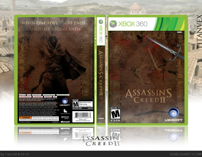
 Assassin's Creed II Box Cover Comments
For the Summer Comp. Credit to Jevangod for template, ADFD for ESRB.
[ Reply ]
I think the picture of Ezio on the back would be better on the front and the Assassins logo and knife on the back. Still really good, gonna fav.
[ Reply ]
#2, yeah and add some screen shots in the back plus more text.
[ Reply ]
#3, It is a simple/minimalitic design so that would defeat the purpose.
[ Reply ]
Personally I don't like it.
Something abotu it is just, Iunno.
Also for Assassin's Creed the colors tend to be a very ligth brown such as papyrus paper or white/light blue. If you decide to expand upon this box later I would recommend making the brown a lighter tone.
[ Reply ]
#5, But if he were to change the colour to what your suggesting it wouldn't be unique and look pretty much like the other ones.
Not bad, but that template is mucked up.
[ Reply ]
#6, Its still way to dark, he needs to lighten the shade of brown.
[ Reply ]
#6, What is wrong with the template? The outer green plastic part?
[ Reply ]
I myself like it. The brown makes it different from all other blue assassin boxes.
[ Reply ]
Oops, double post.
Edited at 1 decade ago
[ Reply ]
#8, Yeah.
[ Reply ]
very pretty....
very empty......
this would be a hellalot better if you expanded on it, gave it more information, you dont need screenshots or anything. however...very nice
[ Reply ]
I would reccomend keeping this, removing the Xbox temp and using it as a slip cover, then making another box with more detail as the actual case.
[ Reply ]