But I dunno about the textures. I think it might be better without them. It would match the Kirby theme more. I think it should be solid, vivid, and sharp thing.
Hmm ... Kinda like this Spongebob shirt ( link ) except with Kirby instead.
Lol, I was actually thinking of a making a similar Pokemon yellow box with Pikachu.
 Kirby's Adventure Box Cover Comments
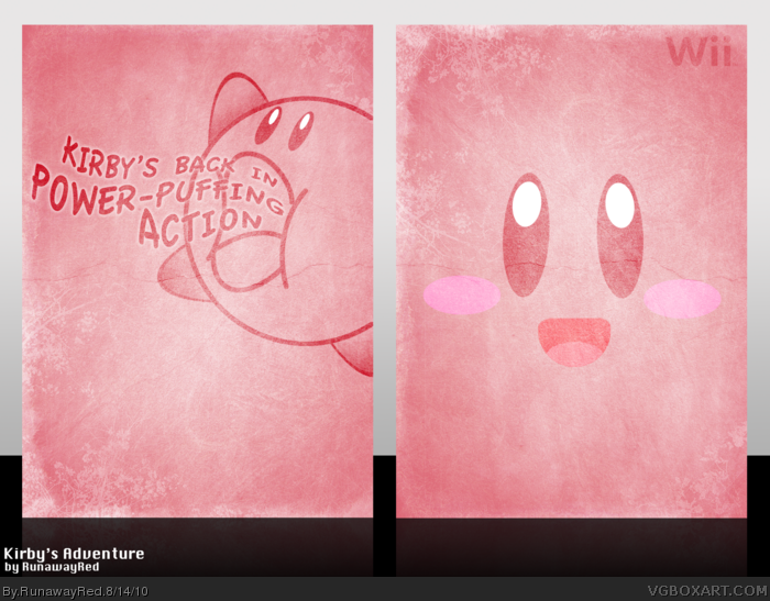
This is my entry for Round 1 of the Summer Competition.
Everything on this box is custom made. :)
[ Reply ]
<3
[ Reply ]
I loove it.
But I dunno about the textures. I think it might be better without them. It would match the Kirby theme more. I think it should be solid, vivid, and sharp thing.
Hmm ... Kinda like this Spongebob shirt ( link ) except with Kirby instead.
Lol, I was actually thinking of a making a similar Pokemon yellow box with Pikachu.
[ Reply ]
It looks very good, I do agree about the textures though.
[ Reply ]
It's a good idea, but looks more like a slipcover to me. +fav cause it's pretty :D
[ Reply ]
Grunge + Kirby = What?
The design is spot on, but the textures seem unnecessary. I love your color work though, the quality is consistent throughout your designs.
[ Reply ]
*PHEWW*
One of the WiP's that I started making for my submission for this very comp had the exact same concept as this one. Glad I didn't go with it.
[ Reply ]
I looove it :)
[ Reply ]
Love it :O
[ Reply ]
There seems to be a minimalist flare at the moment, but damn, they're good boxes.
[ Reply ]
#10, It's cause I think minimalism is the theme for the first round of the summer contest.
[ Reply ]
#11, Ah right, I see. Well good luck to you all.
[ Reply ]
I could see the front of the box being a poster for like a movie lol.
"This summer, pink just got a new name."
Anyway, great box! +fav
[ Reply ]
Congrats on Hall man.
[ Reply ]
simple and effective... however, the back is not as good as the front. dunno, it got a "rushed" feeling to me.
[ Reply ]