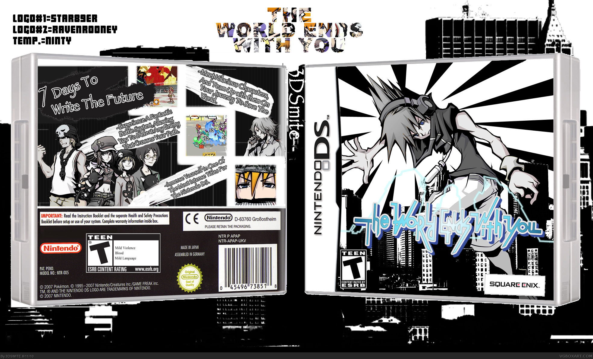
Not bad, there are issues though. The ESRB and Square Enix logos aren't matched up with the 3D angle of the case and look really strange. I'd also try fixing the screenshots, the huge borders don't look right.
Nothing else wrong with it, the reflection's already been mentioned but if you plan on fixing it then great.
I just have to say he background is counterproductive. It is blending way too much into the box. The rest is very well done. I am missing the informations about singlecard-play (etc.) though.
Edit: The Nintendo-logo should be the new one. It is no longer red, you know? ;) And it the rating on the back the real 3D-thing? It sure looks a bit off.
Ok, I was messing around in photoshop and found the skew tool, so i decide to try and make one of my boxes 3d so i made this one i think it looks pretty good.

 The World Ends With You Box Cover Comments
This is my sixth box. I chose this game because I really like the style of the art and it is a fun game. Enjoy. Comments? Suggestions?
[ Reply ]
I love the front, the back is just meh to me though.
[ Reply ]
Thanks! I'll try to work on the back.
[ Reply ]
OK I made the back a little better and I really like how it came out. Comments? Suggestions?
[ Reply ]
The reflection is messed up but other then that this is really good.
[ Reply ]
What about the reflection?
[ Reply ]
It looks like its tilting the wrong way. I love the box! +Fav +Author Fav
[ Reply ]
Thanks for the comments. I'll try to fix that.
[ Reply ]
AWESOME
[ Reply ]
Thanks, means a lot coming from you.
[ Reply ]
Not bad, there are issues though. The ESRB and Square Enix logos aren't matched up with the 3D angle of the case and look really strange. I'd also try fixing the screenshots, the huge borders don't look right.
Nothing else wrong with it, the reflection's already been mentioned but if you plan on fixing it then great.
[ Reply ]
OK, I fixed the logos the borders and completely took out the reflection because even when i got it right it looked weird. Comments? Suggestions?
[ Reply ]
This box seems to be way underrated.
[ Reply ]
I just have to say he background is counterproductive. It is blending way too much into the box. The rest is very well done. I am missing the informations about singlecard-play (etc.) though.
Edit: The Nintendo-logo should be the new one. It is no longer red, you know? ;) And it the rating on the back the real 3D-thing? It sure looks a bit off.
Edited at 1 decade ago
[ Reply ]
The back is strikingly good. Impressive. Although the "Teen Rating" isn't in correct 3D or angle, in my opinion.
Nevertheless: Great box!
[ Reply ]
Thanks for the comments I think I'll get a new template because this one makes everything look weird.
[ Reply ]
OK I finished modifying it I got a new non-3d template, I got rid of the background, and I put on the multi-card logo. Comments? Suggestions?
[ Reply ]
I'd make the logo on the background (the one on the top) a bit smaller or the background bigger, 'cause it's kinda squeezed up there.
[ Reply ]
Yeah I kind of like it like that.
[ Reply ]
This is sweet! +Fav
[ Reply ]
Thanks! Love the front of your Eternal Sonata box.
[ Reply ]
Why is this box so underrated?
[ Reply ]
Ya, I am bummed out about that because I thought this box looked really good and that it would do better than it has.
[ Reply ]
Ok, I was messing around in photoshop and found the skew tool, so i decide to try and make one of my boxes 3d so i made this one i think it looks pretty good.
Comments? Suggestions?
[ Reply ]
The only problem I see is that it has no top. It looks like a piece of paper. Of course that might be intentional. I do not know.
[ Reply ]
yea i wasn't to good at making the top so i thought i would keep it like this.
[ Reply ]