![]() »
»
[ Box updated on August 5th, 2010 ] [ original ]
 The Legend of Zelda: The Wind Waker Box Cover Comments
Comment on Hawt Es's The Legend of Zelda: The Wind Waker Box Art / Cover.
![]() »
»
[ Box updated on August 5th, 2010 ] [ original ]
Comment on Hawt Es's The Legend of Zelda: The Wind Waker Box Art / Cover.
Thanks to everybody who left c&c in my WIP thread. Sorry it took so long.
If you like this go check out my Jet Set Radio box.
Box link
(I think it is close to masterworks)
All feedback welcome, thanks.
Edited at 1 decade ago
[ Reply ]
This is off the charts awesome man. Incredible job, especially with the editing.
[ Reply ]
Overall a great job Hawt Es, glad to see it finally finished.
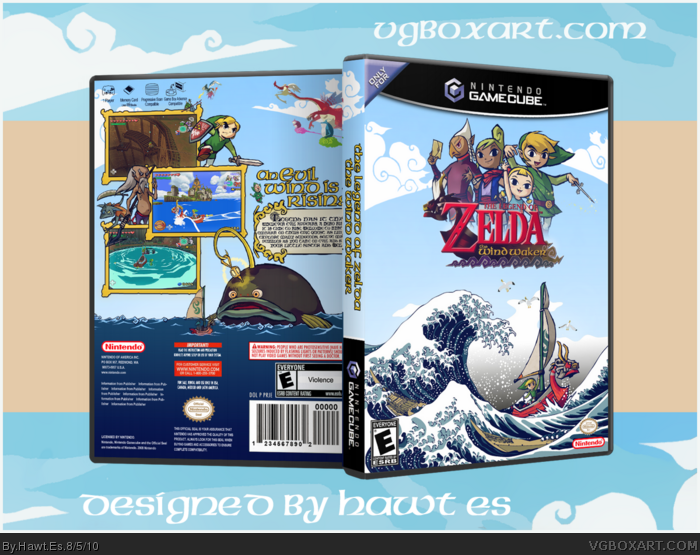
The front's basically flawless. Others in the WIP were saying it seemed empty, I'm personally glad you kept it simple and not overcrowded. You were able to match the two art styles at the bottom incredibly well.
The back's good, Valoo and the wind gods' seem to be in a more 3D style, it's a bit clashing with the rest of the design but not that big of a deal. My major gripe with the back is the differing style of water, the bright and much more simplistic waves clash with the front. If you were to darken the water I think it'd look much better.
[ Reply ]
I really wish you had not used the wave for the presentation... it takes away from it, imo. Either way, I like it.
[ Reply ]
The characters being so high in the air on top of the logo fucks with me, it looks so odd.
[ Reply ]
Beautiful, man. I'm glad I'm not the only one to use Hokusai in a box.
[ Reply ]
#3, Yeah good idea. I originally wanted it to match the middle screen on the back but I see what you are saying. I will definitely fix this in V2.
#4, You are right. I sort of rushed the presentation. I will also Change this.
#5, What do you mean?
[ Reply ]
Impressive use of Hokusai's work, clever and well thought out.
[ Reply ]
Awesome job! Can we please have a printable? I really want this on my cover. Also, I don't like the presentation D:
The box itself is amazing. I'm really glad to see it done.
[ Reply ]
Yes I am working on adding a flat now. I am updating that ESRB mistake also on the back. Fixing the presentation as I type this.
[ Reply ]
ok updated
[ Reply ]
This Box art is amazing. Great job on it my only problem is that I'm sure its supposed to say Cartoon Violence instead of just Violence
[ Reply ]
New presentation looks awesome!
[ Reply ]
I love it but I dislike the brown boat in the wave.
[ Reply ]
So awesome, and I love the new presentation. It looks incredible how you integrated the art with Zelda, and you did that flawlessly. The back really turned out great, and it complements the front so well.
Are you going to add the session tag though? I was thinking it was for one of the Expression Sessions.
[ Reply ]
This could have been a MasterWorks box, but I am feeling that the back was a bit of a cop out. Don't get me wrong, and please don't take offense...the front is very great, I love the way you've incorporated The Wave with the traditional Zelda artwork. The back just seems to fall a bit short, and it seems like you just tried to get one together so you could post :$
Once again, so amazing box...I just think it could have been ever better. :)
[ Reply ]
I actually like the back more than the front. The great wave was a great idea, but the rest of the box doesn't match it. Rather than the blueish scheme you did, I think a peach-ish ancient one would would work better. Also, I'm not a fan of the characters hovering over there behind the logo.
[ Reply ]
Ahh, excellent update man. The darker colors on the back match up perfectly with the front, and the new presentation takes less focus off of the box.
[ Reply ]
So happy you finished this. It still seems a tad incomplete, maybe a bit empty even, but overall I like it.
[ Reply ]
Flawless. Literally. Glad you didn't clutter the top on the front.
[ Reply ]
I think I might cry at how good this is.
[ Reply ]
lol Tingle. Anyway, the logo with the characters didn't work for me at first, but it's growing on me. The tiny Link out in the ocean really captures the feel I often had sailing across such a vast body of water.
[ Reply ]
This comment is directed towards people who don't like the logo with the pictures behind it.
I just wanted to say that it isn't a bizarre design choice or anything. It is actually a pretty common layout. There are some boxes on here along with mainly movie posters that usually have characters lined up towards the top followed by the bottom being just some sort of action scene. In this case it is Link sailing across the ocean.
Personally I think I fell short with the back.
[ Reply ]
Yeah, it is a common layout, so everyone thinking it looks odd really says that something is wrong. I dunno though. I reaaally like the back. Captures that empty sailing feeling of the game perfectly. Front is just .. too unique. I wish you had carried the Hokusai theme throughout the box. The weird way the light blue fades to that brown also looks strange
[ Reply ]
Seems like Zelda games get eaten up pretty quickly with the views.
[ Reply ]
Wow, I didn't see you uploaded this. One of my favorite boxes on the site.
Edited at 1 decade ago
[ Reply ]
I Love the front cover
[ Reply ]
I Love the front cover
[ Reply ]