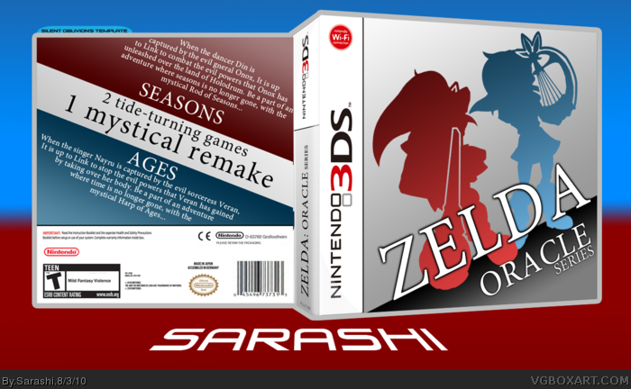
Well, firstly, it's a different box. No Zelda logo, no pictures, just the two Link incarnations on the front, with their instruments made obvious. No Zelda font at all, as I feel it is cliche now. For the back, there's the two information sections, both off the same template. I did this to show how they are very similar. I was planning to have a Maku tree in it, but it really took away that feel from it.
I felt this game really should have a remake. It's an amazing game, even if it was on the Game Boy Color.
 Zelda: Oracle Series Box Cover Comments
Well, firstly, it's a different box. No Zelda logo, no pictures, just the two Link incarnations on the front, with their instruments made obvious. No Zelda font at all, as I feel it is cliche now. For the back, there's the two information sections, both off the same template. I did this to show how they are very similar. I was planning to have a Maku tree in it, but it really took away that feel from it.
I felt this game really should have a remake. It's an amazing game, even if it was on the Game Boy Color.
[ Reply ]
really good, like the front and somewath the back. and I like it :) +fav
Edited at 1 decade ago
[ Reply ]
I really like the white and blue colors, very eye catching.
[ Reply ]
#2, #3, Thanks!
[ Reply ]
Wonderful job.
[ Reply ]
Simple, but I like it. The red/blue looks great together.
[ Reply ]
think its perfect but ITS NOT the Nintendo 3DS Logo should go on the left
[ Reply ]
also why the wifi logo is red?
[ Reply ]
This is eye-catching, and I like it a lot. You're one of my favorite authors, Sarashi.
[ Reply ]
If Nintendo doesn't do this, they should at least put in in the e-shop.
[ Reply ]