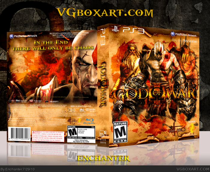
Here it is, God Of War 3! This is my second try at a GOW3 cover and I must say, It was more fun making this than the last one. Thanks to all the people who helped me in the WiP thread. Went for a simplistic look.
Most of the artwork on this cover is from the Press/Fan kits on the GOW website. The only thing here that is credit-worthy is the template, which is by ScorpionSoldier.
Thanks for viewing and the printable will be uploaded if needed.
#4, Ok. Well is this a limited edition or something cause I dont see any info for the game on the back. I like the 3 on the front but I dont like how their fading into the paper.
#6, No, It's not a limited edition. The reason there is no game description is because it was ruining the look of the cover. Plus, people commented in my WiP thread telling me not to add a description or screens.
The back looks incomplete. If you were going to leave out text, I feel like there should've been more substance to the background. I like the overall feel and idea but I think the back leaves a lot to be desired.
 God of War III Box Cover Comments
Here it is, God Of War 3! This is my second try at a GOW3 cover and I must say, It was more fun making this than the last one. Thanks to all the people who helped me in the WiP thread. Went for a simplistic look.
Most of the artwork on this cover is from the Press/Fan kits on the GOW website. The only thing here that is credit-worthy is the template, which is by ScorpionSoldier.
Thanks for viewing and the printable will be uploaded if needed.
Edited at 1 decade ago
[ Reply ]
very nice man!
[ Reply ]
What is up with the 'only on playstation" faded?
[ Reply ]
#3, It's not faded. It was like that on the original template as well.
[ Reply ]
The composition on the front is really nice.
[ Reply ]
#4, Ok. Well is this a limited edition or something cause I dont see any info for the game on the back. I like the 3 on the front but I dont like how their fading into the paper.
[ Reply ]
#6, No, It's not a limited edition. The reason there is no game description is because it was ruining the look of the cover. Plus, people commented in my WiP thread telling me not to add a description or screens.
[ Reply ]
I think it looks much better without a description or screenshots, it's something different and it works very well.
[ Reply ]
The back feels incomplete to me but I'm diggin' the front.
[ Reply ]
The back looks incomplete. If you were going to leave out text, I feel like there should've been more substance to the background. I like the overall feel and idea but I think the back leaves a lot to be desired.
[ Reply ]
I will agree: at least throw 2 or 3 screenshots..idek if u need a border..jsut something lol
[ Reply ]
Add a drop-shadow to the logo, its kinda lost in the shuffle. :/
[ Reply ]
#12, It already has drop shadow, but I'll make it stronger.
[ Reply ]
the front sweet but the back is missing allot.
[ Reply ]
Back seems unfinished..
[ Reply ]
What should I add to the back?
[ Reply ]
Synopsis or no, this seems pretty good. I died when i saw the front.
[ Reply ]
#16, maybe some text? should make the back more interesting. The front is awesome!
Edited at 1 decade ago
[ Reply ]