#2, Stop being an a-hole and start helping others out.
@Habib3
This could use a lot more work (better logo, not using just a wallpaper etc.) Try putting up your covers on the Critiques/WiP forums before uploading it to the site. That might help you get better.
 Mario Kart 3DS Box Cover Comments
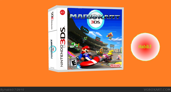
White pixels, everywhere.
Put a more creative background than a BIG orange background.
[ Reply ]
This isn't good at all. Keep making boxes without effort, and you know what'll happen. But don't worry, not gonna "rek" your "avalbility".
[ Reply ]
#2, Stop being an a-hole and start helping others out.
@Habib3
This could use a lot more work (better logo, not using just a wallpaper etc.) Try putting up your covers on the Critiques/WiP forums before uploading it to the site. That might help you get better.
[ Reply ]
somebody please give advice or tell me what ive done wrong
[ Reply ]
I thought the wifi logo was blue. In your box its red
Edited at 1 decade ago
[ Reply ]
#1, I agree it does need more in the background. In my boxes I dont put any backgrounds, I just put the box art there.
[ Reply ]
Nice box, needs a little more done in the title but it gets bye.
[ Reply ]
1. its just copied by a mario kart wii fake boxart
2. the Wi-Fi symbol isn't red and
3. the nintendo 3DS logo is on left
[ Reply ]
exactly I think its better with the 3DS logo on the right
[ Reply ]
uh... wow. you could tell it was horribly photoshoped and had no effort put into it. well mine sucks too, ill post it later.
[ Reply ]