notemplatek [ Buy Assassin's C... at Amazon ] By Beer 24 on July 26th, 2010 No Printable Available Assassin's Creed: Brotherhood Box Cover Comments Comment on Beer's Assassin's Creed: Brotherhood Box Art / Cover. Cancel Reply Beer 24 [ 1 decade ago ] View in full, please. Credit ------ Mub for the symbol and general helpfulness on msn. Squall for the fantastic custom logo. Planet Renders for all the renders. [ Reply ] jevangod 50 [ 1 decade ago ] To tell you the truth Beer I dont see much effort here. I mean you typed a bit on the back. The renders are from Planetrenders.net and the logo is from Squall. I mean I dont see much creativity here either. IDK, just not your best my man. [ Reply ] Beer 24 [ 1 decade ago ] All in all, bout 30 layers? I know that doesn't seem like much, and no, I won't lie, not a lot of effort, but I like the final outcome myself. Any pointers on how I can liven it up a bit? [ Reply ] mchapra 34 [ 1 decade ago ] #2, Actually he already gave his resources credit, it also took a fair share of time, I know 'cause I helped him on MSN making it. I love the banner effect you were going for, I fairly like where this ended up, good job. Edited at 1 decade ago [ Reply ] tmrd 43 [ 1 decade ago ] Wowwwww. [ Reply ] Beer 24 [ 1 decade ago ] Thanks both. [ Reply ] Squall234 44 [ 1 decade ago ] Awesome my good man =) [ Reply ] Beer 24 [ 1 decade ago ] Thank you. [ Reply ] SonicSuperFan1 1 [ 1 decade ago ] hmm... it's good! but the front is plain maybe add something too it, but either way it is good :) [ Reply ] White_Dove 38 [ 1 decade ago ] I like the simplicity and I like the colors, though the renders on the back seem a bit odd places over each other I still think it is a very good box. [ Reply ] Beer 24 [ 1 decade ago ] Thanks to both, no fav? [ Reply ] beardedwalrus 41 [ 1 decade ago ] Love [ Reply ] Beer 24 [ 1 decade ago ] Thanks. [ Reply ]
 Assassin's Creed: Brotherhood Box Cover Comments
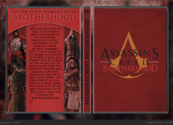
View in full, please.
Credit
------
Mub for the symbol and general helpfulness on msn.
Squall for the fantastic custom logo.
Planet Renders for all the renders.
[ Reply ]
To tell you the truth Beer I dont see much effort here. I mean you typed a bit on the back. The renders are from Planetrenders.net and the logo is from Squall. I mean I dont see much creativity here either. IDK, just not your best my man.
[ Reply ]
All in all, bout 30 layers? I know that doesn't seem like much, and no, I won't lie, not a lot of effort, but I like the final outcome myself.
Any pointers on how I can liven it up a bit?
[ Reply ]
#2, Actually he already gave his resources credit, it also took a fair share of time, I know 'cause I helped him on MSN making it.
I love the banner effect you were going for, I fairly like where this ended up, good job.
Edited at 1 decade ago
[ Reply ]
Wowwwww.
[ Reply ]
Thanks both.
[ Reply ]
Awesome my good man =)
[ Reply ]
Thank you.
[ Reply ]
hmm... it's good! but the front is plain maybe add something too it, but either way it is good :)
[ Reply ]
I like the simplicity and I like the colors, though the renders on the back seem a bit odd places over each other I still think it is a very good box.
[ Reply ]
Thanks to both, no fav?
[ Reply ]
Love
[ Reply ]
Thanks.
[ Reply ]