I SCREWED UP WITH THE AGE RATING. DIDENT NOTICE TELL I WAS DONE. OTHER THEN THAT, i think it is way better than my last one. im still a begginer, so trty and keep that in mind.
Why didn't you fix it before you posted it, then?
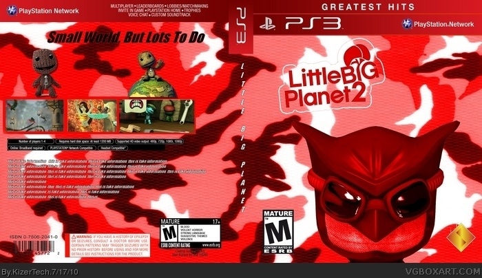
I'll list everything wrong about this box:
1. Background looks horrible.
2. Renders are randomly placed.
3. Why is Nite Owl the main character? He's a DLC costume.
4. You decimated the LBP2 logo.
5. Screenshots look horribly crappy.
6. Tagline is boring and stupid.
7. No description of the game.
8. It's not rated M.
anyways, welcome to VGBA! here is my critique on the box,
-why is it so red? honestly with the m rating, this makes it look like a horror game
-remove nite owl and replace him with just a regular sackboy.
-the background looks bad and unfit for a LBP game, maybe replace it with stars and such and have the moon and earth hanging from a string
-the back looks very nice, but move the legal info down and write a description for the game
-i like the tagline, but not the way it looks, i used this website link when i first started making taglines.
hey at least youre using photoshop, thats a very good start!
and dont let negative critique take you down, most of the time its advice.
 LittleBigPlanet 2 Box Cover Comments
I SCREWED UP WITH THE AGE RATING. DIDENT NOTICE TELL I WAS DONE. OTHER THEN THAT, i think it is way better than my last one. im still a begginer, so trty and keep that in mind.
[ Reply ]
other than the false age rating and the weird red camo background, It's pretty good, nice job!
[ Reply ]
Why didn't you fix it before you posted it, then?
I'll list everything wrong about this box:
1. Background looks horrible.
2. Renders are randomly placed.
3. Why is Nite Owl the main character? He's a DLC costume.
4. You decimated the LBP2 logo.
5. Screenshots look horribly crappy.
6. Tagline is boring and stupid.
7. No description of the game.
8. It's not rated M.
[ Reply ]
#3, aww, you are so good at welcoming new users.
anyways, welcome to VGBA! here is my critique on the box,
-why is it so red? honestly with the m rating, this makes it look like a horror game
-remove nite owl and replace him with just a regular sackboy.
-the background looks bad and unfit for a LBP game, maybe replace it with stars and such and have the moon and earth hanging from a string
-the back looks very nice, but move the legal info down and write a description for the game
-i like the tagline, but not the way it looks, i used this website link when i first started making taglines.
hey at least youre using photoshop, thats a very good start!
and dont let negative critique take you down, most of the time its advice.
Again, welcome to the community
[ Reply ]