[ Buy MediEval 2 ... at Amazon ] By Lodovicok 27 on August 15th, 2006 No Printable Available [ Box updated on February 21st, 2007 ] [ original ] MediEval 2 Total War Box Cover Comments Comment on Lodovicok's MediEval 2 Total War Box Art / Cover. Cancel Reply Lodovicok 27 [ 1 decade ago ] Hope you like it!! [ Reply ] Radioactive Bob 38 [ 1 decade ago ] beuatiful, 5/5 [ Reply ] Mad Spike 43 [ 1 decade ago ] Title on the front cover should have some shadow or stroke... It is hardly seems on the light background. [ Reply ] Lodovicok 27 [ 1 decade ago ] #3,i'll se what I can do [ Reply ] Lodovicok 27 [ 1 decade ago ] darkened logo [ Reply ] Reed 36 [ 1 decade ago ] Not too shab. Really like the background imagery being used across both sides. But the logo on the front and spine still aren't standing out well enough. They need some kind of shadowing. Also suggest giving the screens on the back each a border. [ Reply ] Lodovicok 27 [ 1 decade ago ] #6, that's going to be tough to do with a jpg file, but i'll try [ Reply ] Reed 36 [ 1 decade ago ] #7, Oh, you don't have this in layers? Yikes, that will be tough indeed. ;) [ Reply ] Lodovicok 27 [ 1 decade ago ] #8, I went through alot of trial and error, you can see with all of the versions, but i think i finally got it done. btw, the logo is mor clearer in full view [ Reply ] Lodovicok 27 [ 1 decade ago ] *more [ Reply ] Lodovicok 27 [ 1 decade ago ] can i get some votes so it can be ranked..i think i just need one more... thanks in advance [ Reply ] E_G 39 [ 1 decade ago ] Ace box Lodo, thing IÂ’ll recommend is in future you should spread the whole summary text across like a lot of official boxes do. A degree of Authentic-ness can be essential. [ Reply ] Lodovicok 27 [ 1 decade ago ] #12, thanks general...i'll do that with my next box...glad everybody liked it [ Reply ]

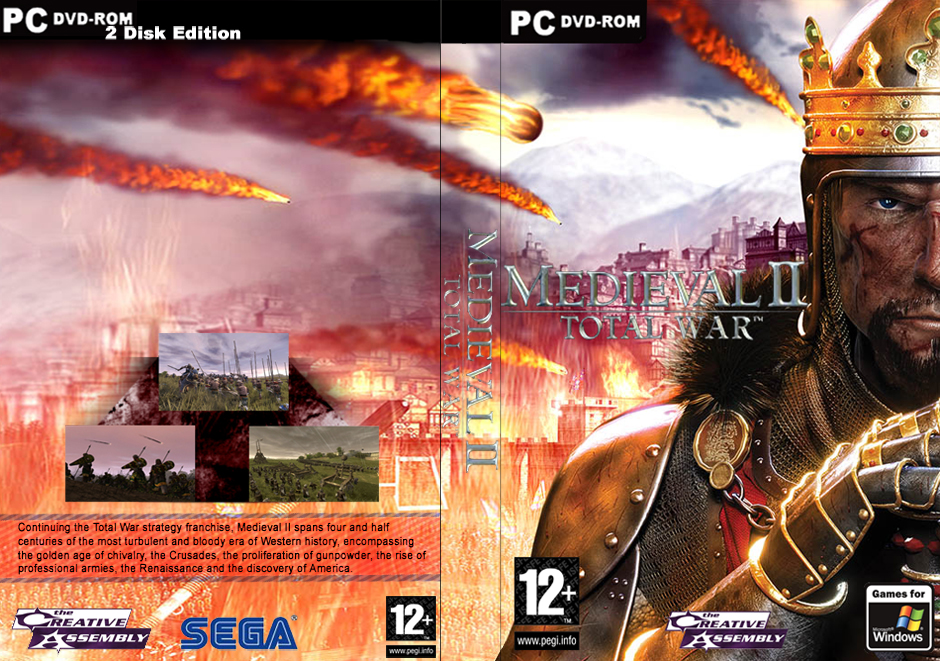
 MediEval 2 Total War Box Cover Comments
Hope you like it!!
[ Reply ]
beuatiful, 5/5
[ Reply ]
Title on the front cover should have some shadow or stroke... It is hardly seems on the light background.
[ Reply ]
#3,i'll se what I can do
[ Reply ]
darkened logo
[ Reply ]
Not too shab. Really like the background imagery being used across both sides.
But the logo on the front and spine still aren't standing out well enough. They need some kind of shadowing.
Also suggest giving the screens on the back each a border.
[ Reply ]
#6, that's going to be tough to do with a jpg file, but i'll try
[ Reply ]
#7, Oh, you don't have this in layers? Yikes, that will be tough indeed. ;)
[ Reply ]
#8, I went through alot of trial and error, you can see with all of the versions, but i think i finally got it done.
btw, the logo is mor clearer in full view
[ Reply ]
*more
[ Reply ]
can i get some votes so it can be ranked..i think i just need one more...
thanks in advance
[ Reply ]
Ace box Lodo, thing IÂ’ll recommend is in future you should spread the whole summary text across like a lot of official boxes do.
A degree of Authentic-ness can be essential.
[ Reply ]
#12, thanks general...i'll do that with my next box...glad everybody liked it
[ Reply ]