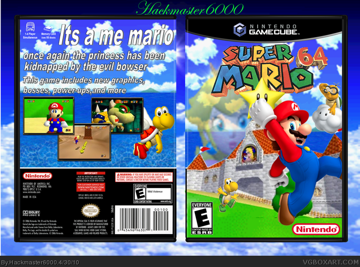
Yes the back is empty but I ran out of ideas and I also hate doing backs.
Credit goes to...
Gamecube templete - querty334
Borders - silent oblivion
Renders and everything else - bing
Rate out of 5 a/o +fav if you really like it
......64?......GameCube?...
-------------------------------
It's pretty good but:
1.Koopa Troopa doesn't have a shadow, put a black cirle under him so it looks like he has a shadow.
2.Lakitu is choppy, and....you get the point
-----------------------------------------------
This is how I do good at boxarts:
I looke at MasterWork boxes and study them
See what makes them unique and pretty..
This is not to bad, except the front, a lot of things are blur, and choppy, and lastly the back, it doesn't have a good layout to stand on its own. Also the back is very blurry as well. Try getting better resources and keep try. Not to bad, but could have been MUCH better. 2/5
 Super Mario 64 Box Cover Comments
Yes the back is empty but I ran out of ideas and I also hate doing backs.
Credit goes to...
Gamecube templete - querty334
Borders - silent oblivion
Renders and everything else - bing
Rate out of 5 a/o +fav if you really like it
Edited at 1 decade ago
[ Reply ]
......64?......GameCube?...
-------------------------------
It's pretty good but:
1.Koopa Troopa doesn't have a shadow, put a black cirle under him so it looks like he has a shadow.
2.Lakitu is choppy, and....you get the point
-----------------------------------------------
This is how I do good at boxarts:
I looke at MasterWork boxes and study them
See what makes them unique and pretty..
[ Reply ]
I don't really like this... Everything looks like in went through multiple blur filters...
[ Reply ]
I guess your right #3 sorry for disturbing you
[ Reply ]
This is not to bad, except the front, a lot of things are blur, and choppy, and lastly the back, it doesn't have a good layout to stand on its own. Also the back is very blurry as well. Try getting better resources and keep try. Not to bad, but could have been MUCH better. 2/5
[ Reply ]
Peach is blurry and the font on the back isn't the best. It looks pretty good otherwise. 3.5/5
[ Reply ]
its good but it needs an only for sign +fav
Edited at 1 decade ago
[ Reply ]
thanks #6 and #7
[ Reply ]
Bad bad grammar.
[ Reply ]
#8, your welcome
[ Reply ]