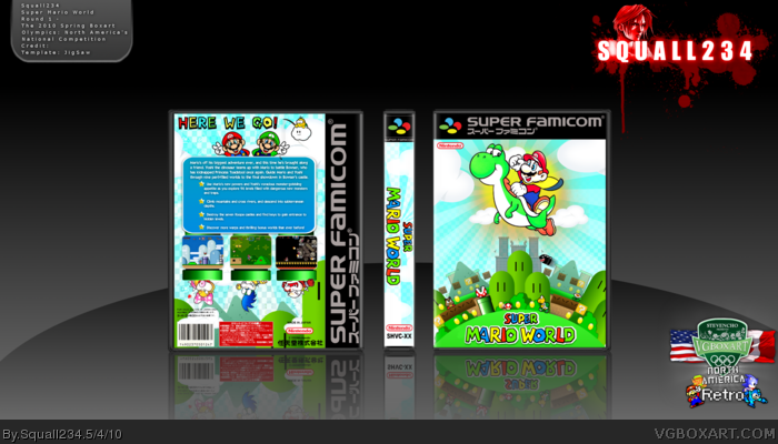
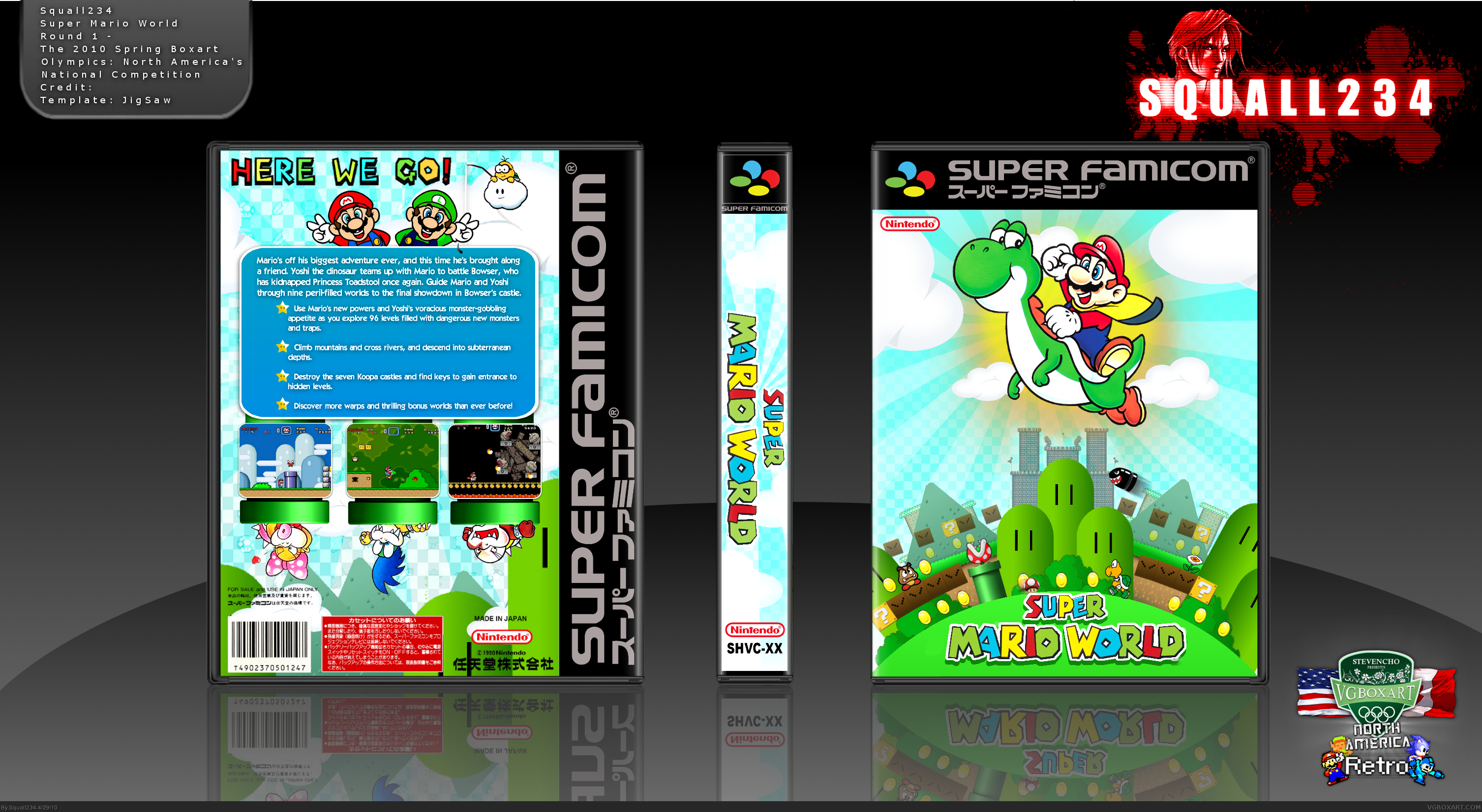
Hey everyone! This box is for the The 2010 Spring Boxart Olympics: North America's National Competition : Retro style, and this is my first retro box. Hope you like it, and credit is on the box. ^^
This captures the essence of smw pretty dang well, the background on the front cover is fantastic, the only downside I see is Luigi's face is a tad choppy.
#13, Mostly the rendering of things... More specifically:
FRONT:
Rendering of mario and yoshi
Choppyness/blurryness of hills and bushes, as well as the general bg
Logo
BACK:
Tagline
Rendering of Luigi
Rendering of Lakitu
Low Quality Koopa Kid renders.
As well as this there are also VERY conflicting art styles (3d pipes, sorta half-3d mushroom, 2d koopa kids, coins are a different sort of 2d, the background is different again, and its a paper goomba...
#14, Thank you for your comment, but its EXTREMELY hard to find content for this game. I know its not the best quality at some parts, but I tried XD Again, thank you for your comment.
Also Thanks everyone for the fav, and comments =) You all rock!
 Super Mario World Box Cover Comments
Hey everyone! This box is for the The 2010 Spring Boxart Olympics: North America's National Competition : Retro style, and this is my first retro box. Hope you like it, and credit is on the box. ^^
Round one : link
Edited at 1 decade ago
[ Reply ]
Sweet.
[ Reply ]
Awesome
[ Reply ]
This is just awesome. The logo and text is a little choppy but other than that this is great!
[ Reply ]
I love the front bottom. It looks very well done.
[ Reply ]
What everyone else said.
[ Reply ]
This captures the essence of smw pretty dang well, the background on the front cover is fantastic, the only downside I see is Luigi's face is a tad choppy.
[ Reply ]
Thanks everyone =)
[ Reply ]
squall, did you make the background on the front cover?
[ Reply ]
#9, Yes I did. Anything that is not official art, I custom made =)
[ Reply ]
#10, Well nice work because it is EPIC
[ Reply ]
Well, I DID like it. I really did. I even faved it.
But then I viewed it in full. *shudders*
[ Reply ]
#12, All renders are in HQ, so I don't know what you mean. Could you please elaborate on why it looks so bad in full? Thanks. =)
[ Reply ]
#13, Mostly the rendering of things... More specifically:
FRONT:
Rendering of mario and yoshi
Choppyness/blurryness of hills and bushes, as well as the general bg
Logo
BACK:
Tagline
Rendering of Luigi
Rendering of Lakitu
Low Quality Koopa Kid renders.
As well as this there are also VERY conflicting art styles (3d pipes, sorta half-3d mushroom, 2d koopa kids, coins are a different sort of 2d, the background is different again, and its a paper goomba...
[ Reply ]
not bad but it's a bit choppy
[ Reply ]
Edited at 1 decade ago
[ Reply ]
Really like this.
[ Reply ]
Sweett mario jumping over a city with Yoshi . Also I really like people coming out of pipes on back
Edited at 1 decade ago
[ Reply ]
You did a great job capturing the style of Super Mario World. I love the design as well. I'll fave it.
[ Reply ]
#14, Thank you for your comment, but its EXTREMELY hard to find content for this game. I know its not the best quality at some parts, but I tried XD Again, thank you for your comment.
Also Thanks everyone for the fav, and comments =) You all rock!
[ Reply ]
Okay so i updated it =) is it better?
Edited at 1 decade ago
[ Reply ]
great boxes, man, all i can say is to keep 'em coming. peace bro.
[ Reply ]
The update made everything better, +fav.
[ Reply ]
Thank you everyone, glad you like the update =)
[ Reply ]