I mean, cut the black backgroud around the logo. Sorry for my english, most of the people here are already used to it, I hope :)
I am from Kiev, that's why my english is not so good :)
Well your English is fine Spike; you spell better than some of the English who write on here ;)
It would look better if you put a glow on the logo, and used the ‘‘magic wand’’ to delete the black on cavia logos on it slots in better as said.
Still its impressive, packs a lot of detail.

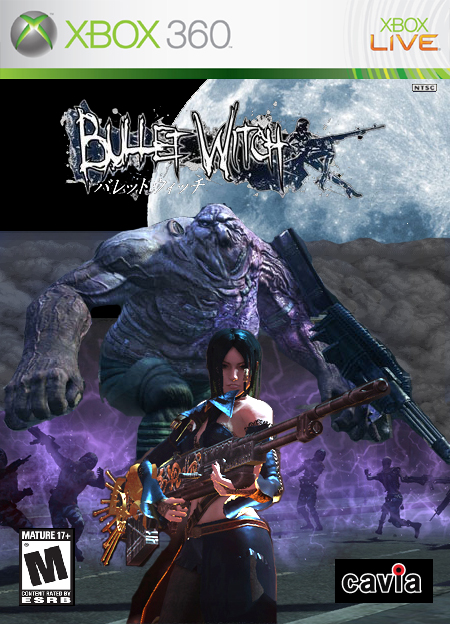
 Bulletwitch Box Cover Comments
My first boxart. Completion time 4 hours. I know it's rough around the edges but with a little luck and practice I'll get better.
[ Reply ]
Not bad for the first one. Only the Cavia logo not cuted and this is bad. What prgram do you use to create this one?
[ Reply ]
Photoshop. cuted?
[ Reply ]
*cutted
[ Reply ]
I mean, cut the black backgroud around the logo. Sorry for my english, most of the people here are already used to it, I hope :)
I am from Kiev, that's why my english is not so good :)
[ Reply ]
If you use Photoshop, you can set "Lighteen" or "Screen" parameters for the logo-layer. Black color will dissapear :)
[ Reply ]
Well your English is fine Spike; you spell better than some of the English who write on here ;)
It would look better if you put a glow on the logo, and used the ‘‘magic wand’’ to delete the black on cavia logos on it slots in better as said.
Still its impressive, packs a lot of detail.
[ Reply ]
Well I suppose if it really bothers you I can get rid of the black. Um... is it possable to remove this so I can resubmit it?
[ Reply ]
Oh god. literally 5 seconds after I posted the above message I saw the "Update Box" link below. I feel so noobish. I'll update now.
[ Reply ]
Now it looks much better :)
[ Reply ]