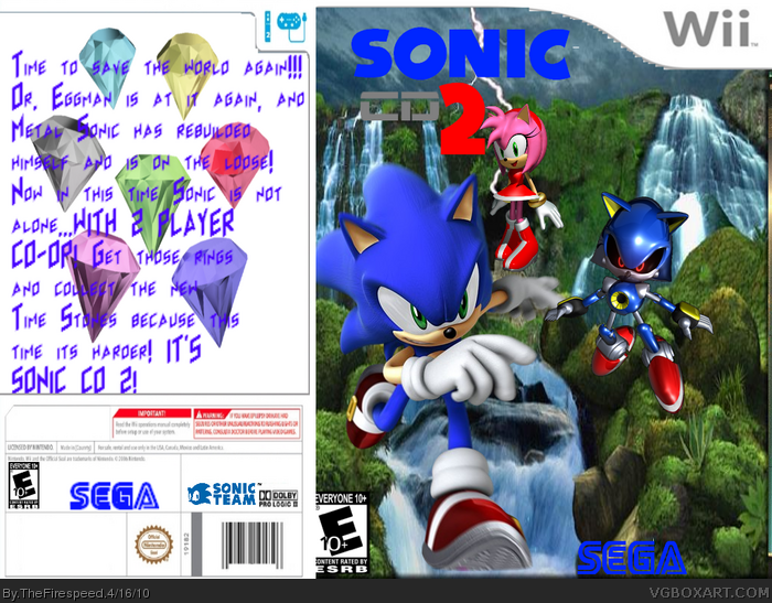
Not too good. It's very squashed, the ESRB is too much in the corner, the SEGA logo is badly placed, Sonic and Amy are floaing, and the back isn't too good.
Please post your next box in the WIP / critiques section of the forum before you upload it. The community here is rather helpful, and can give you some great pointers on how to make your box art better.
 Sonic CD 2 Box Cover Comments
Made a brand new box!Sonic CD 2. Sorry for no center plate, but i had no room this time. I think i like how the front turned out!
[ Reply ]
Not all that good, SEGA logo has no white around it, ESRB is cut off, Sonic and Amy are floating and a bad back! 2/5
[ Reply ]
its a good art box so stop complaing because you cant make an succesful one
[ Reply ]
@superjayjaysaiyn Like you could do any better.
[ Reply ]
It's pretty good for a second. Just get more practice at backs. I'll favorite beacsue this is better than my second
[ Reply ]
Not too good. It's very squashed, the ESRB is too much in the corner, the SEGA logo is badly placed, Sonic and Amy are floaing, and the back isn't too good.
[ Reply ]
Please post your next box in the WIP / critiques section of the forum before you upload it. The community here is rather helpful, and can give you some great pointers on how to make your box art better.
[ Reply ]