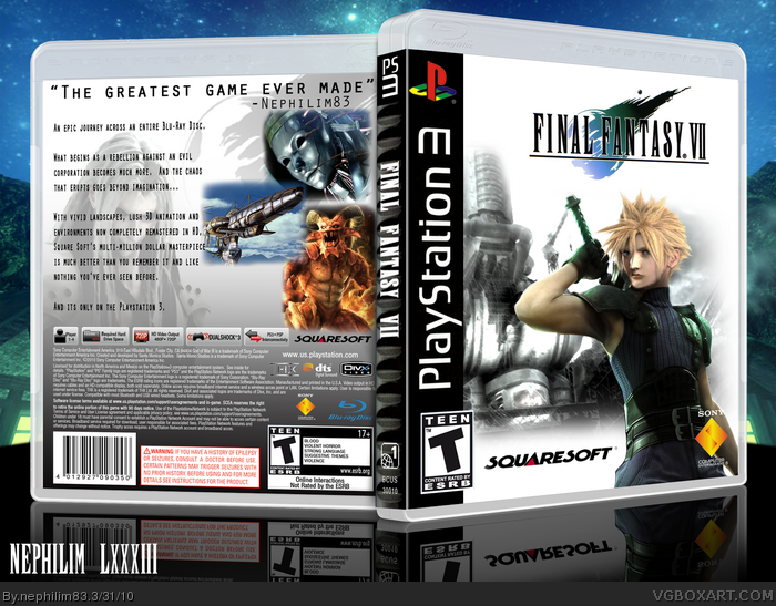
I've been wanting to do this box for a while. I just love this game and wanted to do something to resemble the original box as closely as possible. I never could find a decent Red XIII on a hill for the back , but I needed to put Sephiroth on there anyway since I cut him from the screenshots.
If you want that Cloud render let me know. You'll never find another like it and believe me when i say its a pain to blend half of cloud's pale girl head onto half of zack's dark man head and hide wipe away enough of zacks jay leno chin to make it look convincing.
Well, It looks pretty nice, but wow Clouds face there looks, well not like himself. And the spine is a tad bit blurry. but other then that, nice job. Much is said about PS3 FF7 , "it was only a tech. demo, it's just a rumor, IT"S GATA HAPPEN!". all in all nice, but that face is odd.
#3, Yeah, I know. I honestly did the best I could with what I had. Of course if you look at different wallpapers and stuf around the net you'll find that Cloud doesn't always look the same anyway. His character models from Advent Children and Crisis core are so different I figured what the hell, this can be the FVII remake version. :P
Okay, I just updated it. I fixed the spine so it fits in better and made the PS3 logo on it match the text on the front. Most importantly, I did some more cosmetic surgery on Cloud/Zack's face. No more Jay Leno chin!
#5, that's better, but I'm seeing this line across his face, like on his cheek, and that's weird. I never noticed the font on the Spine being so Bold, use-ally it's fairly thin. but it could just be me.
#6, Thanks. I see that line too, but it was already there. I've only edited from his top lip down. :P I made the font a bit bigger than it was last time. I think I had "faux bold" turned on or something when I typed that cause its usually pretty thin. I used the same font to put my username in the bottom corner. The difference is remarkable. Oh well. I'll fix it later. I'm just glad cloud can finally do a chin up without having to get someone to boost him up an extra foot to get the bottom of it over the bar.
#9, I fixed what I could. What's wrong with it. I may be able to fix it, but I really don't see how it looks "off" anymore. Please, help me see the trouble, and I'll gladly make it better. Thanks.
if you flipped clouds head horizontally it may be better. may b e. and maaybe you can try and make the outfit a bit darker as clouds outfir was not purple. and maybe remove the epaulette and replace with skin. it could look amazing. oh and skin tone.
#11, All of that sounds good, but this is what Cloud's outfit looked like in FFVII. It was the same exact outfit tha Zack wore in Crisis Core, so the one in the picture is just right. It was a hand-me-down. ;)
 Final Fantasy VII Box Cover Comments
I've been wanting to do this box for a while. I just love this game and wanted to do something to resemble the original box as closely as possible. I never could find a decent Red XIII on a hill for the back , but I needed to put Sephiroth on there anyway since I cut him from the screenshots.
If you want that Cloud render let me know. You'll never find another like it and believe me when i say its a pain to blend half of cloud's pale girl head onto half of zack's dark man head and hide wipe away enough of zacks jay leno chin to make it look convincing.
Anyway, I hope you guys like it.
Thanks for looking!
[ Reply ]
This is incredible. I love how you tried making it look like the original playstation case. I especially love the editing on that render. +fav
[ Reply ]
Well, It looks pretty nice, but wow Clouds face there looks, well not like himself. And the spine is a tad bit blurry. but other then that, nice job. Much is said about PS3 FF7 , "it was only a tech. demo, it's just a rumor, IT"S GATA HAPPEN!". all in all nice, but that face is odd.
[ Reply ]
#3, Yeah, I know. I honestly did the best I could with what I had. Of course if you look at different wallpapers and stuf around the net you'll find that Cloud doesn't always look the same anyway. His character models from Advent Children and Crisis core are so different I figured what the hell, this can be the FVII remake version. :P
[ Reply ]
Okay, I just updated it. I fixed the spine so it fits in better and made the PS3 logo on it match the text on the front. Most importantly, I did some more cosmetic surgery on Cloud/Zack's face. No more Jay Leno chin!
[ Reply ]
#5, that's better, but I'm seeing this line across his face, like on his cheek, and that's weird. I never noticed the font on the Spine being so Bold, use-ally it's fairly thin. but it could just be me.
The smaller chin is way better XP
Edited at 1 decade ago
[ Reply ]
#6, Thanks. I see that line too, but it was already there. I've only edited from his top lip down. :P I made the font a bit bigger than it was last time. I think I had "faux bold" turned on or something when I typed that cause its usually pretty thin. I used the same font to put my username in the bottom corner. The difference is remarkable. Oh well. I'll fix it later. I'm just glad cloud can finally do a chin up without having to get someone to boost him up an extra foot to get the bottom of it over the bar.
[ Reply ]
Cloud's head looks a bit strange on that render, but I have to give you props for putting the effort into making it. Nice job.
I'm a big fan of the back, but then again I wasn't a fan of the original's layout, which is what you were going for here.
[ Reply ]
It's nice but Cloud's head, like everyone else said, looks a bit odd. Also that PlayStation box template looks a bit off, as well. =\
[ Reply ]
#9, I fixed what I could. What's wrong with it. I may be able to fix it, but I really don't see how it looks "off" anymore. Please, help me see the trouble, and I'll gladly make it better. Thanks.
[ Reply ]
if you flipped clouds head horizontally it may be better. may b e. and maaybe you can try and make the outfit a bit darker as clouds outfir was not purple. and maybe remove the epaulette and replace with skin. it could look amazing. oh and skin tone.
[ Reply ]
#11, All of that sounds good, but this is what Cloud's outfit looked like in FFVII. It was the same exact outfit tha Zack wore in Crisis Core, so the one in the picture is just right. It was a hand-me-down. ;)
[ Reply ]
i wont insist. it is a wonderful box though. oh i think the problem with cloud's head is that it is slightly big.
[ Reply ]
i mean....slightly small
[ Reply ]
#13, Thanks. You're probably right. The upper part of his face does look a bit small.
[ Reply ]