#5, It is your best, but it still needs improvement. You are coming along though, before long you will start to see favs on your boxes if you keep improving. The ERSB is too big. And the Main logo is too small. Terra isn't rendered/cutout very well. And you need a better background for the front. On the back the text needs to stand out from the background, with either a drop shadow or a out glow. But it would also be best to use a better background for the back. You might want to think about using a better font as well, usually the game fronts, from the logo, because they don't tend to be legible always. Adding a couple of screens with a border would help as well. But as I said this is an improvement and you need to keep it up.
#6, Thanks for the feedback! And as soon as I can upload a new box it's going to be Final Fantasy XIII and I think it's my best and I don't really know how to edit pics after I saved them BUT for my next boxes I'll take you'r advice into consideration! OH and last but not least THANK YOU!
 Kingdom Hearts: Birth by Sleep Box Cover Comments
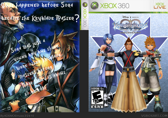
1st of all I own none of the artwork!
2ND I know I don't have a spine they're kind of hard to do...
3rd haven't uploaded a box in a while so what do you think?
[ Reply ]
nice alt. link
[ Reply ]
#2, THANK YOU for favoriting me! I really appreciate it! And thanks for liking my box(if you did)!
[ Reply ]
#3, He didn't favorite you.
[ Reply ]
#4, Now that I look at that you're right! ( :( ) So Roar shark how do you like it?
[ Reply ]
#5, It is your best, but it still needs improvement. You are coming along though, before long you will start to see favs on your boxes if you keep improving. The ERSB is too big. And the Main logo is too small. Terra isn't rendered/cutout very well. And you need a better background for the front. On the back the text needs to stand out from the background, with either a drop shadow or a out glow. But it would also be best to use a better background for the back. You might want to think about using a better font as well, usually the game fronts, from the logo, because they don't tend to be legible always. Adding a couple of screens with a border would help as well. But as I said this is an improvement and you need to keep it up.
[ Reply ]
#6, Thanks for the feedback! And as soon as I can upload a new box it's going to be Final Fantasy XIII and I think it's my best and I don't really know how to edit pics after I saved them BUT for my next boxes I'll take you'r advice into consideration! OH and last but not least THANK YOU!
P.S. what do you mean fonts from the logo?
Edited at 1 decade ago
[ Reply ]
#7, The font used on the back is the font used in Kingdom Hearts logos.
[ Reply ]
#8, That's a good thing... RIGHT?!
[ Reply ]
#9, Sadly no, as I explained in post #6.
[ Reply ]
#10, Okay after I re-read it I understand it. So should I just use a more-eligible font (but those look BORING!).
[ Reply ]