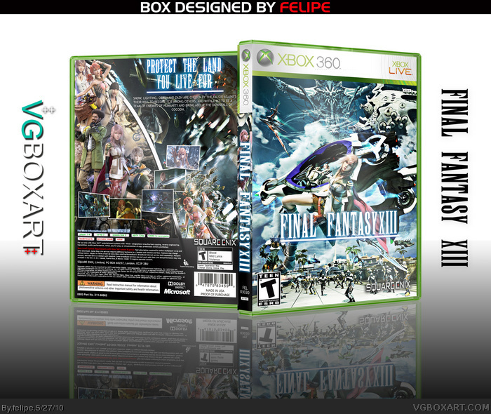
I'm back hehehehe!
I work very hard on this box something about two days and i think this is my best box. I hope you like it too!
Credits for Oddmania for some renders!
Amazing...Apparently the 360 version is hella glitchy though, my only problem with the box though is the description is dry, and its not zazh. It also looks a bit to much like throavium's.
P.S. Snow looks like he's grabbing vanille's boob...
#5, The front is pretty much identical but just reversed. But I will elaborate why I don't like this one:
1. He put Serah on the back but not Fang when there's clearly an empty space next to Snow and above Hope.
2. He misspelled 'Lightning' and 'Sazh'
3. He called 'Vanille' by her first name, 'Oerba,' which while technically correct, doesn't make much sense seeing as she is constantly referred to and known as 'Vanille.'
4. That and the front logo looks weird. The 'III' in the 'XIII' seems like it's a bit bigger than the rest, indicating that he used a custom Final Fantasy font rather than the official logo.
5. The front logo isn't separated enough from the background and it's somewhat hard to read.
6. Some more text to fill the empty space on the back would've been appropriate.
I do, however, love the way he displayed his screenshots.
#7, But rather than type it with a font that isn't quite right, you should've found a high resolution version of the original and just cut out the black text. It's dead easy because the text in FF logos always has a 14 pixel color border that allows you to cut out the black text quickly.
I'll comment because you asked me. I think the back has a similar look to mine, but all in all, it's quite different. The screenshots are, like Grand said, well done. The background you use used for the description text seems a bit messy and few errors that Grand mentioned, but overall, a solid job.
I don't see much harm in using boxes' composition as inspiration, (not saying felipe did).
I think you did a great job. I love the screenshot placement and the whole back is very impressive. Maybe, you should update the presentation to something more interesting.
Eh well I think Fang is more deserving than Serah seeing as she's an actual party member. But whatever. Faved & author faved 'cause I can't get over how nice those screenshots look.
Very nice, has an epic feel to it, alot better then the crap they use for official covers, *White background with lightning, lmao*, yeah, it's brilliant and worth a fav.
Wow, love the box, aside from the front just being 1 single piece of artwork, but I can't stand the presentation, try and go for something more professional looking, this kind of just looks ridiculous, but since it's the box that matters I will fav it.
 Final Fantasy XIII Box Cover Comments
I like it! :)
[ Reply ]
I'm back hehehehe!
I work very hard on this box something about two days and i think this is my best box. I hope you like it too!
Credits for Oddmania for some renders!
[ Reply ]
Amazing...Apparently the 360 version is hella glitchy though, my only problem with the box though is the description is dry, and its not zazh. It also looks a bit to much like throavium's.
P.S. Snow looks like he's grabbing vanille's boob...
Edited at 1 decade ago
[ Reply ]
Reminds me of this one (link) a bit too much to warrant a fave.
[ Reply ]
#4, I am sorry you just complain way to much... it is quite obvious that this is different than that one... this is even better imo.
Great job Felipe.
Edited at 1 decade ago
[ Reply ]
#5, The front is pretty much identical but just reversed. But I will elaborate why I don't like this one:
1. He put Serah on the back but not Fang when there's clearly an empty space next to Snow and above Hope.
2. He misspelled 'Lightning' and 'Sazh'
3. He called 'Vanille' by her first name, 'Oerba,' which while technically correct, doesn't make much sense seeing as she is constantly referred to and known as 'Vanille.'
4. That and the front logo looks weird. The 'III' in the 'XIII' seems like it's a bit bigger than the rest, indicating that he used a custom Final Fantasy font rather than the official logo.
5. The front logo isn't separated enough from the background and it's somewhat hard to read.
6. Some more text to fill the empty space on the back would've been appropriate.
I do, however, love the way he displayed his screenshots.
Edited at 1 decade ago
[ Reply ]
6# I will update the text and I made that logo because the official one is a quite boring...
[ Reply ]
This chaos look is great.
[ Reply ]
very impressive.
[ Reply ]
#7, But rather than type it with a font that isn't quite right, you should've found a high resolution version of the original and just cut out the black text. It's dead easy because the text in FF logos always has a 14 pixel color border that allows you to cut out the black text quickly.
[ Reply ]
I'll comment because you asked me. I think the back has a similar look to mine, but all in all, it's quite different. The screenshots are, like Grand said, well done. The background you use used for the description text seems a bit messy and few errors that Grand mentioned, but overall, a solid job.
I don't see much harm in using boxes' composition as inspiration, (not saying felipe did).
Edited at 1 decade ago
[ Reply ]
I think you did a great job. I love the screenshot placement and the whole back is very impressive. Maybe, you should update the presentation to something more interesting.
[ Reply ]
#11, Yeah the screenshots on this are fantastic but I'd like to see Fang on the back and possibly Cid.
[ Reply ]
... the site is just going to over flow with millions of FF13 box's.
*Sigh* it's over-rated anyway XD
In my Opinion.
[ Reply ]
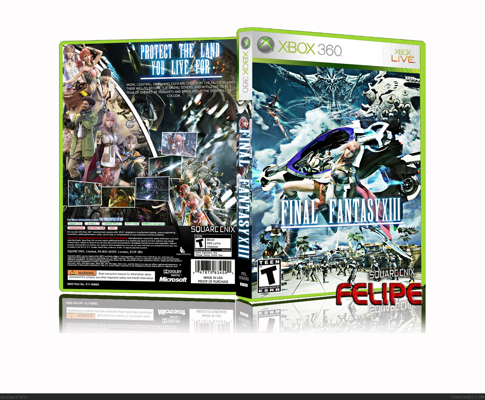
Updated version. New presentation, new text and snow isn't grabbing vanille boob now.
Edited at 1 decade ago
[ Reply ]
#15, Awww still no Fang...and I never noticed Snow was copping a feel.
[ Reply ]
I don't place Fang because of the text and the box have very much renders.
[ Reply ]
Eh well I think Fang is more deserving than Serah seeing as she's an actual party member. But whatever. Faved & author faved 'cause I can't get over how nice those screenshots look.
[ Reply ]
thanks man!
[ Reply ]
18 favs!Yeah!!!
[ Reply ]
wow holy shit thats nice!
[ Reply ]
Very nice, has an epic feel to it, alot better then the crap they use for official covers, *White background with lightning, lmao*, yeah, it's brilliant and worth a fav.
[ Reply ]
Thanks!
[ Reply ]
Wow, love the box, aside from the front just being 1 single piece of artwork, but I can't stand the presentation, try and go for something more professional looking, this kind of just looks ridiculous, but since it's the box that matters I will fav it.
Edited at 1 decade ago
[ Reply ]
Thanks man!
[ Reply ]
Edited at 1 decade ago
[ Reply ]
way to bump your box...
[ Reply ]
Wow, what an amazing box you made ! =D Epic win, I love it, that's how the official one should've been.
I'm glad you used my renders, I hope they helped ^^ The front, the spine, the back, everything's perfect, I hope it'll get the HoF ^^
Edited at 1 decade ago
[ Reply ]
Thanks very much!I hope the same thing!
[ Reply ]
Updated box: New presentation, now the things look better!
I hope you like it!
[ Reply ]
This should be in the Hall of Fame.
[ Reply ]
#31, It's what I want, just one HoF!
[ Reply ]
This is it, congratulations!
[ Reply ]
Finally.
[ Reply ]
Yeah!!!Finally I got a hall, thanks guys!
[ Reply ]
Wow, just noticed this. Congratulations, finally a hall of fame you deserve it.
[ Reply ]
thanks!
[ Reply ]