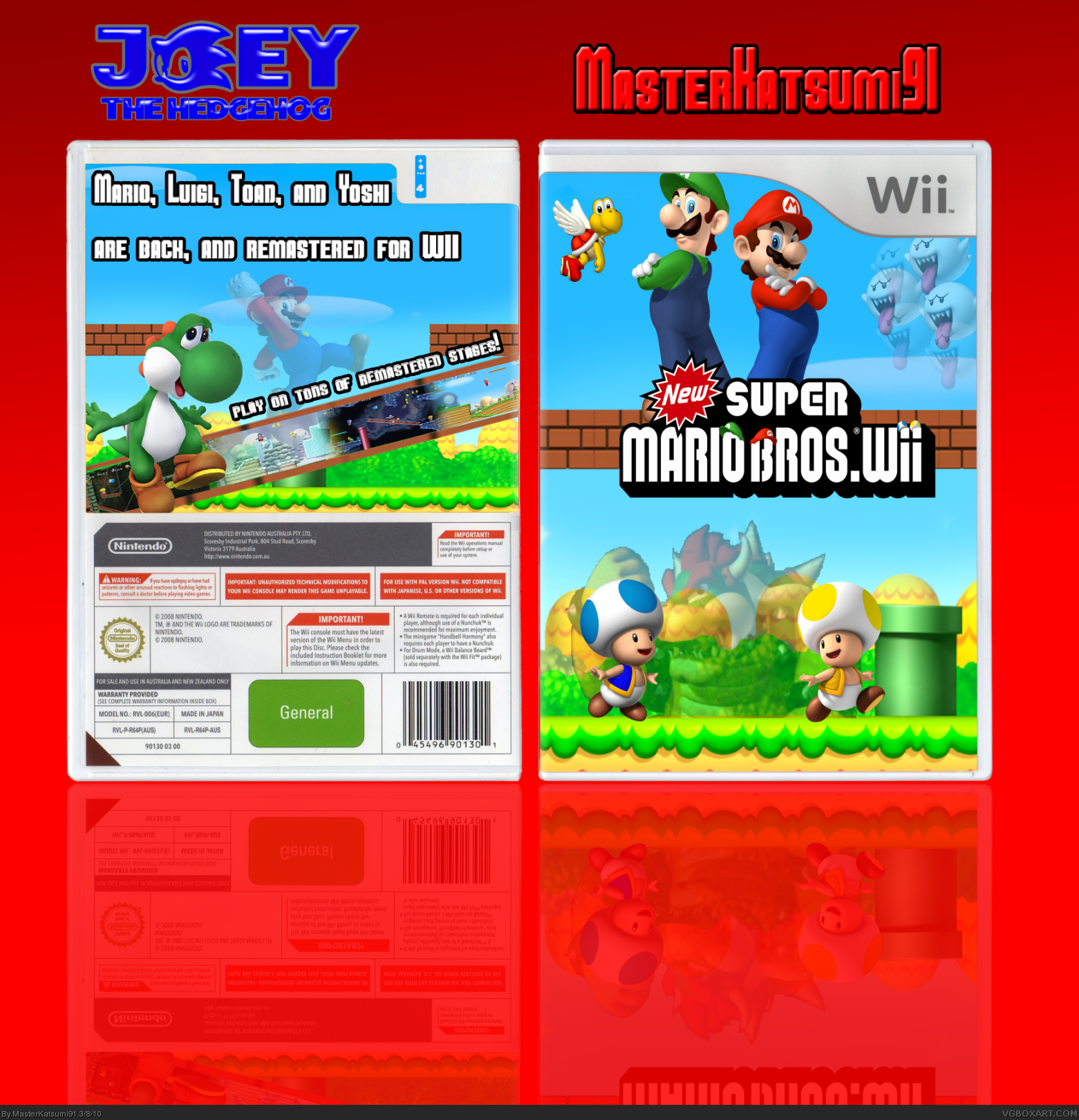
#2, now now, no need to be rude. this is a huge step up from all your other boxes, but i have issues with both parts, on the front, get rid of bowser and the boos, and put a full yoshiin between the toads, not faded. for the back, replace yoshi with mario, get rid of the transparent mario, and put text there in his place. do that an you get my fav
also, why does everybody use tmrd' wii temp so much? jevans looks way nicer. link
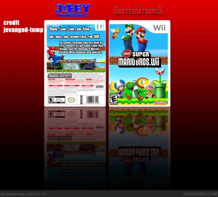
FRONT : I like the layout, except I dislike what you did to the logo (looks very unprofessional) and the transparency bits kills it. Overall I like the front, except PLEASE get rid of that choppy bowser. 2.8/5
BACK : I like the use of font, however the back feels way to plain and empty, and why is Mario transparent? He doesn't need to be and its unnecessary.
Overall Nice work 2.5/5
PRESENTATION: This presentation is to plain, and color choice doesn't fit the box. 1/5
OVERALL: For a collab, its fine but I would love to see more design into this. Not bad 2.5 /5
 New Super Mario Bros. Wii Box Cover Comments
mine and JOEY THE HEDGE HOGS collab on i can't believe its not butter
kidding it Mario wii i did front joey did back
you like my logo?
MY CREDIT:
Mario and Luigi and blue toad: spider pig 24
yellow toad recoulord by jayhog render by me
TMRD thanked for template
PLEASE view in full its quallity is way better in FULL
Edited at 1 decade ago
[ Reply ]
You would think that since there were 2 of you, you would have done a better job.
[ Reply ]
#2, ZING!
[ Reply ]
All the different transparency effects kind of kill it.
[ Reply ]
#2, now now, no need to be rude. this is a huge step up from all your other boxes, but i have issues with both parts, on the front, get rid of bowser and the boos, and put a full yoshiin between the toads, not faded. for the back, replace yoshi with mario, get rid of the transparent mario, and put text there in his place. do that an you get my fav
also, why does everybody use tmrd' wii temp so much? jevans looks way nicer.
link
[ Reply ]
FRONT : I like the layout, except I dislike what you did to the logo (looks very unprofessional) and the transparency bits kills it. Overall I like the front, except PLEASE get rid of that choppy bowser. 2.8/5
BACK : I like the use of font, however the back feels way to plain and empty, and why is Mario transparent? He doesn't need to be and its unnecessary.
Overall Nice work 2.5/5
PRESENTATION: This presentation is to plain, and color choice doesn't fit the box. 1/5
OVERALL: For a collab, its fine but I would love to see more design into this. Not bad 2.5 /5
[ Reply ]
I like the back most. to much fading at the front, and kinda of
[ Reply ]
WHO HOO! updated
#5 i can has fav now?
still i like the yoshi i made. i think it looks nice
[ Reply ]
updated again. just forgot esrb and nintendo logo and put em on.
[ Reply ]
Way better!
4.2/5
The back have to much text, though
Edited at 1 decade ago
[ Reply ]
just for the heck of it, i added a prinable
[ Reply ]
That looks awesome man!
[ Reply ]