[ Box updated on January 23rd, 2010 ] [ original ]
 The Legend of Zelda: Assassin's Creed Box Cover Comments
Comment on Js2Kings's The Legend of Zelda: Assassin's Creed Box Art / Cover.
[ Box updated on January 23rd, 2010 ] [ original ]
Comment on Js2Kings's The Legend of Zelda: Assassin's Creed Box Art / Cover.
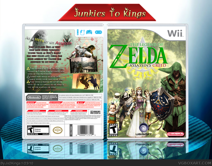
I think I may have overdone it with the brushes. Anyway I want to try something different then my usual boxes since they started looking like renders and backgrounds. The Idea may be bad but I decided to work around that. I have to thank everyone who help me in my WIP especially SpiderPig. I could say I had fun on this one.
Credits:
Casing: TMRD
Ezio render at the bottom back: Eggboy
Hope you enjoy :)
[ Reply ]
My favorite box from you, great job!
[ Reply ]
#2, This!
You Did a fantastic job with the front, though In my opinion the back falls a little short. All and all good job!
[ Reply ]
This is a big step up for you. My favorite box from you too.
[ Reply ]
Ok.
I feel that this could use some feedback.
First of all,as you said, you've overdone the brushes. The brushes are good,but don't suit this game-style at all.Secondly, what do the design choices have to do with a mix of games that both feel traditional, a bit medieval/renaissance-like? This is some sort of ''techno'' vibe i'm getting from the box.
Besides that, did no girl ever tell you that red and green are perhaps the most awful colours to mix this prominently? This doesn't only apply to girl make-up,but design as well. The entire colour scheme makes no sence to me.[ Red/green front,blue back? ]
Also, the render edit is pretty good, but the red mastersword/dagger combination feels out of place, and the back of link's hat you added to Ezio [?] just doesn't quite fit. The shading on it is off,and so is the texture.[the shading is the biggest problem,i think].
The edited screenshot on the back[the left one] looks pretty good, but the rest of the back,again,makes no sense to me. The entire blue scheme is just offputting,the typography could really use some work[ try a better font,and not using this many different colours for the text] and the blended images don't really work.
The overall layout doesn't work,either.
I suggest looking at other boxes and/or tutorials online for improvement.
The idea is fun,and there are some pretty cool design features on this box, but for now....It's just a big mess.
[ Reply ]
I want to say that you never played either game... The aproach to either should be very serious one.
Frankly, this looks much too silly and colorful.
[ Reply ]
#2,3,4, Thank you all
#5, Ok well I can't argue just just have to fix it but wait red and green should work it like Mario and Luigi?
#6, No I haven't played didn't have the money to pick it up.
Edited at 1 decade ago
[ Reply ]
Hmm... this looks really familiar to something I have seen before. I just can't remember what it was though... -.-
[ Reply ]
#8, I know, right? I get a sense of de ja vu as well. The Link looks like something (I think) eggboy did a good while back.
#5, Red and green isn't always a bad idea, but it makes me think Christmas. But I can agree the tone of this box doesn't work for me either.
I would have said something about it on the WIP thread for this, but I couldn't give a better suggestion than to scrap the current idea and totally rework the style of it.
[ Reply ]
#8,9 I have no idea but actually when I recolored Ezio It reminded me of something I seen before.
Oh one more thing Eggboy Assassin's creed is as serious as you think link :P
Edited at 1 decade ago
[ Reply ]
I have to fav this for that render on the front cover... It's amazing.
[ Reply ]
awesome!!!!!!!!!!!!!!!!!!!!!!
[ Reply ]
#9, I made it tleeart. lol :P link
[ Reply ]
#10, The game Assassin's Creed is serious. Just because Ubisoft is random and would put Altair into a soccer game doesn't change that.
Anyway, I feel like a goof now that I didn't realize stevencho's sarcasm, lol. I think his was a better way of showing what this should look like.
[ Reply ]
#13, Ah I remember seeing that
#14, I know it is it was a joke that was what the :P was for
I might make an update if I do ever play the game and/or I can make a better and more serious box.
[ Reply ]
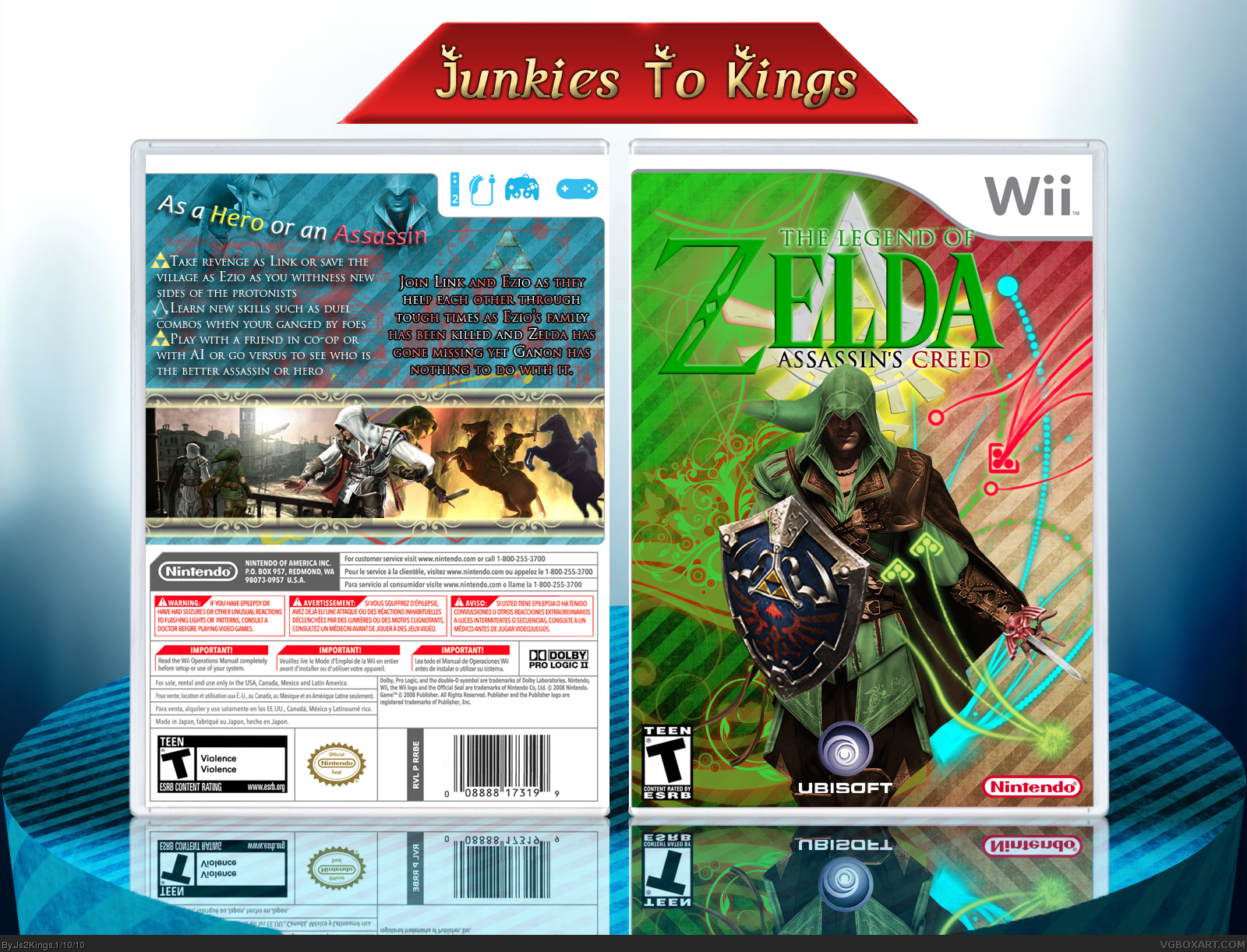
And here is the update.
I hope you like.
[ Reply ]
The update looks great IMO, very nice improvement.
[ Reply ]
just amazing 5/5 + fav
[ Reply ]
#17-18, Thanks!
[ Reply ]