I don't care what any of you say, or think of this box. I don't care how many views or favs this gets. I love this box with all my heart.
I consider this box...my comeback to VGBA. Honestly, I haven't put this much work into a box in a long time, probably my Ocarina of Time box from way back when. This box was started over 2 months ago.
Yes, this was a 2 month project.
I refrained from posting it in the WIP Forum becuase I thought that it would be nice to try things out on my own. And I really think this box is a success, my greatest success in a long time.
Please, tell me what you think, it would mean a lot. C&C couldn't be more appreciated.
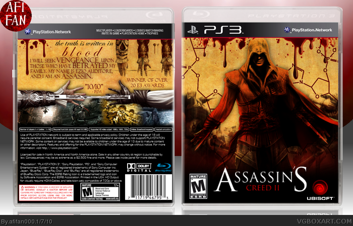
Nice box, but few details really bother me. First of all, template, especially the back part of it. Legal text and stuff on the back looks ugly and there's way too much of it. Then, ACII and Ubisoft logos could be of better resolution.
You'll fix those, you'' get my fav. =)
The concept overall is cool, it's like a fusion between the DaVinci style that some have been doing, and the generic ACII style. The back is seriously awesome, and the front has a good design. However, my main problems lie with the front. Ezio's overlay is a bit too strong, and while I can see that you wanted to put the emphasis on him...it just comes off a bit much.
Saying "I don't care what any of you say, or think of this box..." and then "Please, tell me what you think, it would mean a lot..." doesn't really make me want to give feedback.
However, it's a nice box - although I think you could have done something more with the render of Ezio on the front, rather than simple change the hue. And the black fade on the front looks a little sharp - Needs to fade more.
#14, Well, I'd like your feedback, but that first comment was geared more to those who would say like "Oh I hate this box.", or "Oh, this box is so generic.". You know, I basically meant that I don't care fore the useless comments that many of the members on this site post.
And I did a lot more to the Ezio render than just change the hue. If I changed the hue, there wouldn't be only one color on him (red). I edited the same render 3 times. I edited his texture, gave him a paper look, and then had to recolor him (not fully though, jst enough to give off a red glowish theme).
So yeah, I did a lot more to the box than you think I did, but thanks for the C&C.
#15, yeah I can see there's more that's been done, it's just the render looks more like a cutout because of the black glow around him, I was just suggesting something could be done with lighting or something to make it fit better.
#19, the funny thing is that people always used to say that the boxartists should wait for more art, yet 10 months later there hasn't really been any new art.
 Assassin's Creed II Box Cover Comments
I don't care what any of you say, or think of this box. I don't care how many views or favs this gets. I love this box with all my heart.
I consider this box...my comeback to VGBA. Honestly, I haven't put this much work into a box in a long time, probably my Ocarina of Time box from way back when. This box was started over 2 months ago.
Yes, this was a 2 month project.
I refrained from posting it in the WIP Forum becuase I thought that it would be nice to try things out on my own. And I really think this box is a success, my greatest success in a long time.
Please, tell me what you think, it would mean a lot. C&C couldn't be more appreciated.
[ Reply ]
Wow! Dude this is amazing, I really love it =D
[ Reply ]
Seriously, this is the best box I've seen in a good while.
Really great job, afifan.
[ Reply ]
Nice box, but few details really bother me. First of all, template, especially the back part of it. Legal text and stuff on the back looks ugly and there's way too much of it. Then, ACII and Ubisoft logos could be of better resolution.
You'll fix those, you'' get my fav. =)
[ Reply ]
Really awesome, though I agree with deiviuxs. The ACII and Ubisoft logos could be in better resolution.
You still get a fav from me.
[ Reply ]
You should get a better font for the tagline. Other than that this is amazing fav
[ Reply ]
O to the M to the G!!! Thanks amazing
[ Reply ]
This turned out great, I really like the back.
[ Reply ]
The concept overall is cool, it's like a fusion between the DaVinci style that some have been doing, and the generic ACII style. The back is seriously awesome, and the front has a good design. However, my main problems lie with the front. Ezio's overlay is a bit too strong, and while I can see that you wanted to put the emphasis on him...it just comes off a bit much.
Overall a really nice job, great work!
[ Reply ]
Dude i love this, it is so cool.
[ Reply ]
Really great job
[ Reply ]
It's really good, although the colors and placement remind me a little too much of The Saboteur.
[ Reply ]
Nice, overused front picture, but I can see you put effort into the box, and it's actually pretty original.
+Fav
[ Reply ]
Saying "I don't care what any of you say, or think of this box..." and then "Please, tell me what you think, it would mean a lot..." doesn't really make me want to give feedback.
However, it's a nice box - although I think you could have done something more with the render of Ezio on the front, rather than simple change the hue. And the black fade on the front looks a little sharp - Needs to fade more.
Keep up the good work though.
Edited at 1 decade ago
[ Reply ]
#14, Well, I'd like your feedback, but that first comment was geared more to those who would say like "Oh I hate this box.", or "Oh, this box is so generic.". You know, I basically meant that I don't care fore the useless comments that many of the members on this site post.
And I did a lot more to the Ezio render than just change the hue. If I changed the hue, there wouldn't be only one color on him (red). I edited the same render 3 times. I edited his texture, gave him a paper look, and then had to recolor him (not fully though, jst enough to give off a red glowish theme).
So yeah, I did a lot more to the box than you think I did, but thanks for the C&C.
[ Reply ]
I like the new approach to this, and the different style makes it unique. Fav.
[ Reply ]
awesome
[ Reply ]
#15, yeah I can see there's more that's been done, it's just the render looks more like a cutout because of the black glow around him, I was just suggesting something could be done with lighting or something to make it fit better.
[ Reply ]
With so many AC2 boxes in the site (and some of them really great), I think it was really hard to make a new one that catches the eye. Good job!
[ Reply ]
#19, the funny thing is that people always used to say that the boxartists should wait for more art, yet 10 months later there hasn't really been any new art.
[ Reply ]
O.O Original and fresh, pure amazement!
[ Reply ]