I dont know if you was inspired by Pan's Sonic box but I really do not like the whole 'messiness' of the back you have going on, distorted text, random placement of images, unrelated background...etc
But you know, that is just MY opinion. I'm sure there are others that love the messy look. The front is nice though.
 Sonic Adventure 2 Box Cover Comments
I have no idea why it posted so small..
but yes Sonic, and you'll be seeing alot more of him from mii
[ Reply ]
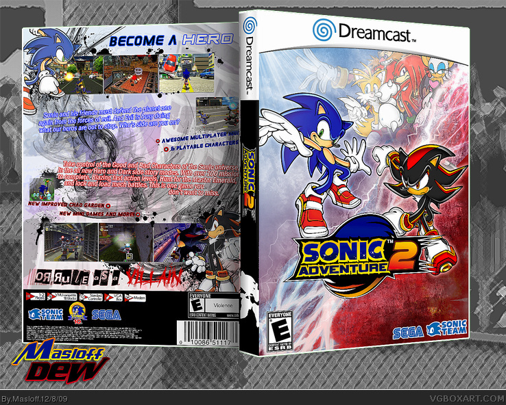
Mah boi, found a small typo. It says one instead of "once". Also you forgot the info on the spine, like the orange bar.
Looking really good though, glad you found something to do with the back.
Edited at 1 decade ago
[ Reply ]
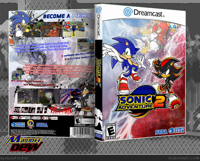
#2, Fix, and I hid something
[ Reply ]
If I see on more Sonic box...
[ Reply ]
I dont know if you was inspired by Pan's Sonic box but I really do not like the whole 'messiness' of the back you have going on, distorted text, random placement of images, unrelated background...etc
But you know, that is just MY opinion. I'm sure there are others that love the messy look. The front is nice though.
[ Reply ]
i love the back all exept for the Shadow font, its to hard to read. Other than that, job well done!
[ Reply ]
#6, It's easy to read on the printable.
and Thx
[ Reply ]
It's a good box, but this isn't really the style I would go for with a Sonic box
[ Reply ]
That is super sexy!!
[ Reply ]
#9, indeed, That's how I iz XP
(thanks)
[ Reply ]